Before I begin, let me tell you that these tutorials are very personal to me. All the steps and instructions are based on my trading style and habits which I developed over time. With time, you will develop your own unique style that makes you comfortable. Don’t do anything that makes you uncomfortable, develop your technique, your instincts and trust them. I will start with the basics and assume that this is your first day in trading school. These tutorials are not exclusive to crypto trading. They can be used for all types of markets such as stocks, forex, precious metals etc.
Let’s start this journey by pointing out your greatest enemy. I plead guilty to all the points below at the start of my trading journey. I suffered and lost nearly everything as a result.
1) YOU.
Yep, YOU are your greatest enemy. It’s easy to blame others for your losses, but everything is on YOU. YOU are the one that’s pressing the buy/sell, long/short buttons. Don’t blame someone that used his knowledge and gave you a trade that went bad. Educate yourself, and studying tutorials like this one, puts you on the right track.
2) FOMO (Fear Of Missing Out).
Don’t fall victim to it (even though I know you will). YOU have to isolate yourself from it. It’s hard, I know, and in the beginning you will fail. I did. Then I started fighting it. Every time I felt FOMO, I would pick up things to do for 30 minutes. House work, garden work, go for a drive. By the time I finished, the trade was gone and so was FOMO. The trade was gone yes but who cares. There are many trades daily and you will catch the other one without FOMO. Know this: THERE WILL ALWAYS BE OTHER TRADES.
3) FUD (Fear, Uncertainty, Despair).
Designed to destroy your spots and reck your shorts/longs by making YOU press that button again. Know that exchanges want to milk you dry. They will create fake outs to scare you and cut your trade. Every time you trade they win money. Learn the difference between fake news and real news. There are trolls/YouTube influences out there that get pay to spread FUD so that YOU press that button. YOU will press that button, not them.
4) EVOLUTION.
Don’t be a dinosaur. Evolve with the markets. You might be bullish (market will go up), but when the data is changing, be ready to turn bearish (market will go down). Always flow with the markets, never against it, and DO NOT EVER bet against the FED. This is important. Keep up to date with FED announcements. They will give you a good indication on where the market is going. The reason is that they can and will take measures to slow or speed up the economy. I follow FED on twitter (X) as well as their Chairman. Read their posts. It will give you an extra advantage in your trading.
5) EMOTIONS.
Don’t let emotions influence your trading. You will fail miserably at this simply because you are a human. It’s natural to have emotions. Have all the emotions you want. Love, hate, be envious, jealous, angry and pissed off but you cannot get attached to coins. You buy them to sell at a profit, not to keep them and hand them down to your kids. I repeat, you buy coins to sell at a profit.
6) YOLO (You Only Live Once).
Yeah and I want to get rich at some point. YOLO in trading, is when one goes all in on one coin hoping to make it big. You know who YOLOs? Smart people that have inside information and they know they can’t lose. You know who else? Desperate people who see this as their only salvation, only to lose what little they have left. We are not “smart people that have inside information”, we simply don’t have access to it. So no YOLO’ing. Putting all your eggs in one flimsy basket? NO, NO, NO. It takes time and effort to grow immunity to the above. You will never get 100% immunity. Even experienced traders fall victims. I still feel the urge to FOMO.I believe I’m 90% immune so there’s room for improvement for all of us.
Tutorial 1: RISK MANAGEMENT
The reason why I start with risk management is because you should consider this more important than the act of choosing coins to trade. Risk management will protect you by minimizing losses. I may win 3 out of10 trades. That’s 7 trades in the red, BUT my risk management is so tight that those losses are minimal. 3 trades at $50 profit each is $150 for the day. 7 trades at $2 loss each is $14 in losses. Overall I went home with $136. The numbers are examples but you get the idea. So how do I apply risk management?
ALLOCATION: Decide the amount that you want to invest in crypto. Some say 10% of your savings, others say 5%. Simplify it. It’s the amount that when you wake up the next day and it’s gone to zero, you won’t be financially affected. You’ll feel bad yes, but you will be able to carry on living without any cutbacks in your lifestyle. That’s the amount that you invest in crypto. What did I do? I saved all my overtime for a year and put it in crypto. Boom.
Once you placed your amount in an exchange you will have a choice to buy SPOT or LEVERAGE (futures/perpetual). I got 90% in spot and 10% in FUTURES. I think it’s wise to have 95% spot and 5% futures. Up to you. Know that during a bull run I switch to 100% spot trading. SPOT: I like spot because I like macro. Buy now and hold for a few weeks/months. I try to ride the bull cycles. In spot, it’s not unusual for my assets to be in stables or fiat for long periods of time but that’s OK. You are CONSERVING YOUR ASSETS for the right time. In my experience, spot trading is more profitable than leverage, less stressful too.
FUTURES (LEVERAGE): The best and easiest way to lose everything. Why do we do it? Because all traders are gamblers at heart (and if you’re not, you will be), so make sure you control that aspect. There are certain good points to futures. It speeds up your education. It forces you to look at charts, and the more you study them the better you become. Futures is your mince meat battleground where blood is everywhere and most of it is yours. You are likely to lose more trades than wins in furures, that’s why risk management is essential. There are other forms of investing in crypto such as airdrops, yields, nft’s but as I said, this is my personal journey I’m sharing with you and I don’t practice them so none of that here.
Simplest definition of a SL: it’s the price that you place in a trade, and when your asset hits that price, the exchange stops the trade. In other words, stop loss is your safety net, your seat belt and your airbag, all in one. ALWAYS, ALWAYS, ALWAYS place a stop loss on all your trades (capital letters show importance). Otherwise there is a chance that you place your trade, go to bed or do some errands, and when you come back to the screen you’re either liquidated (futures) or you lost a large chunk of your money (spot).
How to we use stop loss?
It’s all about percentage. For example, we bought a coin that costs $100 using spot trading (futures we’ll talk later). Traders might use 2%-8% STOP LOSS, some even higher. Myself, I always use 3%-5% but honestly, most of the time it’s 4%. So at 4% my STOP LOSS price is $96 (100-4%=96).
Once I place my STOP LOSS on the trade, if at any given time the price of our coin drops to $96, the trade is stopped by the exchange and we just lost $4. Obviously, you bought that coin because you’ve done your research and you expected it to go up, so anything above $100 is profit for you (minus exchange fees). But there’s always the possibility that your research was wrong or that a news event created volatility to the markets, sending them the opposite way to your trade. But we don’t care, because we have STOP LOSS in place and minimized the damage.
DO NOT ever assume that the trade will go your way. I see many traders talking about low, medium or high risk trades. Consider ALL trades to be high risk. Consider that all your trades may go the other way, in other words always assume the worst. The trading world is one of the few places where it’s an advantage to be cautious and a pessimist.
Again, assume the worst. That’s why we have STOP LOSS.
Now consider the scenario where the trade actually went our way and the price of our coin is now $110. What I would do now is change my STOP LOSS price to $105.6 (110-4%=105.6). It’s OK to round it up to $105. We are now in profit. Market takes a dump? I just made $5, thank you I’m happy.
But remember what I told you about evolution? OK, consider now that your coin pumped big time. You finish off your dinner, look at the screen and your coin is now $150. Do I now change my STOP LOSS to $144? (150- 4%=144). Yes you can but I sometimes use another option, because now I have the luxury to up my percentage. Now I can do 6% or 7% or 8% on my STOP LOSS.
So let’s try 7%. My new STOP LOSS is now $139.5 (150-7%=139.5). But why would I do that if I always assume the worst? Well, because I’m happy with $39.5 profit for this trade. I also do this for another important reason. I protect my position from retraces. Historically, when a coin pumps, it does not pump continuously. It retraces and then continues upwards. That retrace would trigger your 4%, ending your trade, yes with profit but you had the potential for more profit with 7% stop loss. With my 7% STOP LOSS, I have the luxury to afford myself more of a safety cushion and protect myself from the retrace.
WARNING: Apply this tactic ONLY if you have reasons to believe that the market has enough momentum to continue the uptrend (or downturn if you’re shorting).
I would feel much better if you all stick to the 3%-5% percentage rule. You can modify this as you get more experienced. One of the safest and most conservative tactics to use is to move to STOP LOSS ENTRY (SLE) as soon as possible especially when you see volatility in the market. So for our initial trade, as soon as it hits $105, we move our STOP LOSS from $96 to $100. Your STOP LOSS is now your entry point. Safe, only money lost is the exchange fees.
FUTURES RISK MANAGEMENT
I don’t like FUTURES. I mentioned before, that I prefer spot. Less time spent in front of screens, but I trade FUTURES anyway, and so will you, especially if you are in a paid group, receiving trades on a daily basis.
There are a lot of details and parameters involved in FUTURES trading, such as Pnl, leverage, Return on equity (ROE), liquidation price etc. I will be honest and tell you that in the beginning, I didn’t know what these were but started leveraging anyway. Sure, I looked them up and read their meanings, but I was never math’s orientated (I still suck at math) so I simplified my trading procedure.
Know that I use Binance for futures. These are the steps I take to place a trade:
So a coin comes into my radar. I look at the charts (and soon you would be able to do that) and decide that this coin has potential to go short or long, in other words, it will break down or up. Let’s say that our $100 coin is looking weak in the charts and we think it’s about to lose value. We are about to SHORT this coin. Before you do anything, press the “Isolated” button. Never use “Cross” margin as this can damage other assets in your account. Always isolate your trade, so in case of a screw up, only that trade gets liquidated.
I will then enter the trade in either 2 ways. LIMIT order or MARKET order. If I think that it might have room to go slightly up before it goes down, then I place a LIMIT order at $102 (so in case of a fall you have more room for profits) . This value is NEVER a guess. This value is determined by reading the chart. So when and if the coin hits $102, the trade is automatically activated and the coin is bought at the price of $102.
MARKET order is the price of the coin at that specific time.
I then place a STOP LOSS, which is usually 4%, so it’s $106.08 (102+4%=106.08). Remember, in SHORTS, the STOP LOSS price is above your entry price, and in LONGS it’s below. Now in futures, when my trade is low confidence, in other words I “think” it’s going down but market volatility might screw me up, I will use 3% instead of 4%. I would say that 50% of all my trades in futures are 4%, 40% are 3% and 10% are 2% for STOP LOSS. 100% of my trades have STOP LOSS. Saying that you forgot to place one is no longer an excuse.
TAKING PROFITS (TP)
Believe it or not, not many people exercise this option (traders do, people don’t). It’s only recently that I started using this, and the reason why it took so long is greed. Good luck trying to control it, for me it’s the most difficult aspect, because such is the nature of the beast. TAKING PROFIT will make you the tortoise in the long marathon race of trading. You will win, but slowly.
What’s TAKING PROFITS?
When you set a value for your short, for example $95 for our coin, once that price gets hit, your trade is stopped and you claim the profits, $5 in this case. Remember, we shorted this coin at $100.
TAKING PROFITS can be very flexible and you should encourage yourself to play with it. You can have multiple TAKING PROFITS for each trade. One of my favorite trader, uses a simple an effective formula: TP1:
20-50% of profits taken (go for 50%)
TP2: 50-70% of profits taken
TP3: 70-80% of profits taken
TP4: 80-90% of profits taken
TP5: 90-100% of profits taken I never practice this, if I did I would be better off so I encourage you to adopt the above. What I usually do is this. I place a trade (coin at $100) and observe. If my short goes from $100 to $96, I put a new STOP LOSS at entry. So now my STOP LOSS is at $100. Safe minus exchange fees. If it goes lower, then I place my STOP LOSS at profit (below$100). Now I’m in profits and I usually let it ride. In the process I might widen my percentage for STOP LOSS as I do in spots, or if I see a reversal I stop the trade manually and keep profits. I find that this methods works well for me provided I have the luxury of being in front of a screen. If I don’t, then 2 things happen. I wake up the next day in green, or STOP LOSS gets triggered with a small loss. Be a tortoise not the hare.
Some exchanges offer a TRAILING STOP, and you can adjust this to the percentage you want. This is actually a good option and I used it often in the past (it’s about time I started using this again). If you set a TRAILING STOP at, say 4% SHORT, and our $100 coin is declining, the TRAILING STOP will follow the declining price and do nothing. If our coin at, say $90, begins reversing upwards, your TRAILING STOP wakes up at $90 and follows the coin. As soon as it hits $93.6 (90+4%=93.6), it stops the trade. This is a good “fire and forget” option that can be used for both SHORTS and LONGS.
One final thing that you have to set is the amount of LEVERAGE. This is the most important setting and it should be your first action. I left it last so the importance of it can stay in your brain longer. People over leverage and blow their account.
There’s no right or wrong but there’s safe and unsafe. For me, the safest LEVERAGE is X3-X5. You might think, it’s low, and I agree with you, but the lower the leverage the better the risk management. X5 is not written in stone and to be honest 20% of my trades are X5. Most are X7-X9. I’m comfortable with these numbers for ALTS. I say for ALTS because for BTC and ETH I use X15-X25. 90%of the time I use X20 for these two. Why? Simply because they are less volatile and less manipulated than ALTS (although sometimes we know that’s not entirely true). Smaller market cap alts can easily be manipulated so use lower leverage. You have been warned.
You want to try a small amount of your assets and do X40 or X50 or X100? Be my guest. I did that twice with small amounts ($50). I got wiped out both times.
I will share with you something from my experience. Remember how I said that exchanges want to milk you dry? Every time you place leverage greater than X30, an exchange bot awakes, and an analogue places a “shooting target” on your trade. It calculates all the LONGS and SHORTS traded that moment and will find the right time to liquidate you. You can actually see this on charts. It’s those unnatural long candle wicks that last for a fraction of a second. I actually tried it and saw my X75 short get liquidated live on the exchange. I placed it and saw the price of the coin shoot up for a fraction of a second, it was almost instant. Liquidated. I call it “sniper headshot”. Binance does it.
So back to our trade, we got the coin we want to trade, pressed the ‘isolated’ button, we determined the leverage and the amount we want to trade, and placed our STOP LOSS and TAKE PROFITS. Do we now press the LONG or SHORT button? NO, NO, NO. We go to our calculator, we put all our values to get a preview of everything (including the most important: liquidation price). I used to use the Binance Futures calculator but now use ‘calc.trade’. Once you verify the numbers, you may go and press LONG or SHORT button. DO NOT LEAVE. The next part is very important.
Once you pressed short/long, check your trade on the exchange again. Check the liquidation price and your STOP LOSS. I found that even though I checked my numbers with the calculator, I see that my STOP LOSS value in my SHORT trade is higher than the liquidation price. My STOP LOSS would never have been triggered. Liquidation would come first. If this is the case, change your STOP LOSS or your LEVERAGE.
One more thing. Double check and triple check all the decimals in your entries. Many accounts have been blown by placing STOP LOSS at 1.56 instead of 0.156. So always check decimals.
The above is your road map to every trade. Once you get the hang of it, do you know how long it will take you to place a trade? Less than 20 seconds. You will do all the above in less than 20 seconds. You are a champion. 20 seconds.
Tutorial 2: CHARTS
We will dive straight into charts. I won’t bombard you with definitions of candles, patterns etc, but we will teach them as we come across them.
I use Tradingview for my charts, the free version. I like to keep things simple (and cheap) and it allows me up to 3 indicators for free. Indicators are used to get a better picture of what’s happening, or what’s about to happen. I use 50MA (green), 100MA (blue), 200 (red) MA (Moving Average), Volume and RSI (Relative Strength Index). It keeps the chart nice and clean, less complicated, just like the btc weekly chart below. This is all you need for now. Please magnify it on your device and study the details.
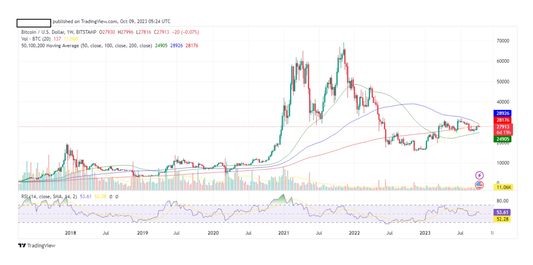
There are hundreds of technical indicators that you can use and I would say that I don’t know 95% of them, simply because I don’t use them. I tried to, but I always go back to simple charts. In fact if you were to apply all the indicators into a chart, you wouldn’t be able to see the candles. There’s too much visual pollution.
For tutorial purposes we will be using BTC chart, because it’s the oldest coin and therefore has a bigger timeline.
TRENDS
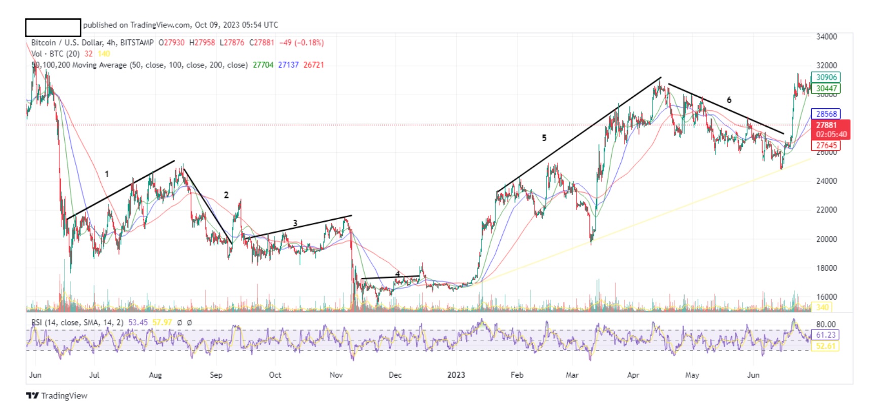
First let’s find out how to form a trend line using the btc chart. Below is a btc 4hr chart taken at a random time period.

Notice the peaks (highs) and troughs (lows). From now on we will refer to them as HIGHS and LOWS. Simple. Now let’s draw some straight lines using the highs.
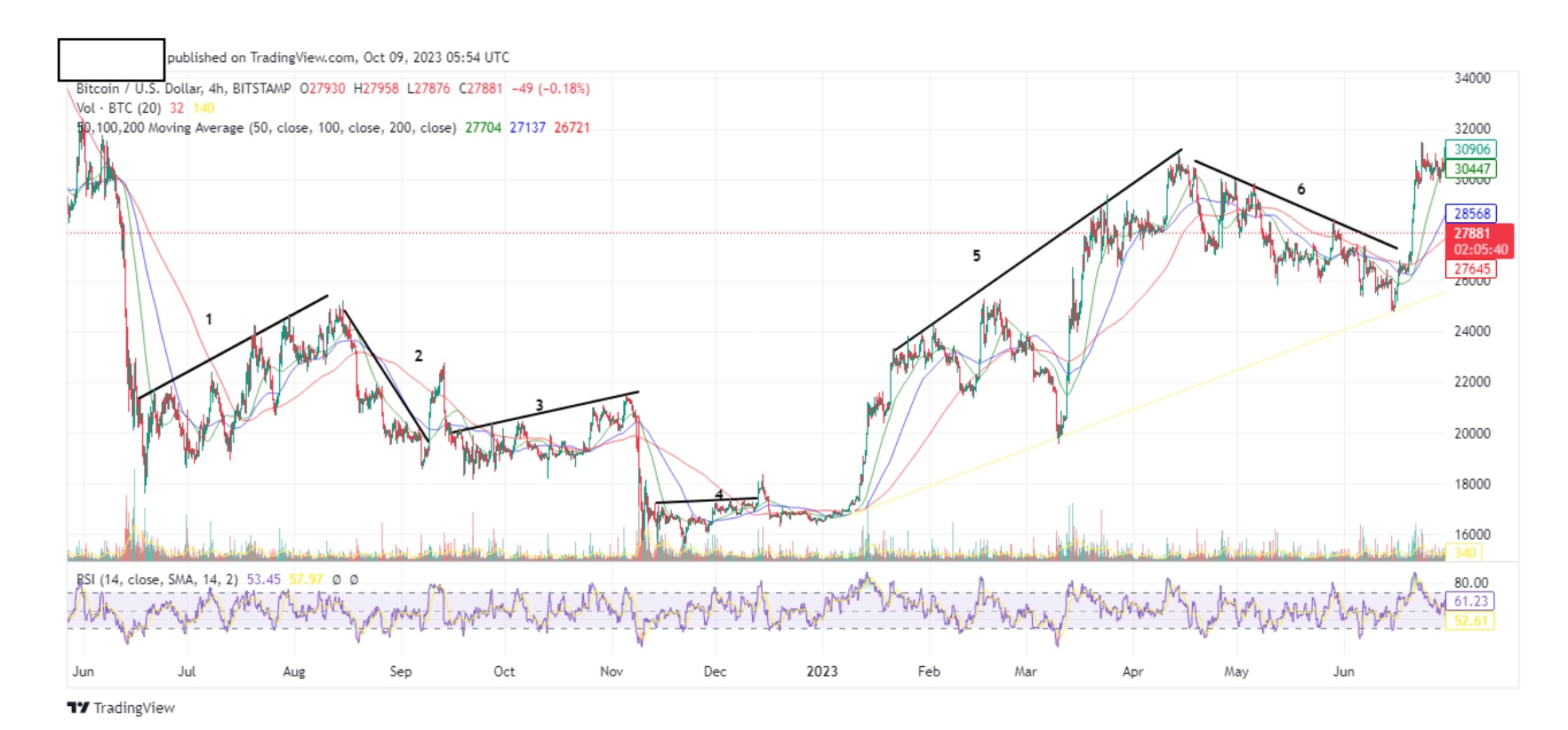
These drawing tools are available for free on trading view. Feel free to zoom in on the chart to see more detail.
1, 3 and 5 are upward trends
2, 6 are downward trends
4 is a sideways trend.
I used the highs to draw my straight lines. You don’t have to be super precise to draw the general trend line for now. You will notice that some of our trend lines miss some highs. That’s ok. We will learn to use different time frames to be more specific. From our chart we now have general trend lines for our research. I say research because you will use trend lines to determine which coin you will trade and at what specific time. This is very important. Trend lines are your mirror to the future. Historically you will find that coins, almost always follow trend lines.
We will see the trend on different btc timeframes (tf). Above is the btc 1minute tf (I call it, the bullshit trend) Above is the btc 30min tf.

Above is the btc 1minute tf (I call it, the bullshit trend).
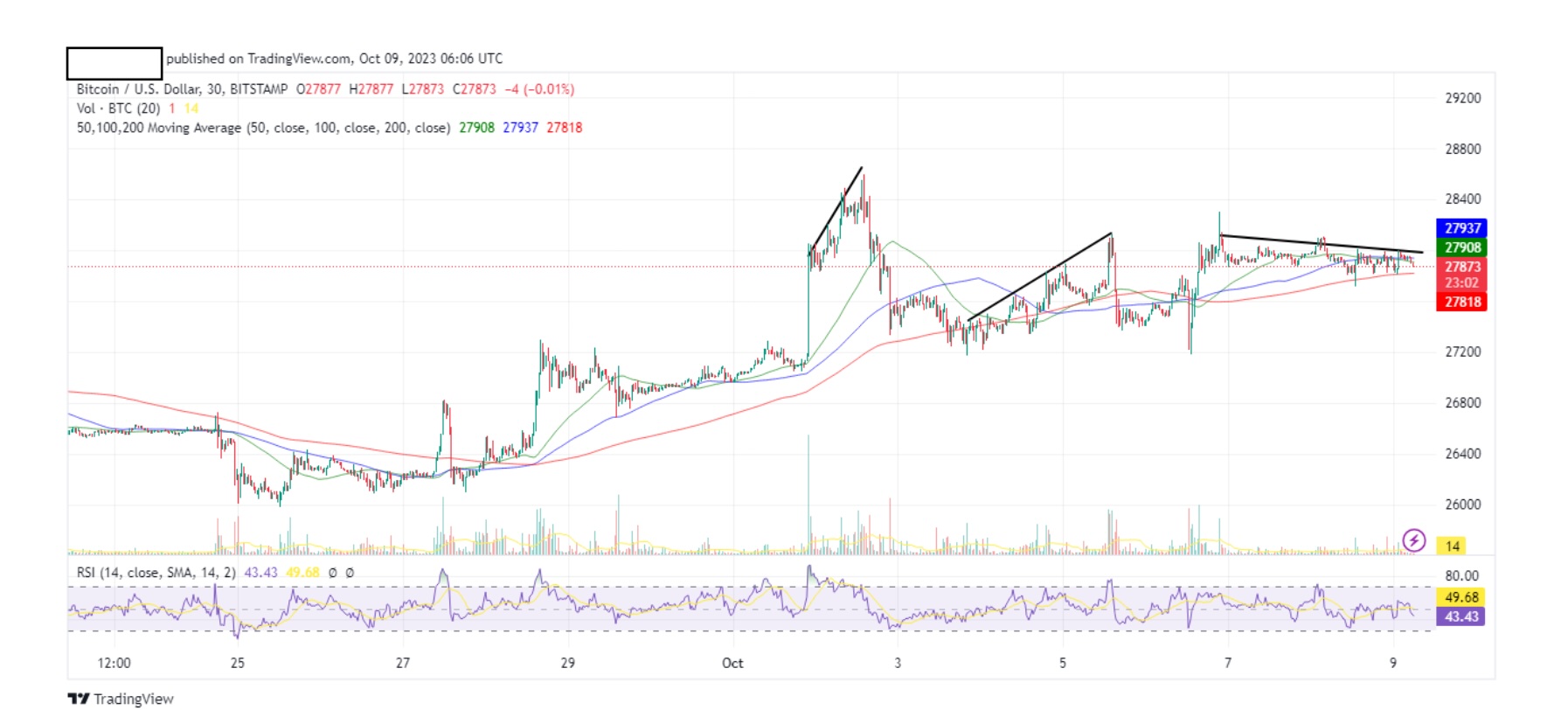
Above is the btc 30min tf.
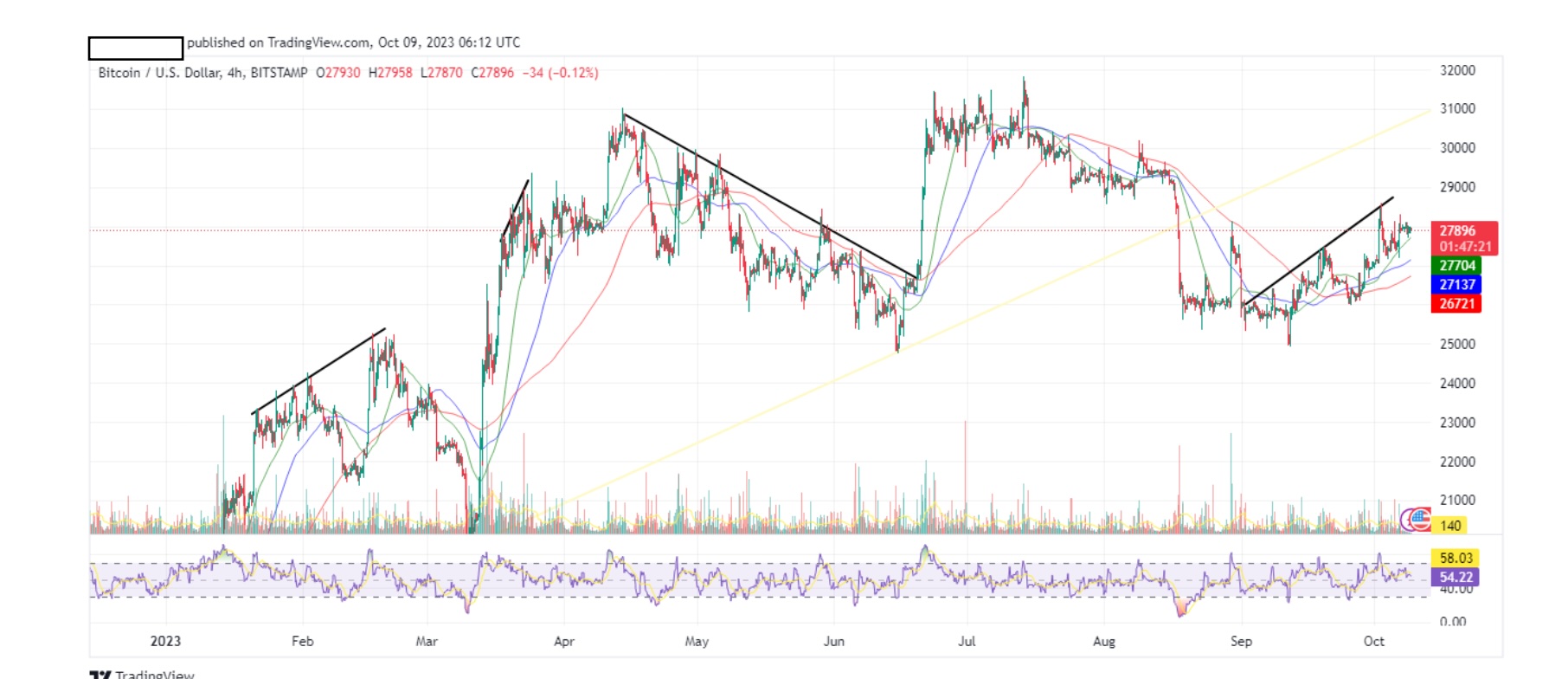
Above is the btc 4hr tf.

Above is a btc daily tf.
Again, this is our btc weekly tf.
The reason why I placed different tf’s starting from the minute, is for you to see that, even though a trend line might be up on a smaller timeframe, if we zoom out at a bigger time frame the trend might be down. This is why the best timeframes to determine the trend of the markets are WEEKLY and DAILY. Some people use the 4hr, but not me.
ALWAYS use weekly and daily timeframe to determine the trend of the market.
Just to give you an idea of how I place my trades, I start from weekly and then go to daily. I now determine the trend of that particular coin. I will then go to the 4hr and 2hr to confirm the latest trend line. Then, I jump to 1hr, 30min, 15 min and finally just before I place my trade I check the 1min. It’s like a microscope, for every lens you use, you go into smaller detail.
I know that looking at the charts at this tutorial might look overwhelming at first, and I don’t want you to learn from my charts. I want you to understand the principles behind trend lines and draw them on your charts. Pick any coin, on any timeframe and practice. It’s all about connecting the dots (highs).
We’ve used the highs to draw our trend line, so now on the same chart, we will use the lows.
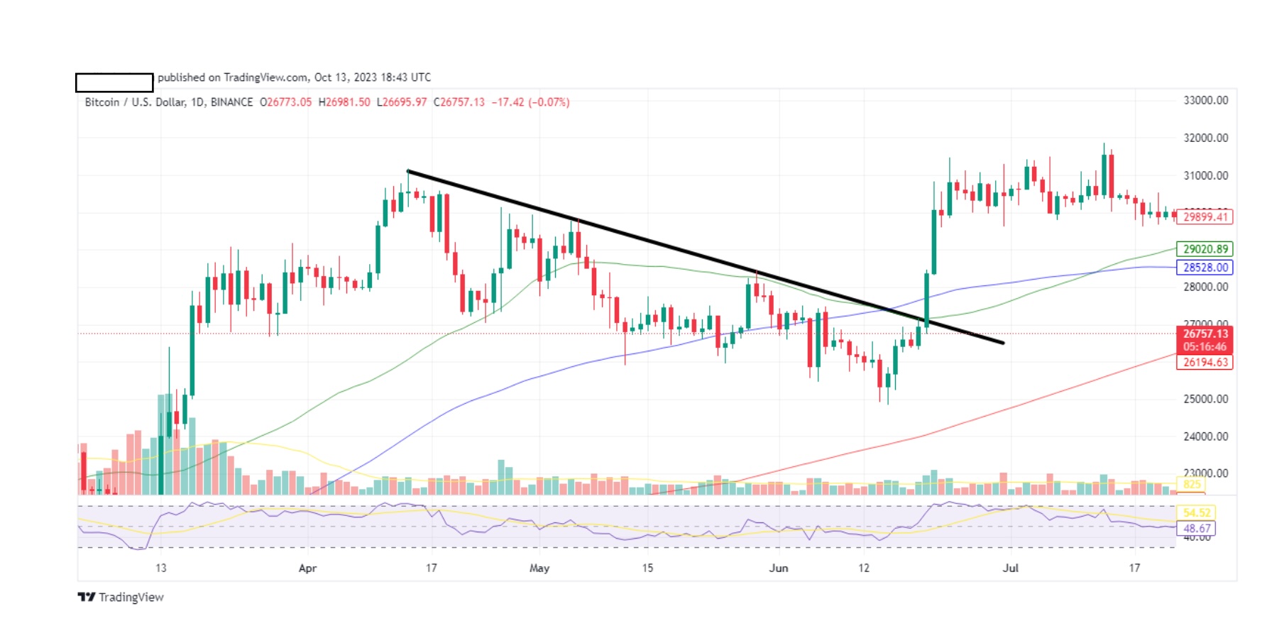
Let’s use the btc daily chart from a random timeline.

Above is a btc daily at random time line.
Now let’s draw a trend line using highs like we learned.
Now let’s draw another trend line using the lows this time.
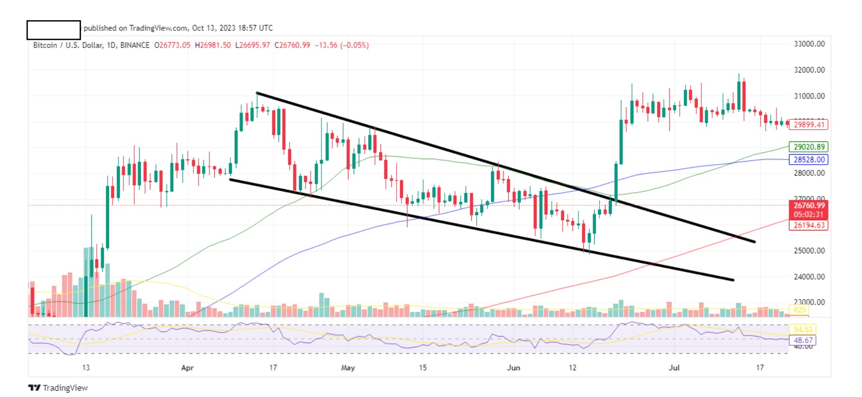
See how the high and low trend lines create an area that our coin moves in? Let’s put some numbers to describe what we see. You don’t need to do this, but I’m doing it for tutorial purposes.

Don’t let the numbers scare you. I’m just highlighting the points were your eyes go as soon as you draw the top and bottom trend lines. With little practice, this will become second nature to you.
1,2,3,4,7,8,10=highs
11,12,14,15,17,18,19=lows
Simple enough. Now take a look at 9,13,6,5 and 16 in that order. You might say “Hey Skelter, these highs and lows don’t touch neither the upper nor the lower trend line”, and you are correct in noticing this. What is important to know is that our coin is behaving within our trend lines, which means we can still speculate the price of the coin. But hang on, how can you speculate the price, if it already happened?
So let’s take a current chart of BTC.
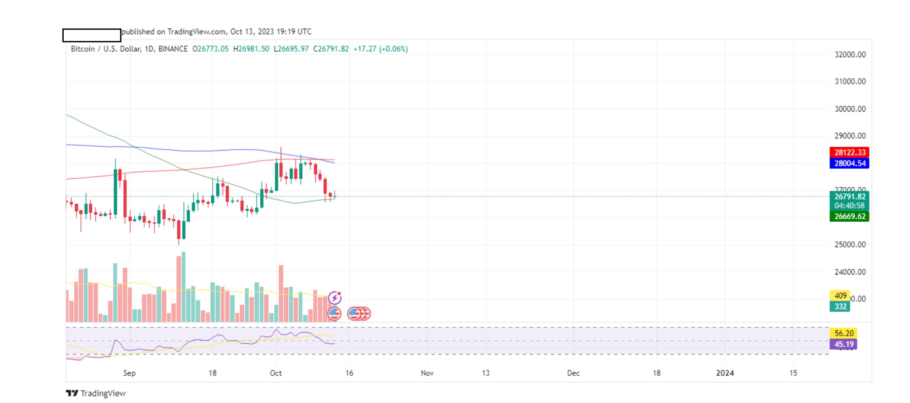
Above is a btc daily chart.
Now let’s draw our upper and lower trend lines (highs and lows).
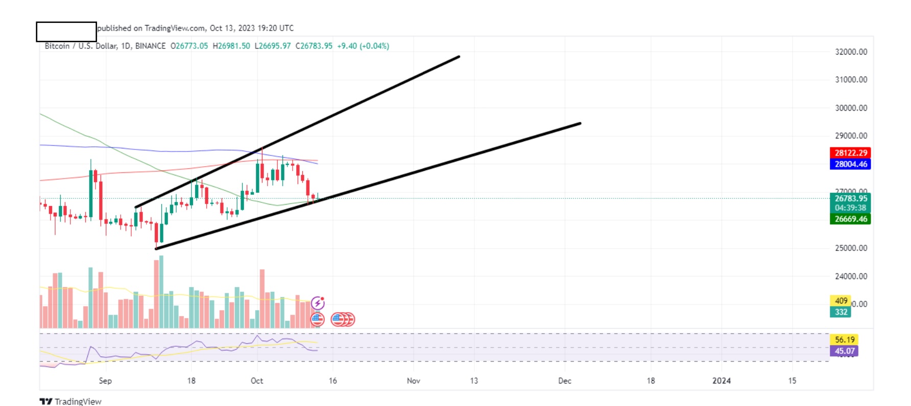
This is where you create magic.
I would expect the price of the btc to progress within those 2 trend lines.
One possible scenario is this:
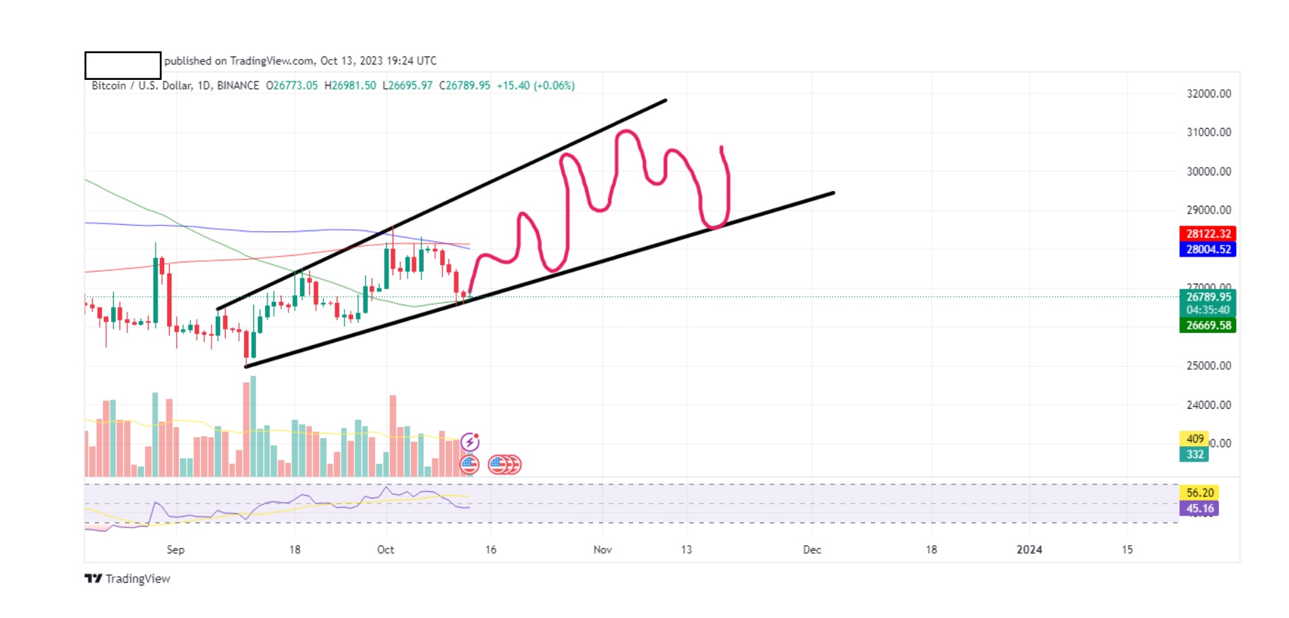
The wiggles I created are just a guess and they can vary in their ups, downs and sideways, but they will most likely always travel between the two trend lines (unless major volatility occurs). Remember, this is the daily chart.
So we decided to scalp btc. We checked the 4hr, 2hr, 1 hr, 30min( you can check any tf you want. The more you check the better picture you get. With time you will choose 3-4 that you’re comfortable with),15min, 5min and we are at the final 1 min tf.
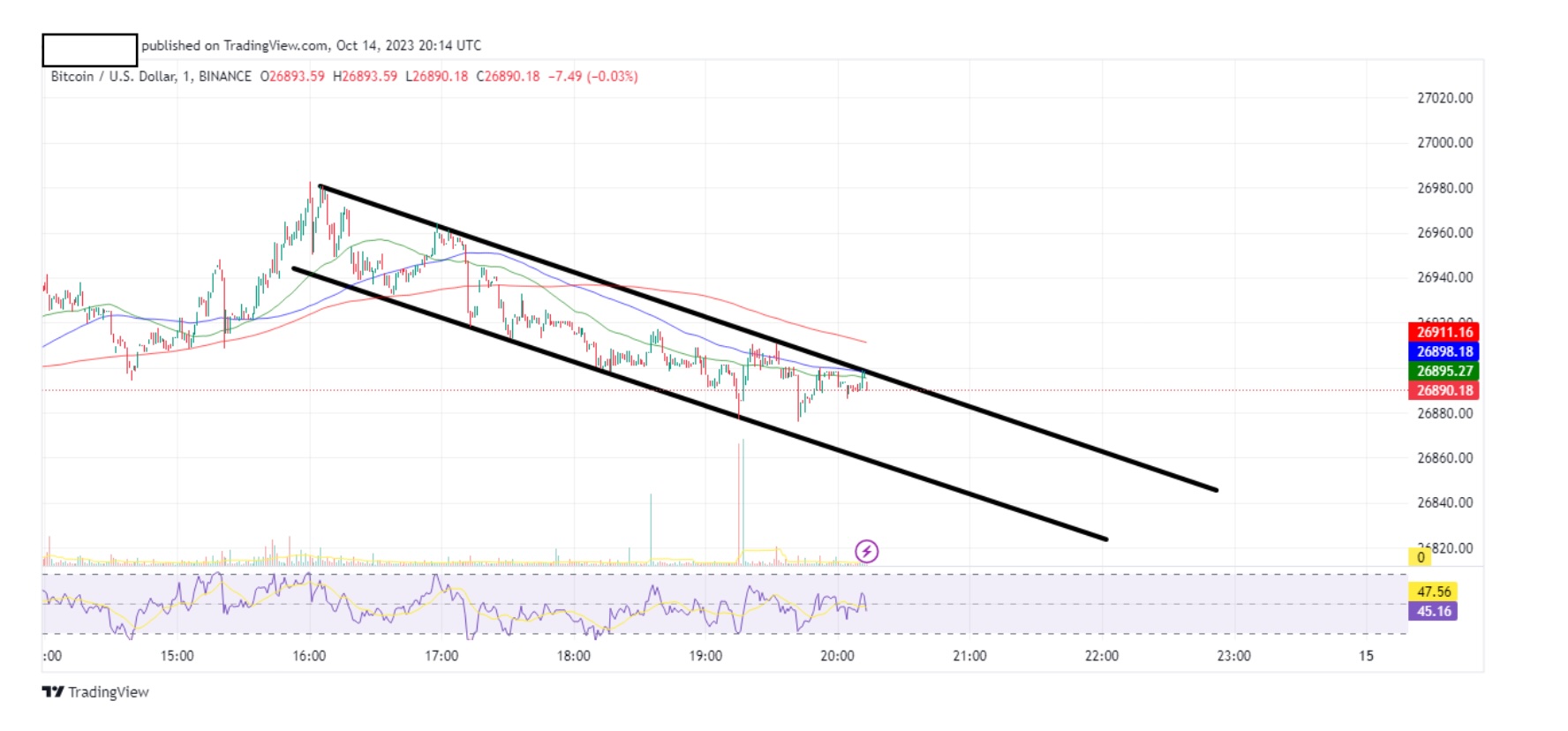
Above is the btc 1 min chart.
So lets scalp it. The price of btc now on this chart is 26895.27. It just touched our upper trend line perfectly and is now moving downwards, so place a short on btc now.
We know that its highly likely to head towards our lower trend line, so for illustration purposes, lets draw our wiggles.
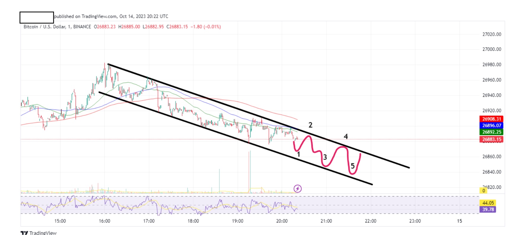
At no.1 btc is 26866. As soon as we see an uptrend, we cash in our short and go long.
At no.2 btc is 26877. As soon as it hits the trend line, we cash in our long and go short etc etc etc. Rinse and repeat, rinse and repeat.
The difference between 1 and 2 is that for no.1 I had to wait for an uptrend (green candle to act as confirmation-more of that later) since it didn’t hit our trend line. No.2 was much safer because I knew that as soon as it hits our trend line, chances are that it will correct. I know this because market movement has its own habits and has been historically proven many times to bounce off the trend lines.
This is how I use trend lines for scalping. Not by guessing, but by calculated speculation. This knowledge alone, puts you in the top 20% of all people trading.
Finalising our tutorial in trend lines
Before we continue, allow me to clarify something. Upper and lower trend lines DO NOT need to be parallel. In fact they are only somewhat parallel in continuous sideways movement. Most of the time, they form a wedge, or a descending /ascending triangle. I like triangles. We’ll get to them shortly.
Another detail is that when I draw trend lines I use the wicks as points rather than the top/bottom of the body of the candle. It’s ok to use the top/bottom of the candles, and sometimes for confluence (better line) it’s ok to use a combination of wicks AND top/bottom of candle BUT you should avoid passing a trend line straight through a candle.
Since we mentioned candles and their wicks, allow me to give you a brief explanation. Skelter will keep this nice and simple. No confusion.
You realized by now that the charts we use are made from green and red candles (also called bars or dildos-be careful, they are called that for a reason, especially when your trade goes bad).
Green means up
Red means down.
Let’s concentrate on one candle and magnify it.
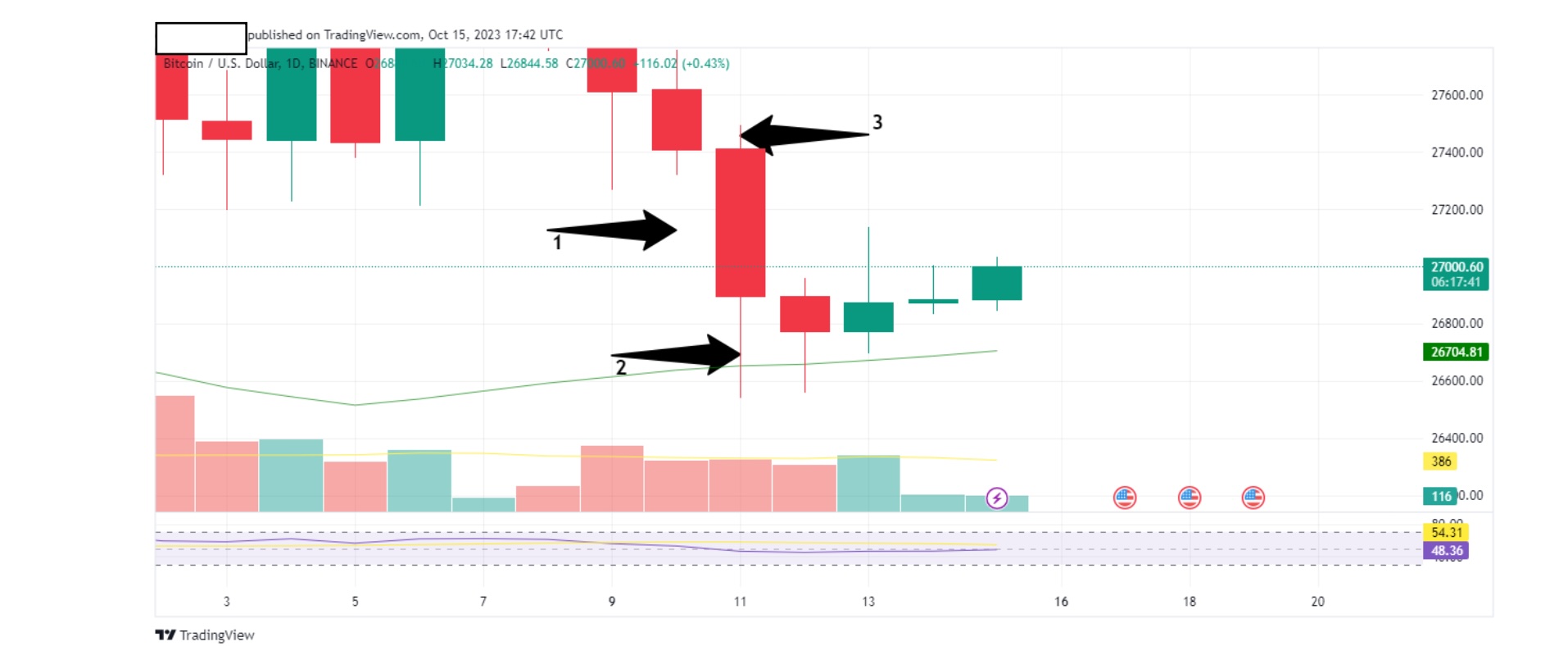
Above is a btc daily chart so each candle represents 1 day.
Arrow 1 points to the body of the candle. It’s red, so price goes down. Notice how our candle body is bigger than the one to its left and right? That’s because during that day the movement in price of our candle was bigger than the one’s next to it.
You can argue that during that day, price was more volatile. The bigger the candle body, the bigger the volatility. The smaller the candle body, the more boring that day is. The body of the candle shows the price range of btc during that day as shown below.
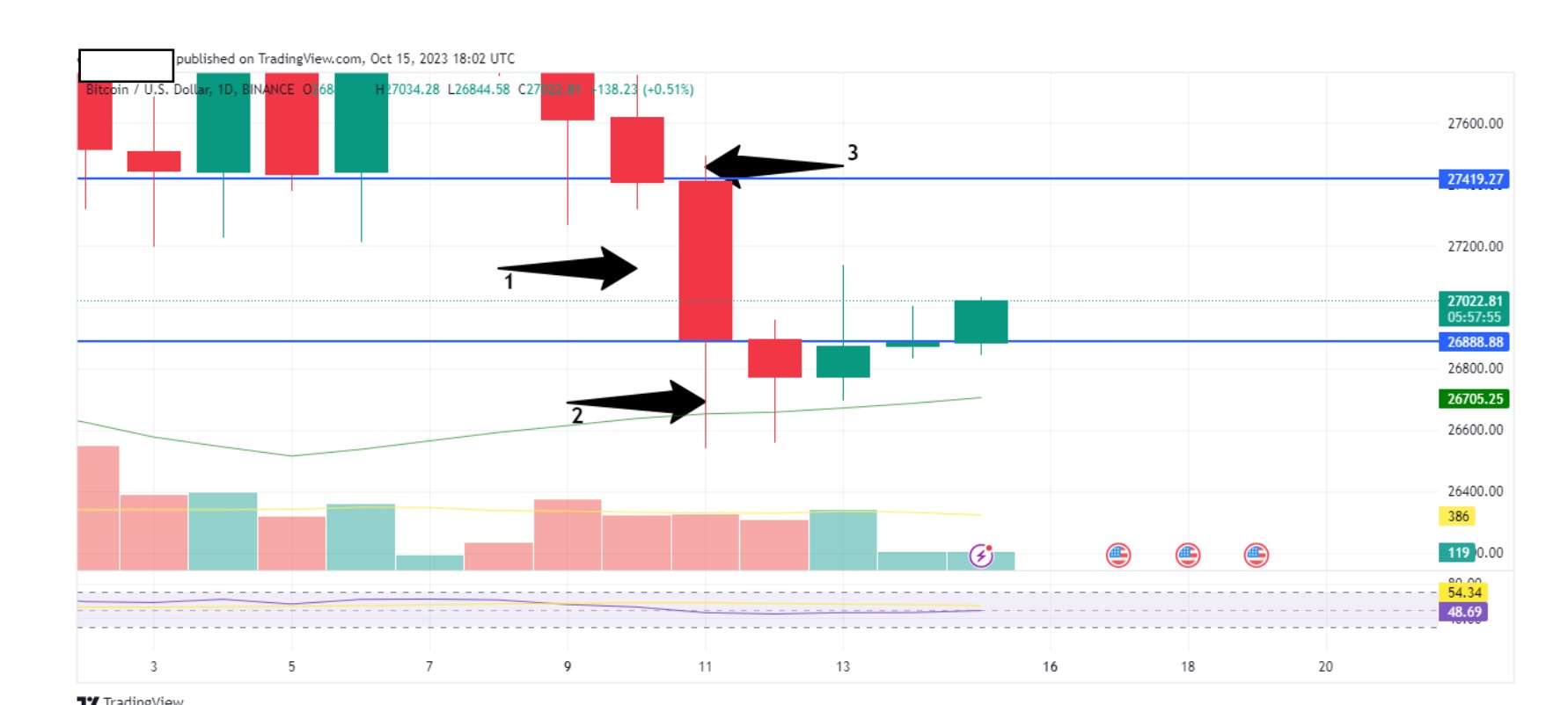
See those blue lines? Throughout that day, the price of btc varied between them.
Arrows 2 and 3 are the wicks of the candle. Lower and upper wick (also called shadows). What you are looking for here, is the length of those wicks. What you see, is the visual representation of the price range during that day. This is the actual price that btc reached (even for a split second) before it returned to the body, as shown below.
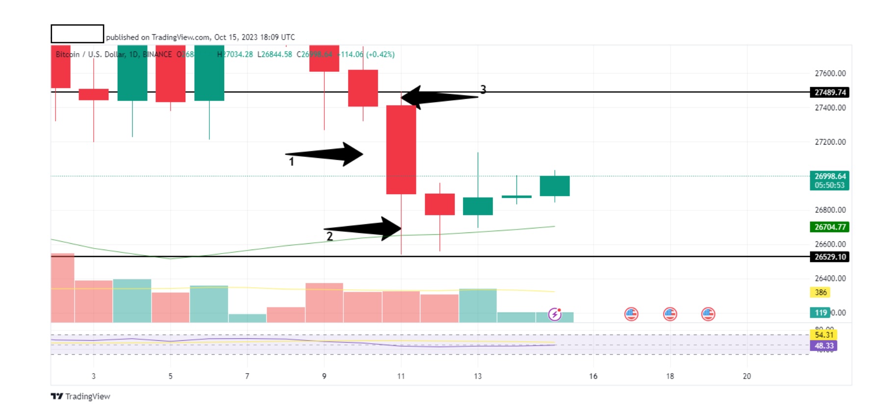
Price range between wicks shown as black horizontal lines.
See how the range is larger? Always go for wicks. They show you the true price ability of btc (or any other coin) during that day.
All the above can be applied for any timeframe. Simple.
As we progress, we will learn that certain shaped candles can tell you if the market will go up or down. Yep. You will able to see the future and place your trades accordingly. They are weapons of knowledge to be used at your disposal.
Let’s now expand the trend lines a bit more and look at triangles.
Have a look at the chart below:
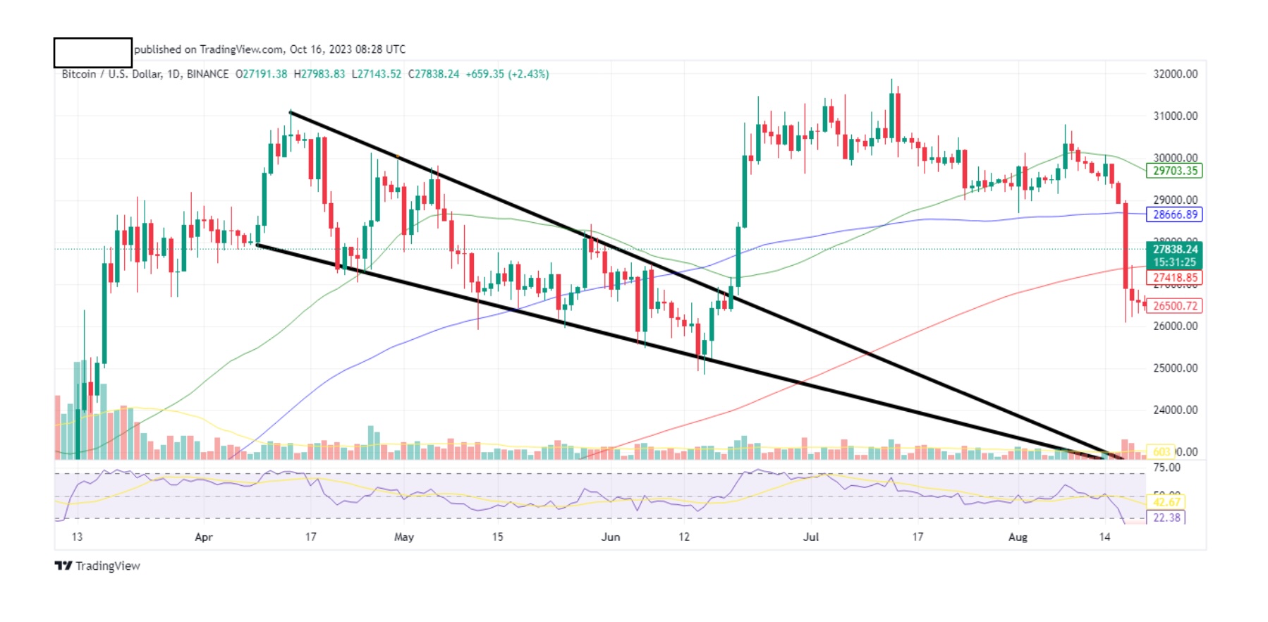
Above is a btc daily chart.
Notice how our trend lines formed a triangle. Triangles are good because they give you a general trend and, an estimation of when a breakout/breakdown is to be expected. This triangle is pointing downwards do it’s a descending triangle.
A triangle pointing upwards is an ascending triangle. Now notice the highs touching the upper trend line. Let me point them out to you in the chart below:
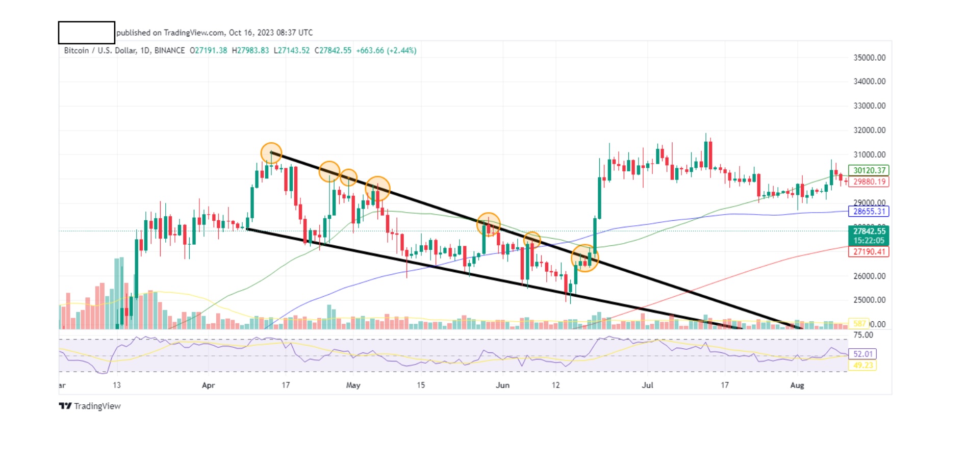
We see at least 7 highs touching the upper trend line. Note that some circles contain 2 candles that touch the trend line.
Now let’s do the same with the lows.
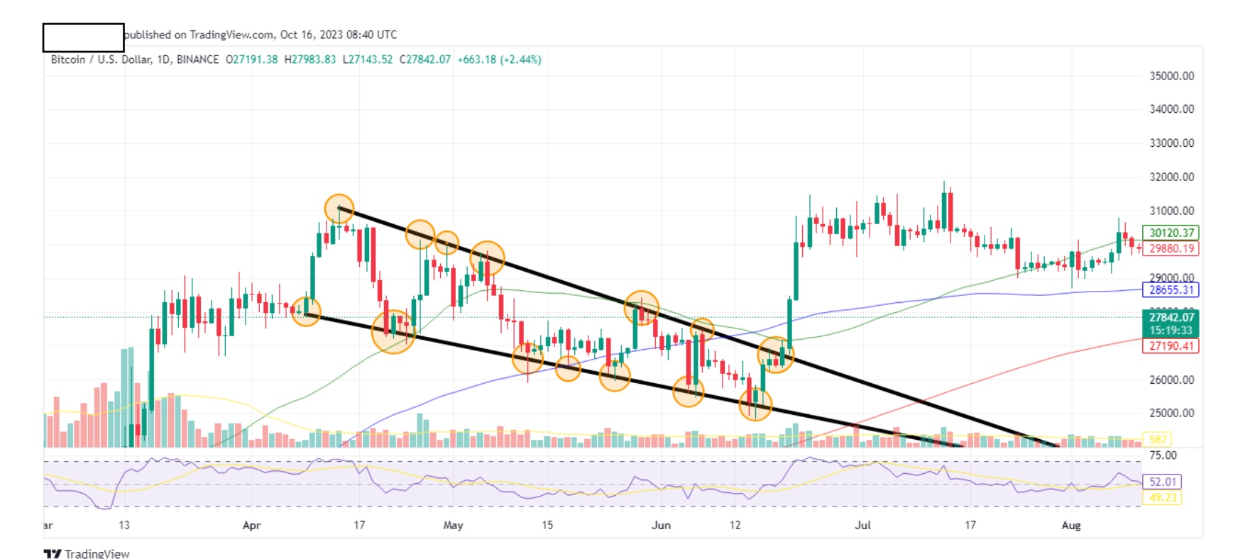
Here we also at least 7 lows touching the lower trend line. Again, some circles contain more than one candle touching the line.
The more times a candle touches a line, the weaker that line becomes and it’s likely for that line to be broken.
Once a candle touches a line from the bottom up, that line is called RESISTANCE, and as historical charts show us, they will bounce off and head back down. But as it comes back, every time it hits the line, the resistance becomes weaker and weaker and at some point in time, it will eventually break that line and that line becomes SUPPORT.
Let me show you what I mean by a simple diagram. No candles. Just lines. Simple.
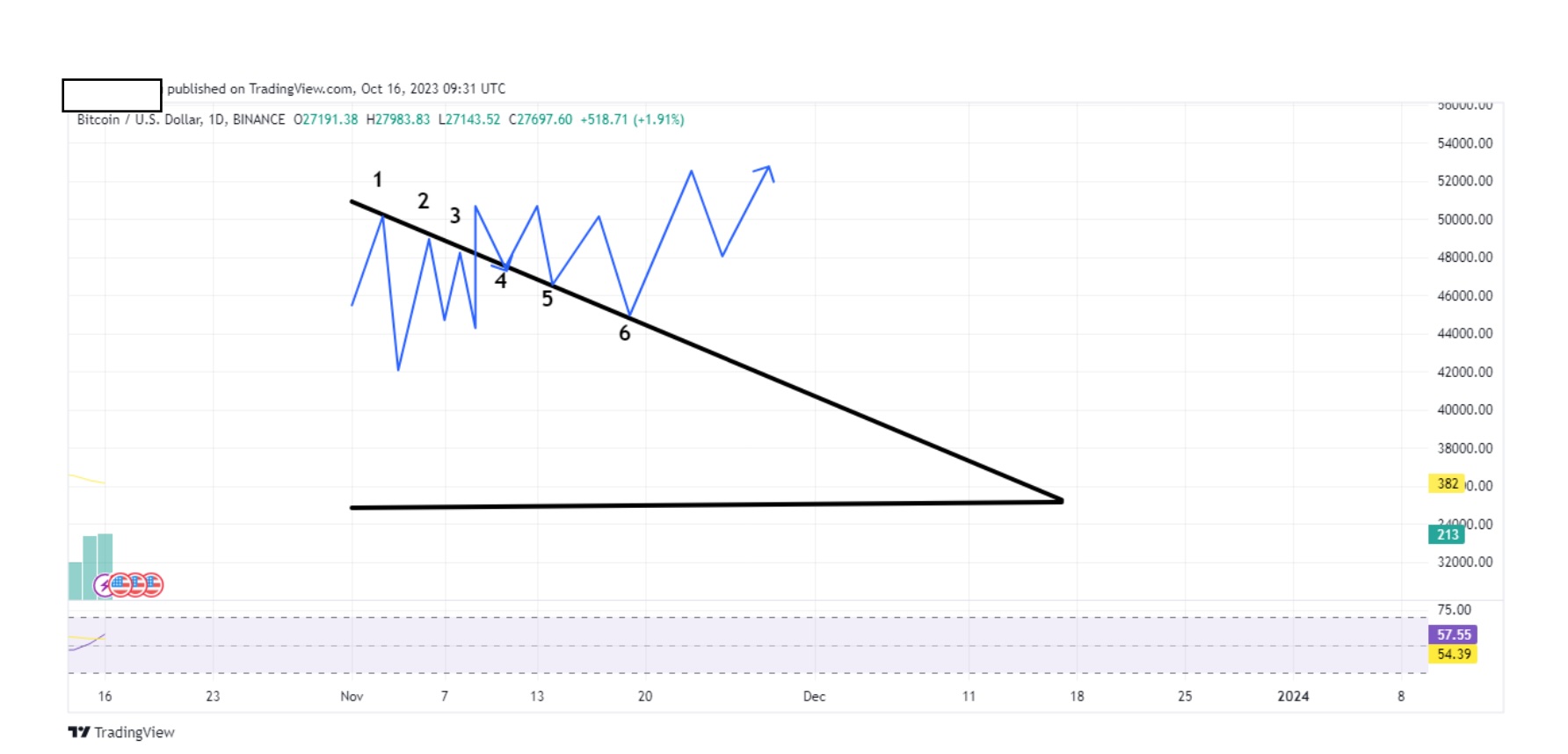
The line at 1,2,3 serves as resistance. Our coin then broke through and when it came back, our line at 4,5 and 6 became support. (Support:Resistance. You will also see them as S/R or S:R).
Let me repeat something to you. The more it bounces off, the more chance of a breakout (up) or breakdown (down). As the frequency of the bounce becomes smaller, the chance of the breakout/breakdown becomes larger. Imagine a spring, the tighter you squeeze it the more it wants to break out.
Back to triangles. As they get narrower, there is less room for the coin to move, so a breakout/down is to be expected.
Look at the chart below:
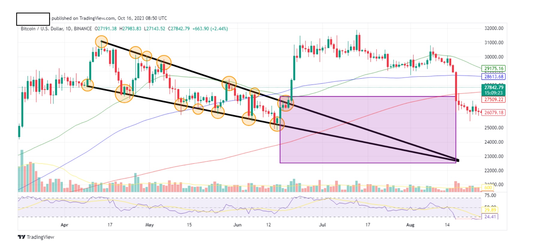
The breakout would be expected somewhere within this box. But hang on a minute Skelter. So you’re expecting a breakout sometime between 19th of July and 15th of August? That’s a period of one month. Can’t you be more precise than that? I mean markets change overnight.
Of course we can. Don’t forget that the above chart is btc daily. Now take a look at the chart below. The above is btc 1hr chart.
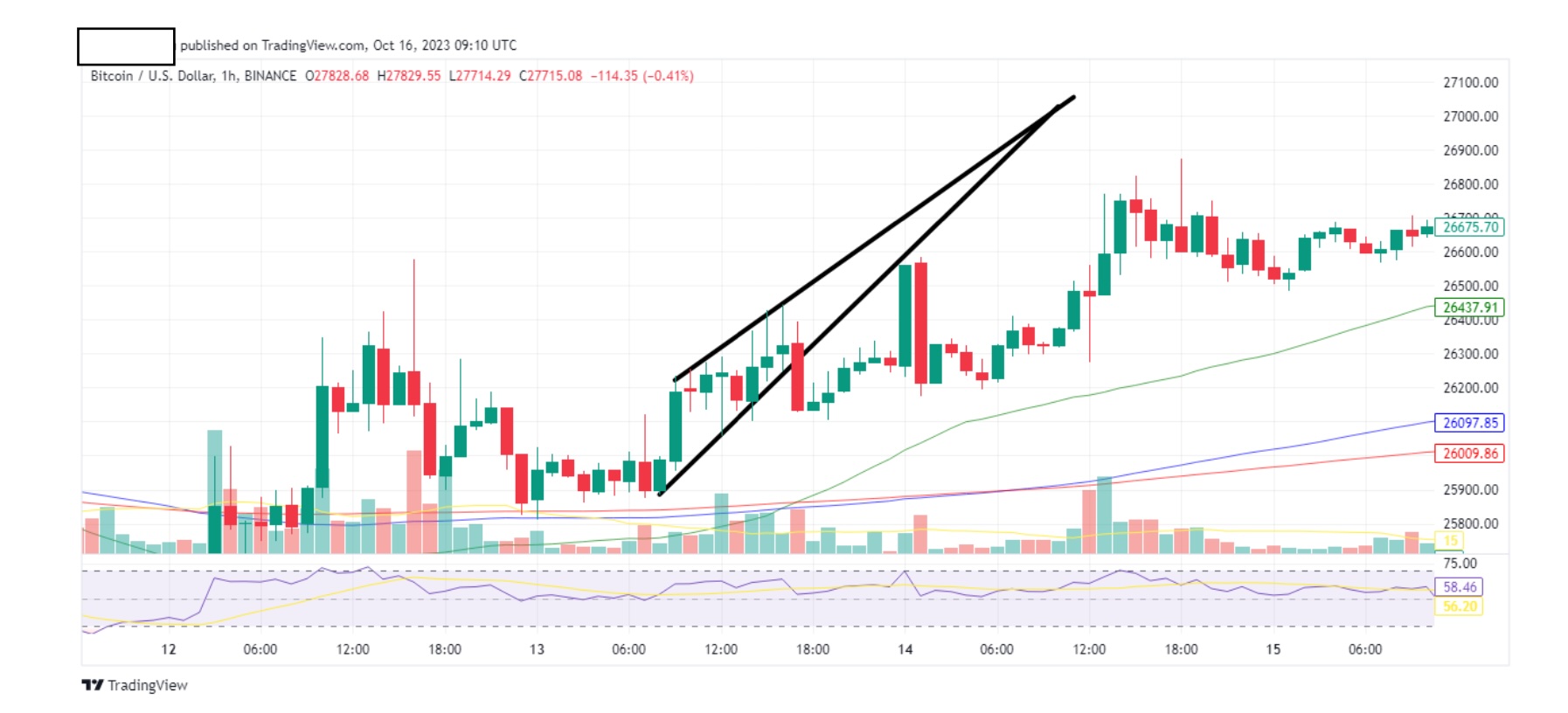
The above is btc 1hr chart.
Let’s use and ascending triangle this time. Now let’s put our breakout area as below.

Time frame is now from 1200-0600 hrs. Eighteen hours till breakout/down. Not bad but we can even do better. Remember when I told you to zoom in using 30min, 15min etc? Well my beautiful family, when you finally get to the 5 min or even 1 min tf, you can tell exactly when the breakout/down will occur. You have to be in front of a screen to catch it at lower time frames, but if you have this luxury, you can catch it.
So there you go traders/scalpers. I will be honest and repeat to you that I don’t like scalping. I prefer macro spot. With scalping there’s more of a chance for things to go wrong, but I know that’s what you want, so go for it.
Some advice on the best way to practice: A lot of tutorials that you might come across will tell you to paper trade. What that means is that you use “monopoly” money to trade and wait for the outcome, record it and study your mistakes. This is nonsense my friends. It’s not real money so you won’t care if you win or lose. As a result, you won’t put in as much effort in your charts. Put your money where your mouth is. Sacrifice $100 in your account and place small trades, $10 each trade. You will spend more time calculating your trade, putting your knowledge into practice because it’s your $10 and you want to achieve a profit. Your trades went bad? All ten of them? You lost $100 and you gained priceless knowledge and experience. Put another $100 in your account and, again, go for small trades. Your will get better with every trade you make and eventually you will see green.
Now let’s solidify our technique. Let’s combine our trend lines with price levels.
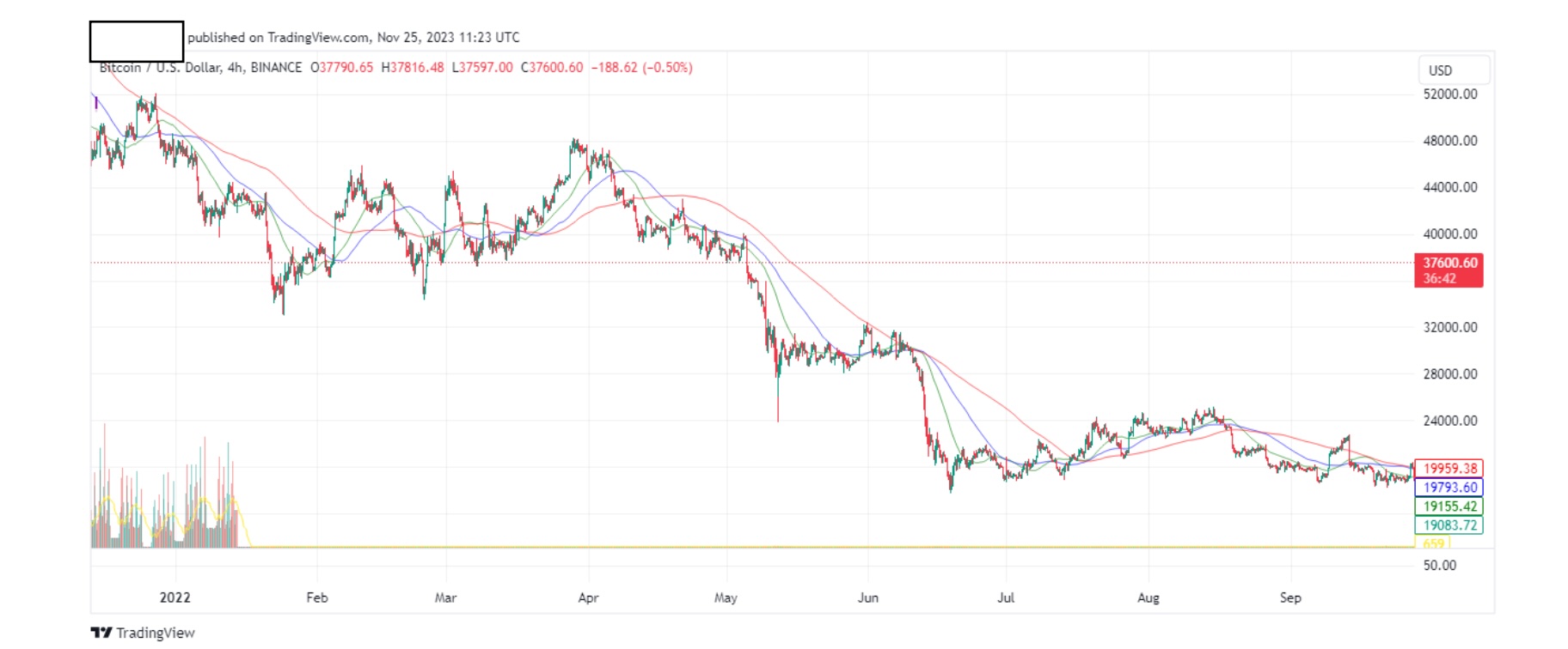
Above is the btc 4hr chart.
Let’s go crazy and draw some trend lines.
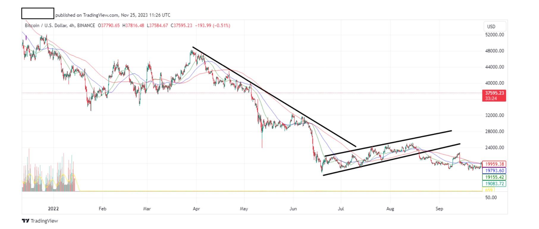
Good enough for me. Feel free to add some more if you want. Now, let’s put some price levels. We do this exactly the same way as trend lines (using highs and lows), but price levels are horizontal. On tradingview its easy, just put your cursor on the level you want on the price column on the right, click the ‘+’ and add the horizontal line.
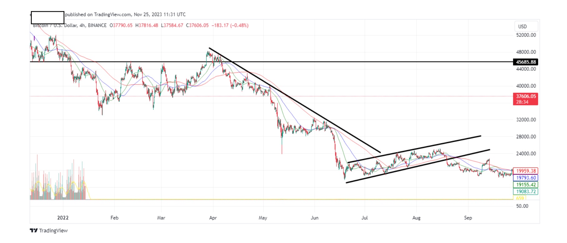
See how I placed it in order to touch as many highs and lows as possible? Let’s zoom in.
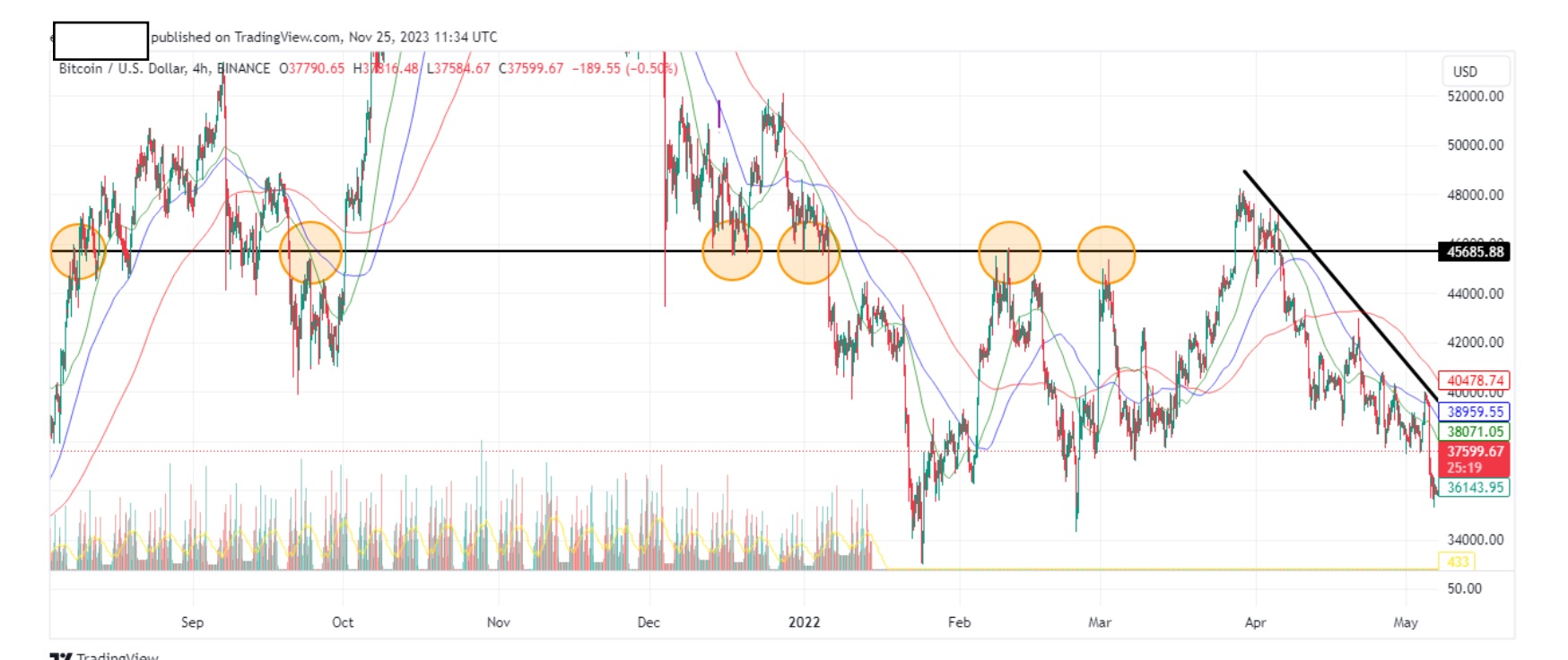
Note that some circles contain more than one high or low. We can put as many price levels as highs and lows allow.
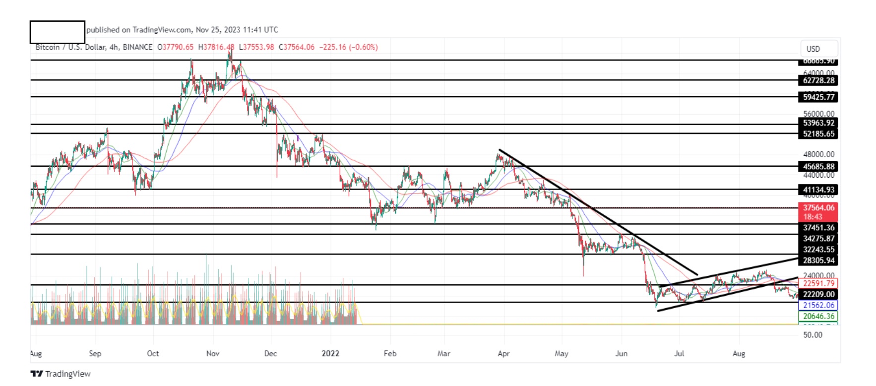
These are important levels for btc as history shows, it tends to re-visit these price on numerous occasions. Remember that this is a 4hr timeframe. You can zoom in using 1 hr, 30 min, 15 min as we did previously with our trend lines.
Now let’s zoom in and combine the trend lines with price levels.
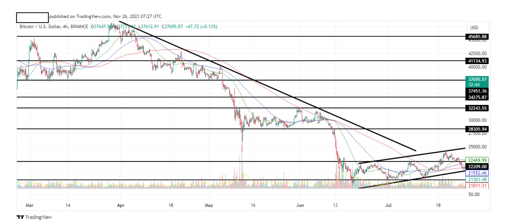
Above is a btc 4hr chart.
Let’s try and look for the interesting parts and place them on the chart below:
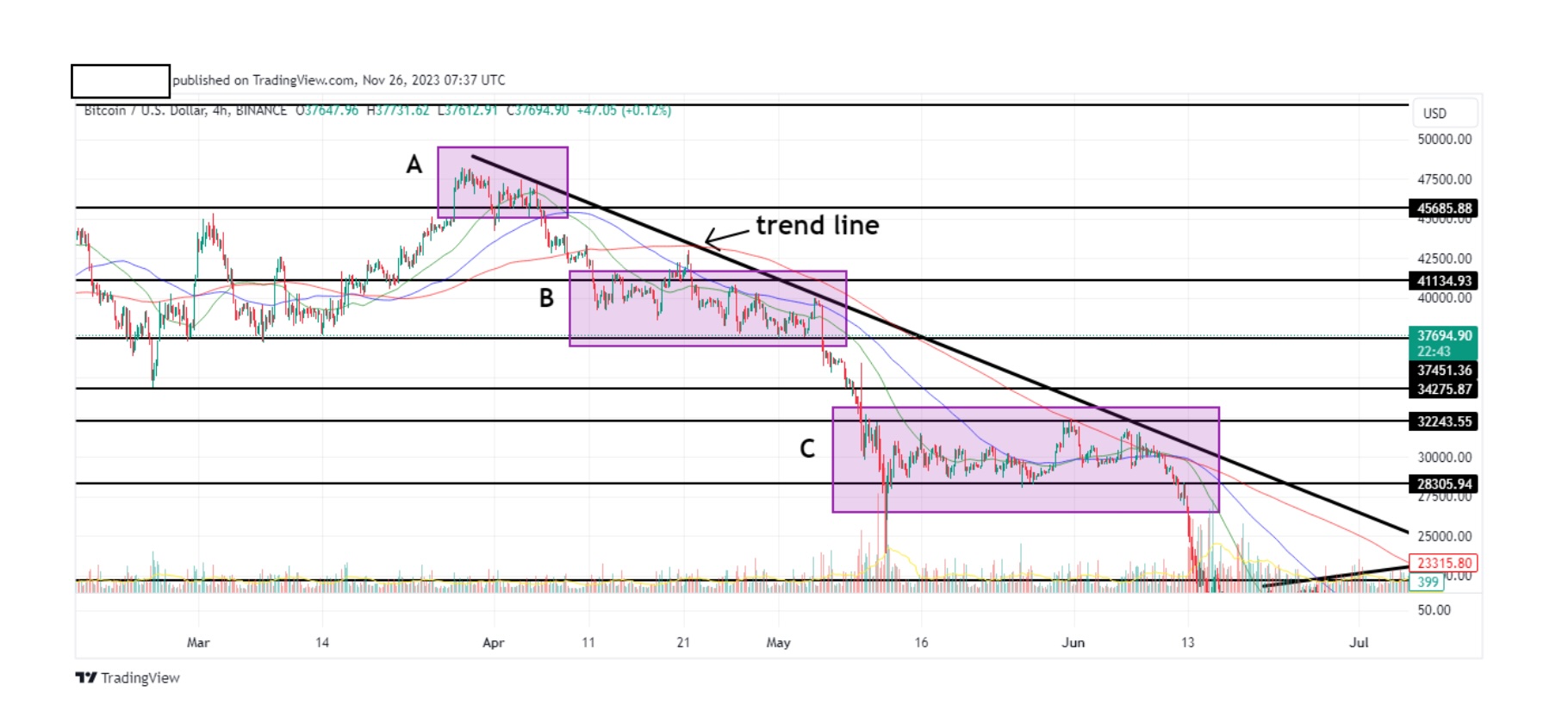
It’s very important for you to understand the reasoning behind the above chart.
We have our trend line that we placed previously. To this, we added our pricelevels, which we determined according to the highs and lows. Take a close look atzones A, B and C. These are the places on the chart where the price bounces offour price levels. They also bounce off our trend line especially zones 1 and 2. Let’szoom in on zone C to make it clear.
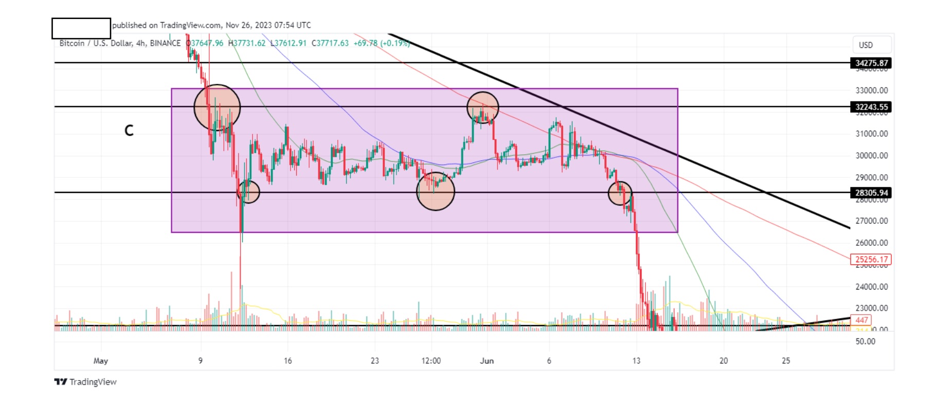
Our circles indicate the points where the price bounces off our levels(Resistance/Support). This is important because, as we mentioned above, theprice will follow historical levels. The price levels that we placed, will be valid inthe future as well. By putting it on the chart, we can speculate the price of btc inthe near future, and go short or long accordingly. The price will always bounceoff these levels, up until the point there will be a break out/breakdown.
Noticehow the price came close twice to our trend line (zone C) before breaking down? Our trend line is another level where the price will bounce from. By combining itwith our trend line, we also know the general trend of the market(ascending/descending).
Notice something else on this chart? Let’s zoom in some more.
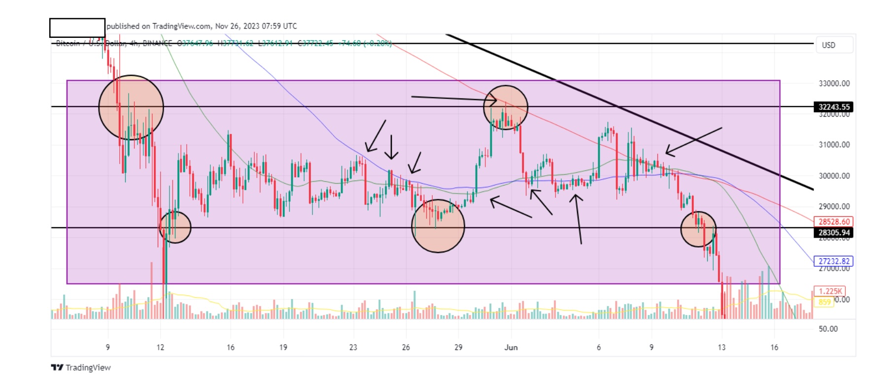
The arrows show the price bouncing off our MA’s. These are explained in the nextparagraph. The 50MA, 100MA, and 200MA. This is a killer combination because itgives you extra confirmation of the direction of the price. You will then switch to2hr, 1hr, 30 min, 15min etc, and know when to jump in to a trade or when to getout. With practice you will look at a chart and determine all these in 15 seconds.
That’s all it takes. The above chart is the most important chart on this tutorial.Please practice it on other coins or stocks. Your ability will expand exponentially ifyou do.
We covered most of the things you need to know about trading lines. In all theabove charts there’s another tool that you can use as a trend line.
Remember at the beginning of this tutorial when I talked about indicators? Well,all our charts have the 50 MA, 100MA and 200MA. MA stands for MovingAverage. I won’t spend too much time on MA’s because some traders use themmore than others, in fact some traders base their trades entirely on MA’s. I usethem as a confirmation to my trend lines.The higher the MA the more solid theresult. For example a 20 MA is ok, 100 is good 200 is great.
Have a look at the following chart.
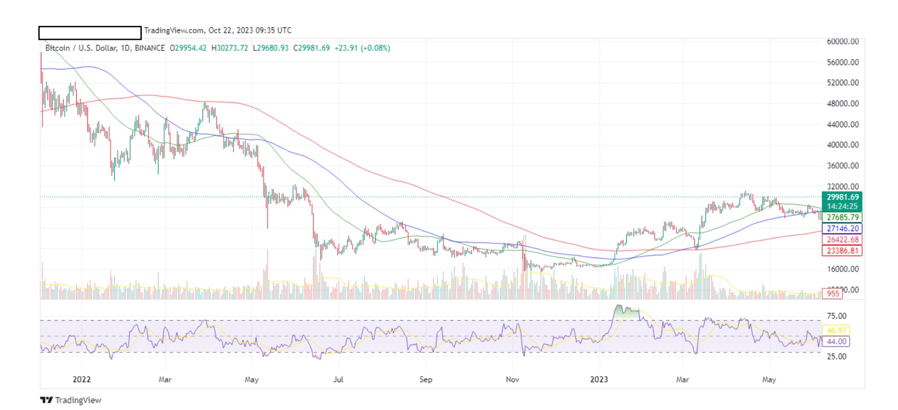
50 MA = green
100 MA = blue
200 MA = red
Notice how all MA’s move with the trend? You can confirm the trend of themarket by these lines. You can also use these lines (and this is important) asresistance and support. Let’s magnify a segment of the above chart.
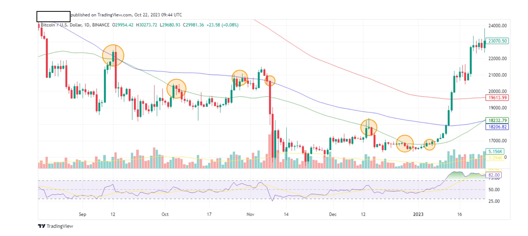
We see from the above chart, the 50 and 100 MA’s acting as resistance for ourhighs. Now take a look below.
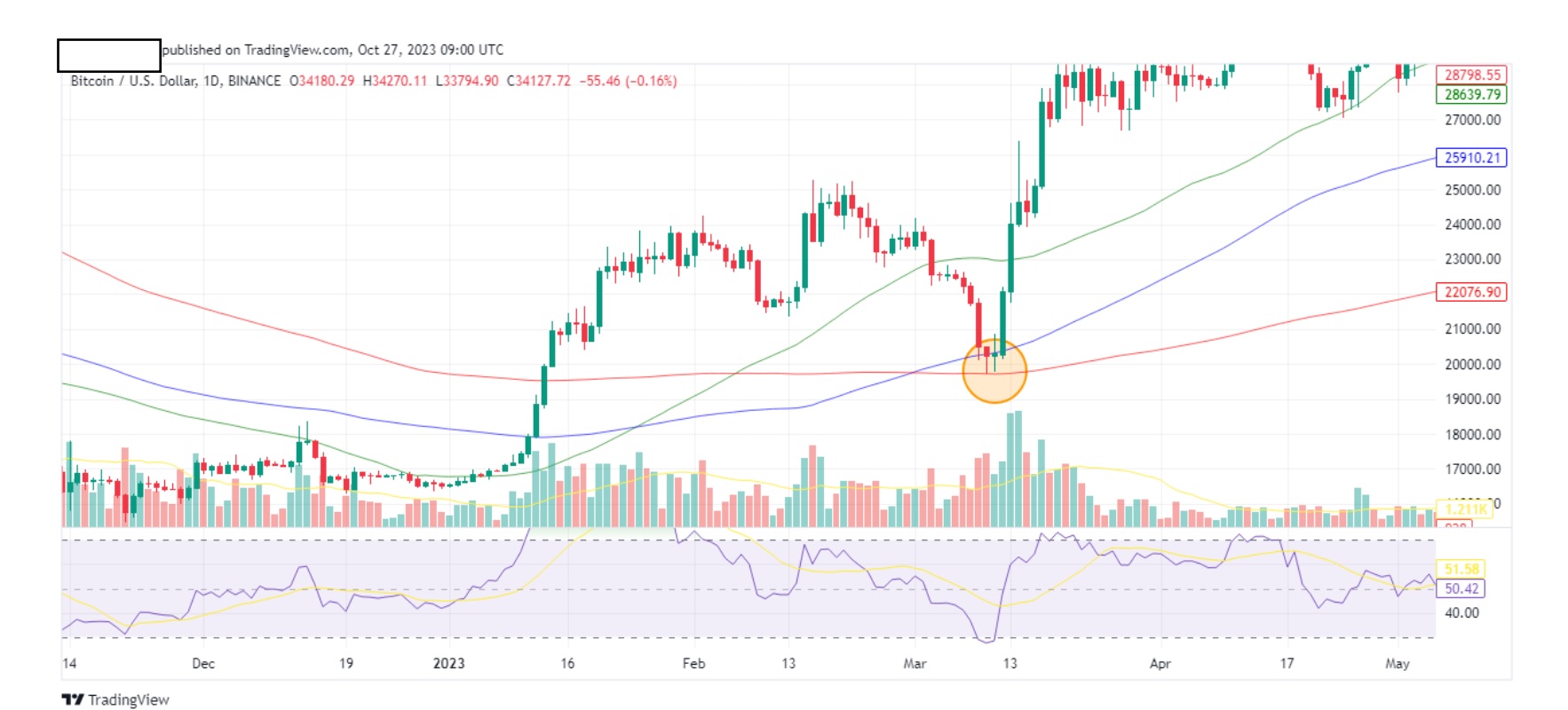
Above is a btc daily chart.Note the 200 MA (red).
Notice how the candles bounced off it twice beforemoving upwards. Here’s a close up look.
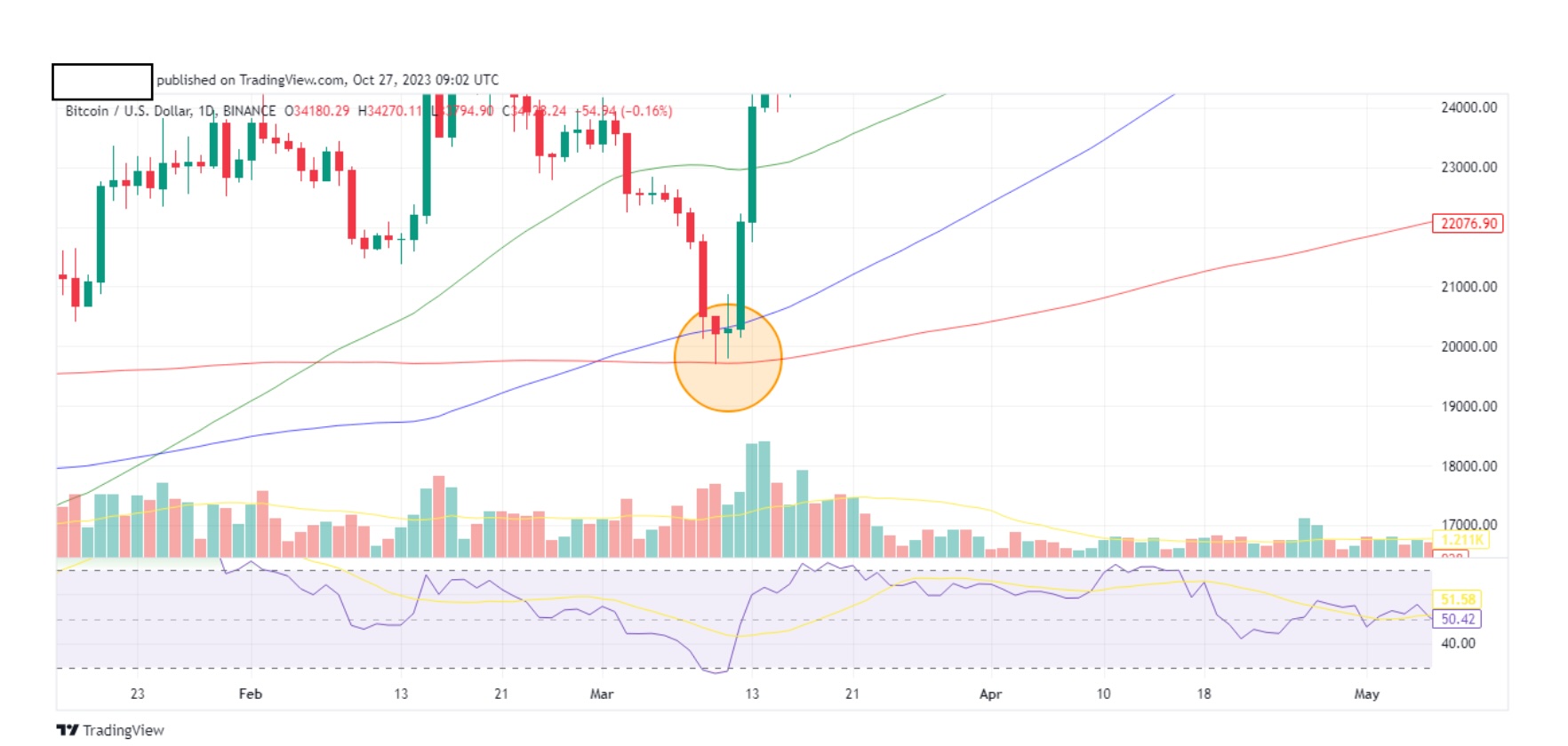
You will find the same thing happening on the 20 and 100 MA at various times.Take note and do not ignore the 200 MA. Remember, they show you the trend ofthe market and can act as resistance and support. Combine them with trend linesfor confirmations. This can’t be done all of the time but when it does occur, yourspeculation goes up a couple of notches.
Since we are talking about indicators, let’s look at our other indicator, the RelativeStrength Index (RSI). Basically, it measures the price momentum of a coin. You’veseen it in all the above charts.
Take a look below.
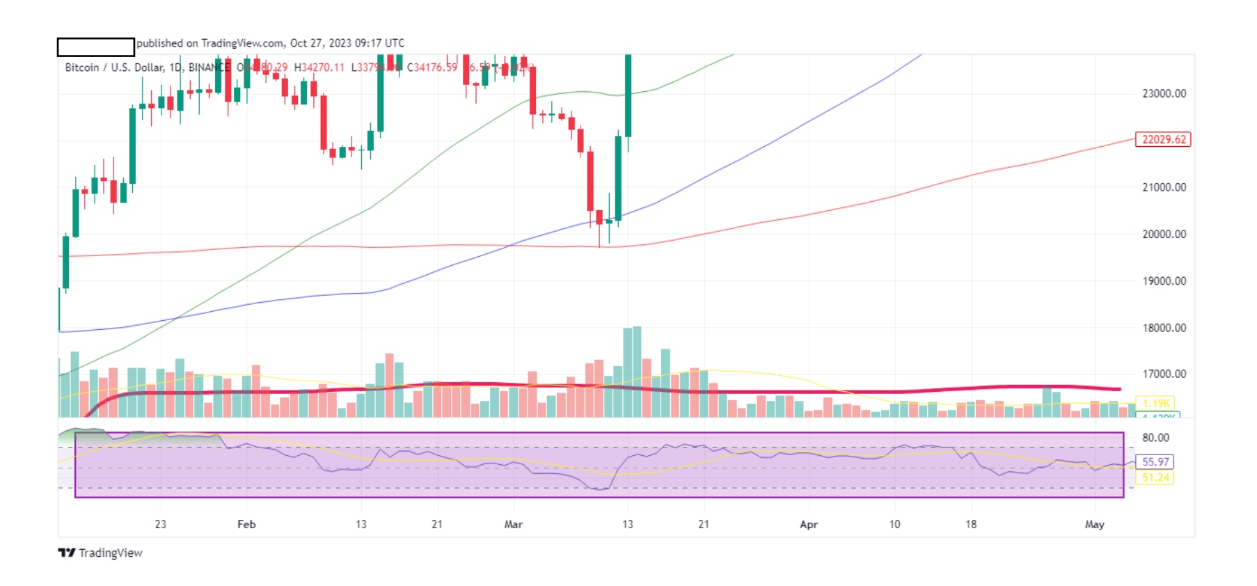
It’s the shaded area above. Let’s take a closer look.
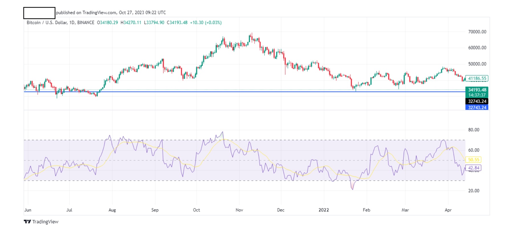
Above is a btc daily chart.
Notice something? See how the RSI movement reflects the candle movement? Letme highlight this better.
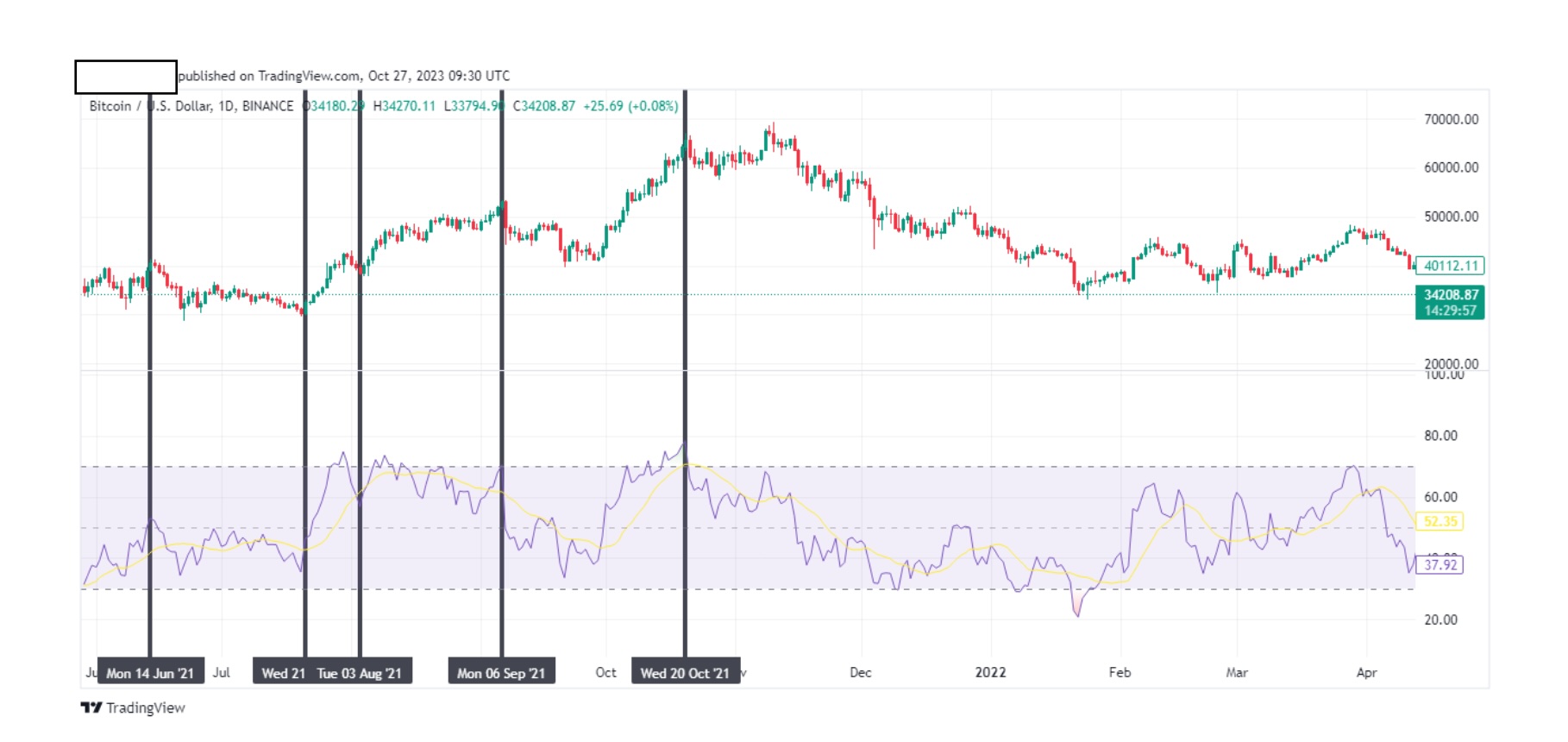
Notice how every high candle is aligned with a high RSI. Also a low candle isaligned with a low RSI. It makes sense to do that because if the strength(momentum) is high, then traders are buying this coin and so the price is goingup. If the strength (momentum) is low, then traders are selling and so the price dips.
The following is extremely important and you can have it in your arsenal ofknowledge to predict an incoming trend. This is where you can make money.
Now let’s use our trend lines, but this time, let’s place them on the RSI.
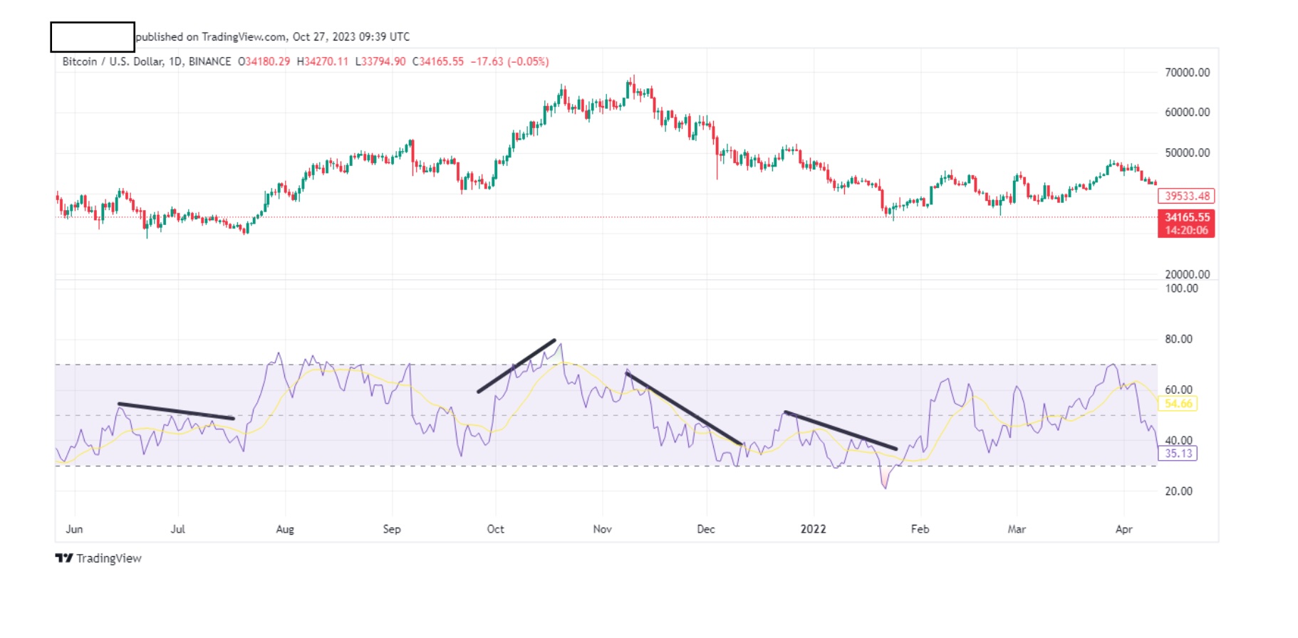
Easy. Now let’s place our corresponding trend lines on our candles. You should beable to do this now. It should look like the chart below.
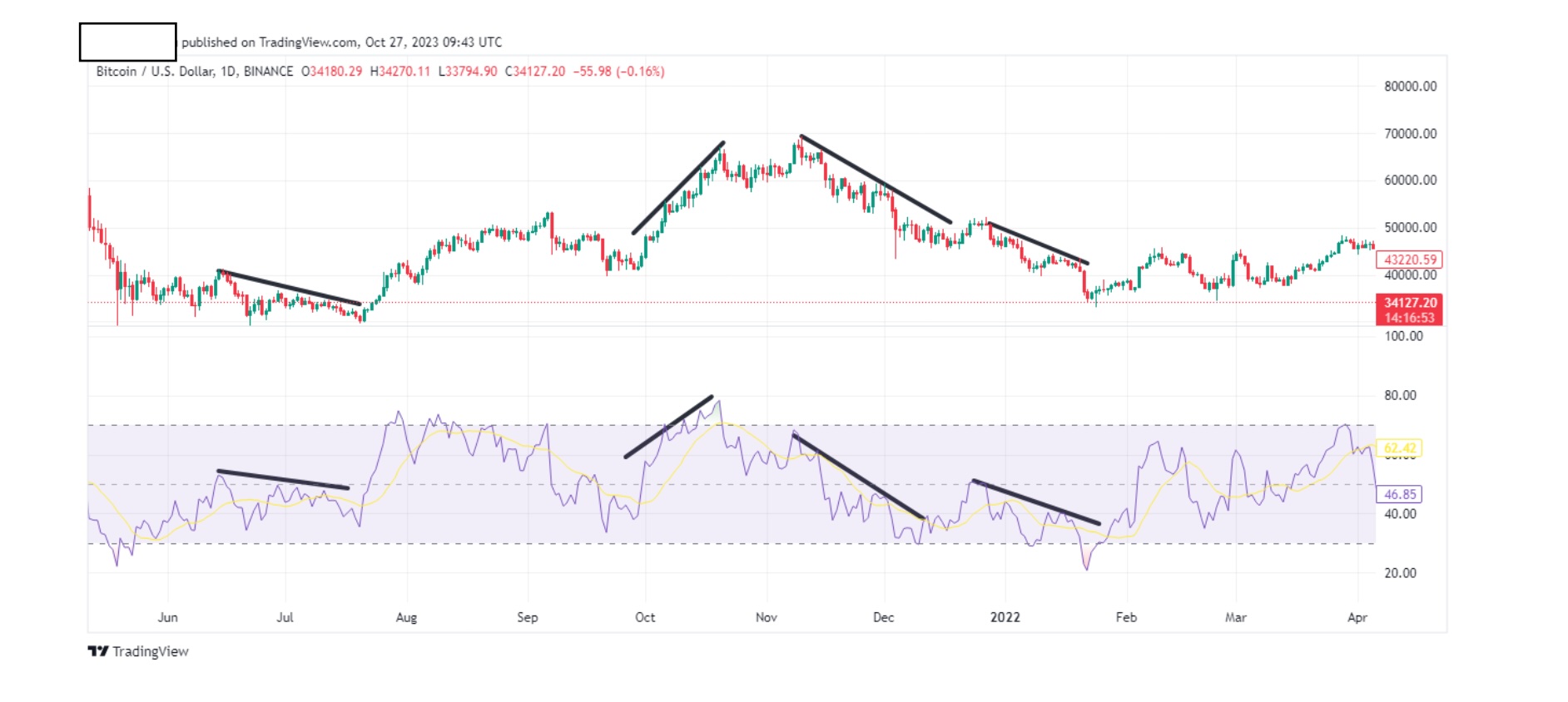
We used the highs but you can also use the lows.
Notice how the trend lines mirror each other. This is called convergence and isimportant for you. The price of the coin mirrors the RSI of the coin.
RSI up= price up.
RSI down= price down.
You will notice that I left a part of the chart without a trend line.
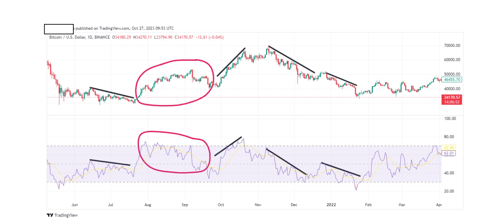
Why did I do that? Well hopefully you would have noticed it yourselves whendrawing your trend lines. Let’s now put trend lines on those two areas.
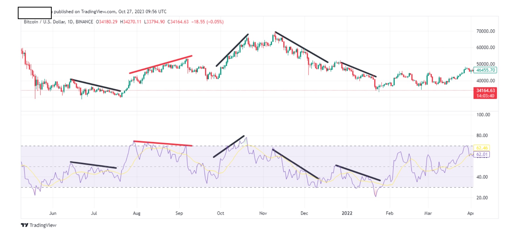
I colored them red for you. One is upwards, the other downwards. This is calleddivergence and it’s also very important to you.
Brothers and sisters: You have your candle and RSI chart and from these two, youwill determine whether their trend lines are convergent or divergent. Why?Because by using this, you will determine if the market will go up or down byusing these simple rules:
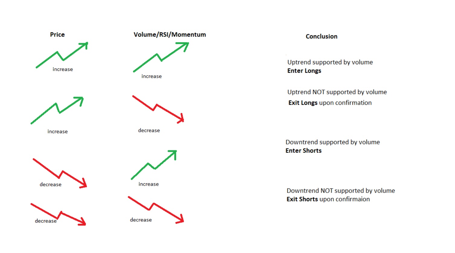
The above can be explained as:
Price increases: RSI increases = Enter Long
Price increases: RSI decreases = Exit long as soon as you see reversal
Price decreases: RSI increases = Enter Short
Price decreases: RSI decreases = Exit short as soon as you see reversal
The above also works with two other favorite indicators of mine, volume and momentum. Use any of these indicators and the rule is the same i.e.
Price increases: volume/momentum increases = Enter Long
Price increases: volume/momentum decreases = Exit long as soon as you see reversal.
Price decreases: volume/momentum increases = Enter Short
Price decreases: volume/momentum decreases = Exit short as soon as you see reversal.
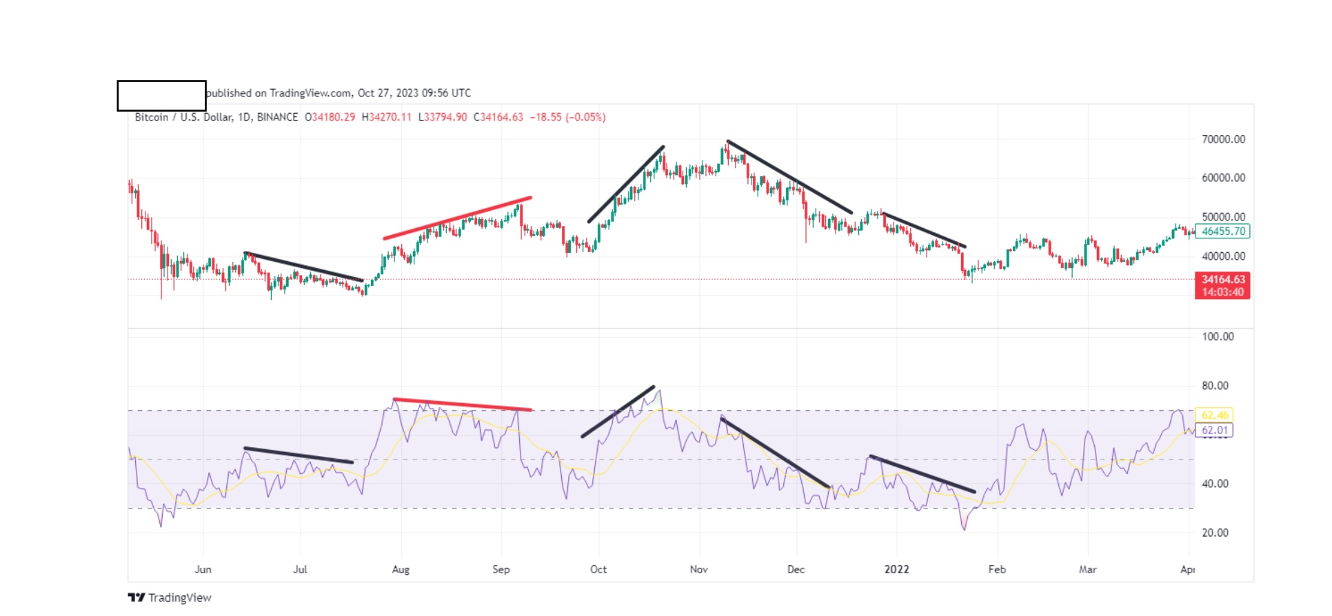
So, let’s get back to our chart and have a look at our red trend line. According toour rule, Price increases: RSI decreases=Exit long as soon as you see reversal.Well would you look at that. At the end of our trend line, our price dropped.
Simplify this in your mind. If price is increasing and volume is increasing, it meansthat the price will continue to go up because there’s more interest on the coin, solongs are safe.
If price continues to increase but volume is decreasing, that means that earlytraders are out but noobs are buying. From whom are they buying? From theearly traders that are now selling for profit. At this point you exit longs, becausewhen noobs start selling at a loss, price will go down. We are not noobs. Do notbe one. They exist so we can make profits off them.
This is the philosophy behind these rules. Learn them, understand them and usethem. Your trading will become much more profitable.
Let’s try and use some more examples of convergence and divergence usingcharts. Above is a random btc daily chart.
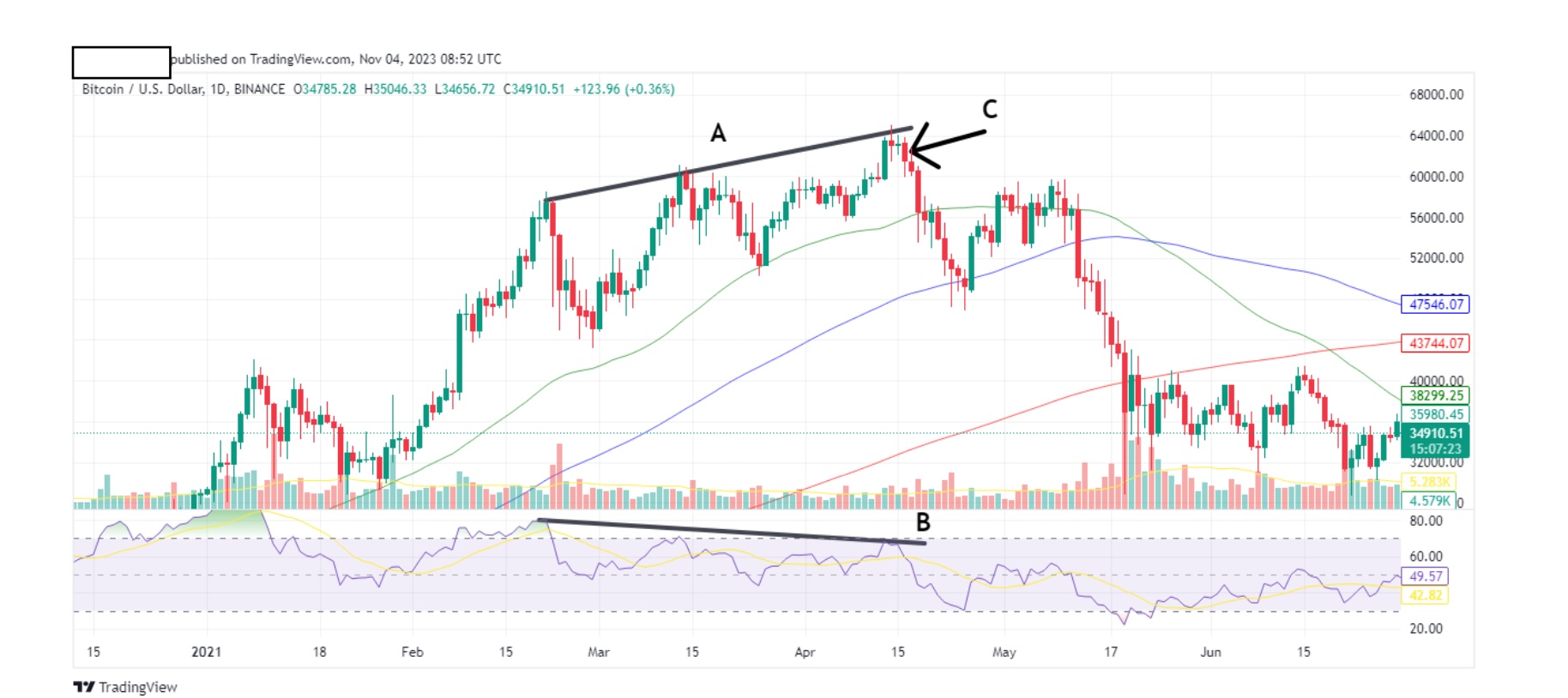
Above is a random btc daily chart.
Notice the ascending price trend line A, and its corresponding descending RSItrend line B. These lines are divergent to each other, meaning that they go theopposite the way. According to our rule, Price increases: RSI decreases=Exit longas soon as you see reversal. At arrow C we see the first reversal bar. After we seea reversal, we exit longs because we expect the market to fall, and in this case itdid just that. Remember this is a daily chart (each bar is 1 day) so you have plentyof time to notice it. You can do this on a 4hr (each bar is 4hrs) chart as well BUT inthe case of 4hr chart, I suggest you wait for confirmation. In my case, myconfirmation on a 4 hr chart is 2 red candles. Two are good enough for mebecause the 3rd might be a huge one, just like in our chart.
Let’s do another quick one.
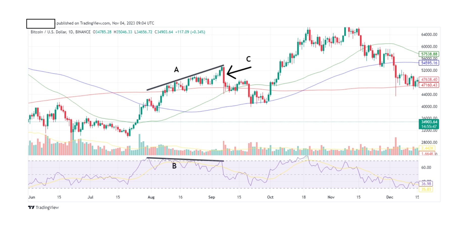
Ascending price trend line A and descending RSI trend line B. They go theopposite way to each other so they are divergent. According to our rule Priceincreases: RSI decreases=Exit long as soon as you see reversal. Arrow C marksthe reversal, one long candle. So, if you waited until the end of the day for thecandle, before you exited, you would have suffered a loss. So let’s see the samechart but on a 4hr time frame (tf).
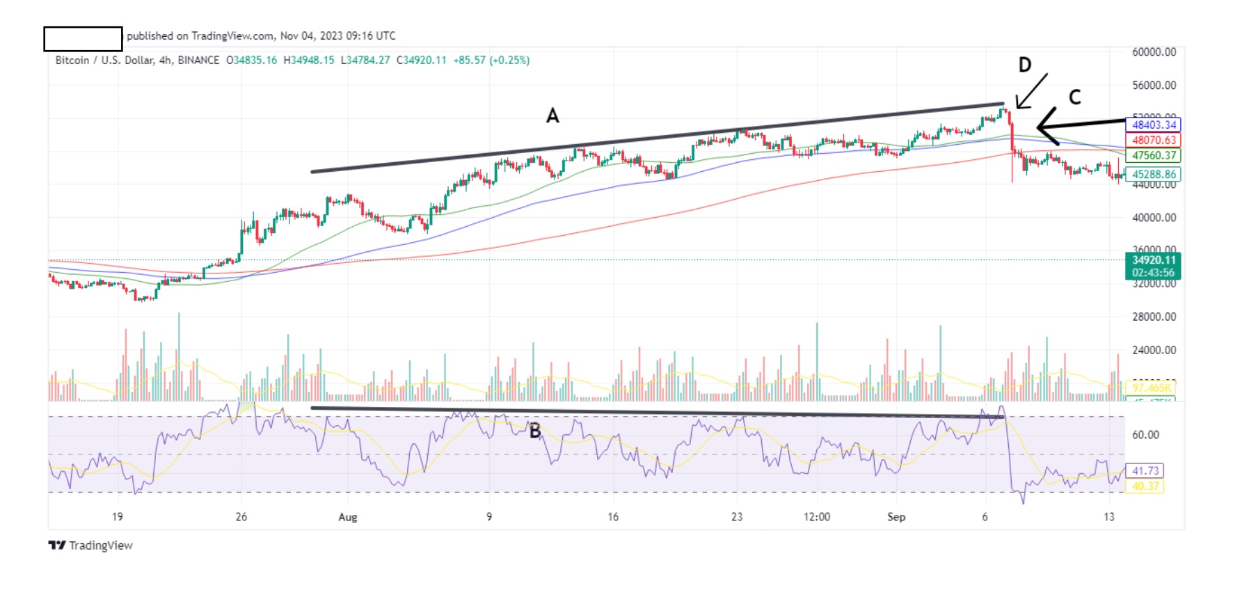
The above is the same chart in 4hr tf. Arrow D marks the second confirmation of adown turn. You can exit your long at this point.
Use the 2hr tf, and the 1hr tf, the same way. I have no issues in using 2hr and 1 hrconfirmations. You can act quicker on your trades.
I want you to feel more comfortable with divergence and convergence, so let’s doa few more (sorry to bust your balls). This time instead of using RSI, we will usemomentum as an indicator.

The above is a btc daily tf.
Descending price trend line A is opposite to ascending momentum trend line B. Soaccording to our rule, Price decreases: RSI increases= Enter Short. So we expect afall in price as indicator by the red candles C. Again, you can play with the timeframes until you find your comfort routine.
Let’s do one more.
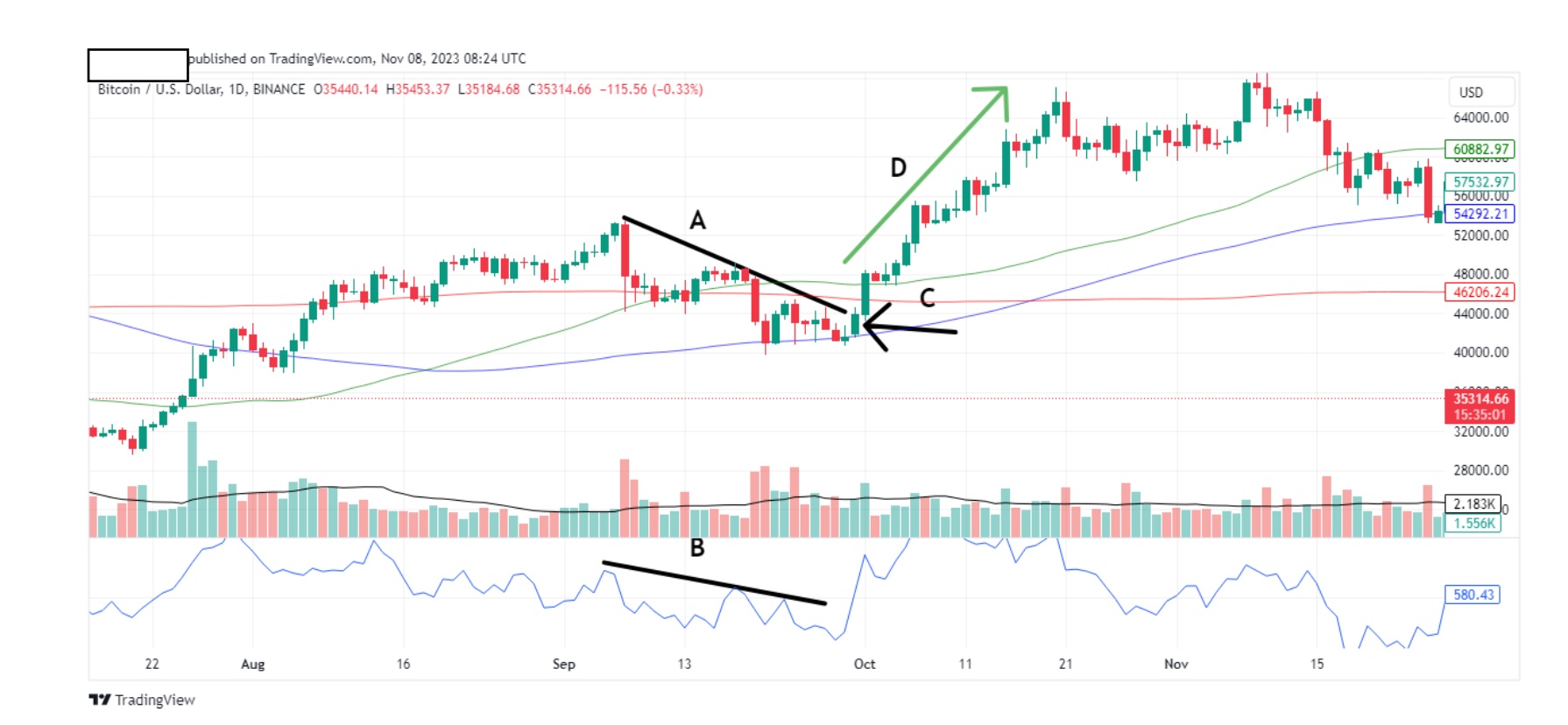
Above is a btc daily chart.
Descending price trend line A, and descending momentum trend line B, areconvergent. They are both going the same direction, in this case, down. Accordingto our rule Price decreases: volume/momentum decreases= Exit short as soon asyou see reversal. The second green bar confirms reversal so I exit shorts. Our longtrend playing out perfectly as shown by D.
Ok, one more and we are nearly there:
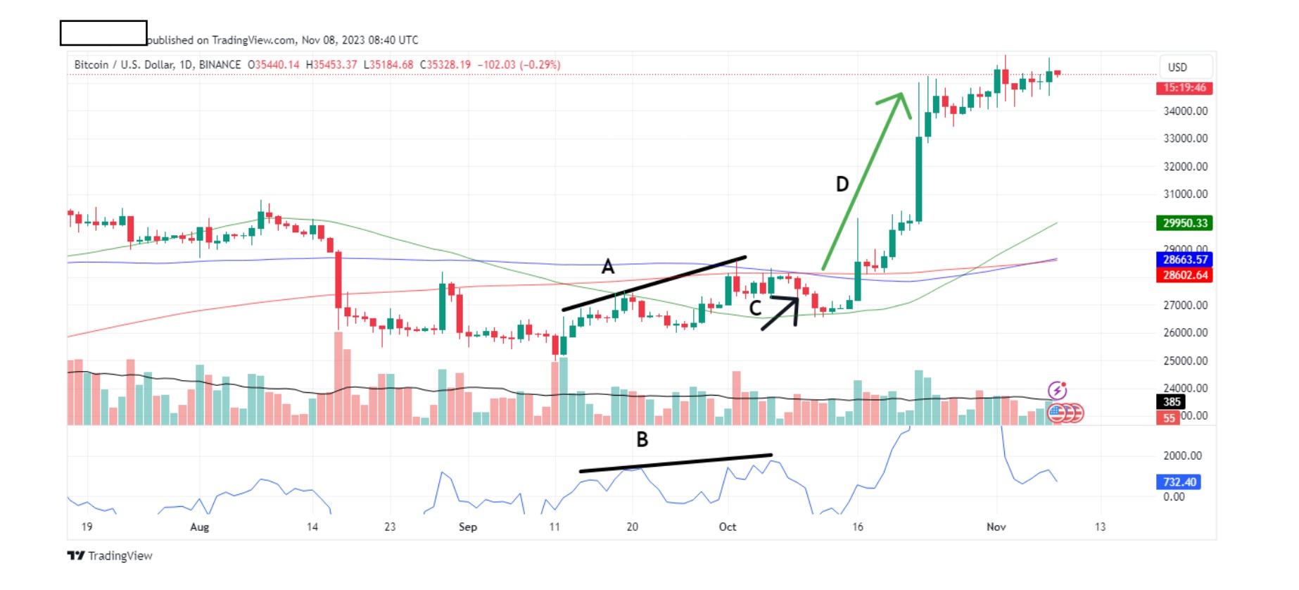
Above is a btc daily chart.
Trend lines A and B are convergent, meaning they both have the same direction,in this case, ascending. According to our rule Price increases: volume/momentumincreases= Enter Long. Note that that, in this case, confirmation came after sixdays, before we got five consecutive red candles, marked by arrow C. It’simportant to know that confirmation may not be instant, or 1-2 days. It may takea few days to play out and in this case, our long, D, took more than a week.
One last chart and we are done.

Trend lines A and B are both descending so according to our rule Price decreases:volume/momentum decreases= Exit short as soon as you see reversal. Youexited shorts, but the market continued to go down as shown by C. In fact, it kepton going down for the next month. Why did that happen? Because we didn’t getconfirmation, that’s why. Our 1st and 2nd candle in area C, were red. Keep thefollowing in mind when trading. The moment you realize the confirmation isinvalidated, than the whole trade is invalidated.
I hope you enjoyed and understood these charts. I can go on and on, but theprinciple is the same. With practice you will learn to pick out the trend lines andspeculate the upcoming market trend. In other words, you study the data andplace your trades accordingly.
Before I go, let me highlight certain patterns that are useful in speculating thedirection of where the market might be heading.
Let’s first take a look at useful chart patterns. There’s too many to choose from,so I will only include the few that I use, assuming that I notice them (It’s notdifficult to do so. You just have to get into the habit of looking for them).
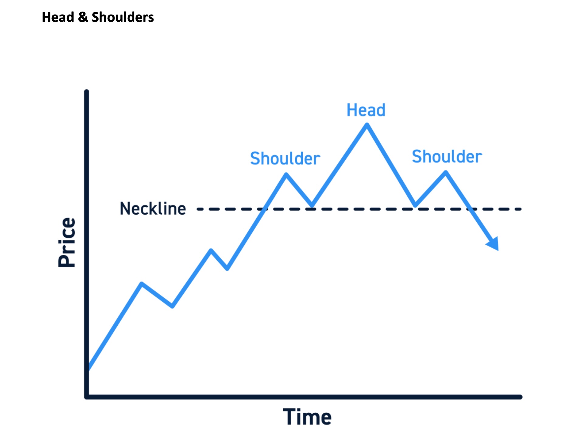
Above is a perfect Head & Shoulders (H&S) pattern. For this pattern you need aleft shoulder, a head and a right shoulder. Ideally the right shoulder should belower than the left shoulder. A H&S pattern warns of an upcoming fall in prices. I say perfect because in a perfect world you don’t get this. You get something like below:
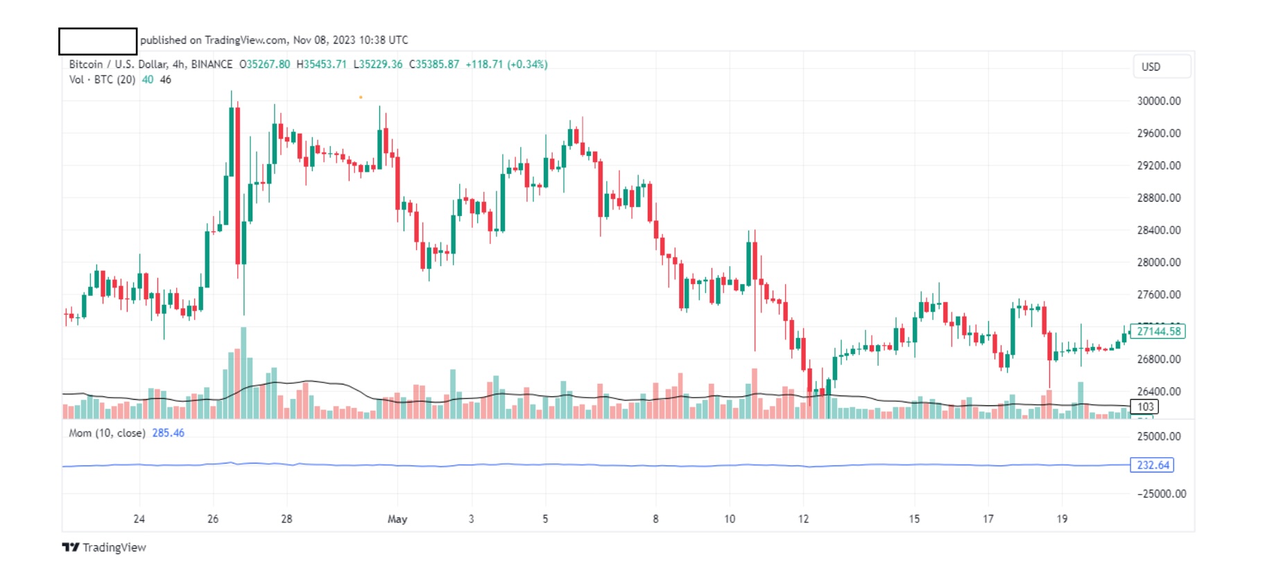
Above is a btc 4hr chart.
On the above chart, somewhere, we have a H&S pattern. Can you find it?

Above is btc 4hr chart.
Let’s really magnify this because I want to show a nice trick.
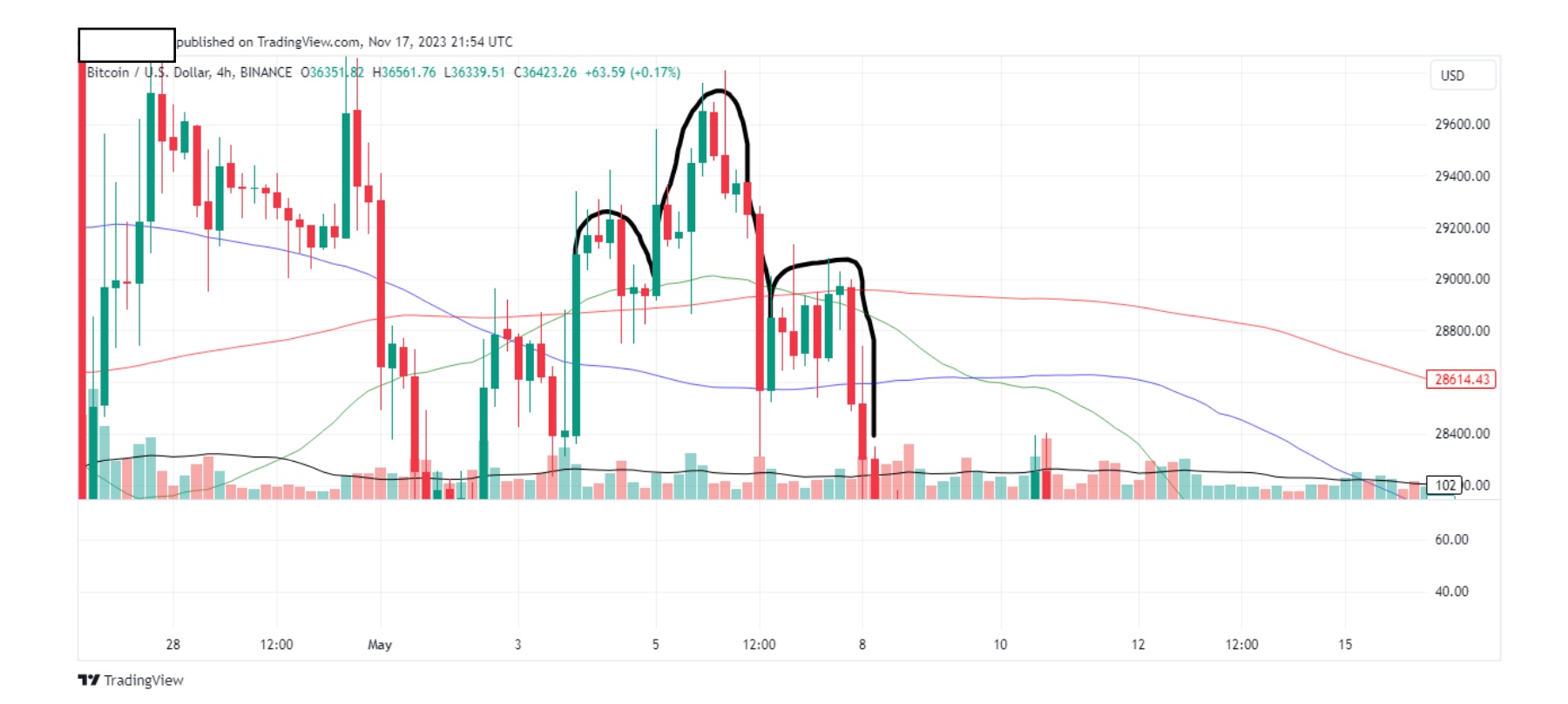
Above is btc 4hr chart.
We said before that a H&S pattern usually warns of a upcoming fall in price.What is brilliant about this pattern is that we can use this pattern to determinethe approximate amount of the fall in price. Let’s go do it. First, let’s draw the neckline.
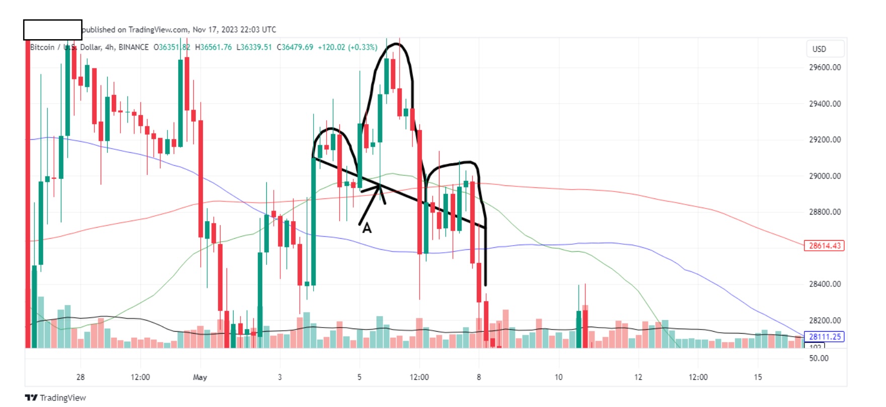
Above is btc 4hr chart.
Our neckline is shown by arrow A. Now let’s draw a line from the top of the ‘head’to the neckline as indicated by arrow B below.

Above is btc 4hr chart.
Now let’s measure line B (from the top of the ‘head’, to the neckline), and placethe same length of line from neck line of the right shoulder, as shown below by arrow C.
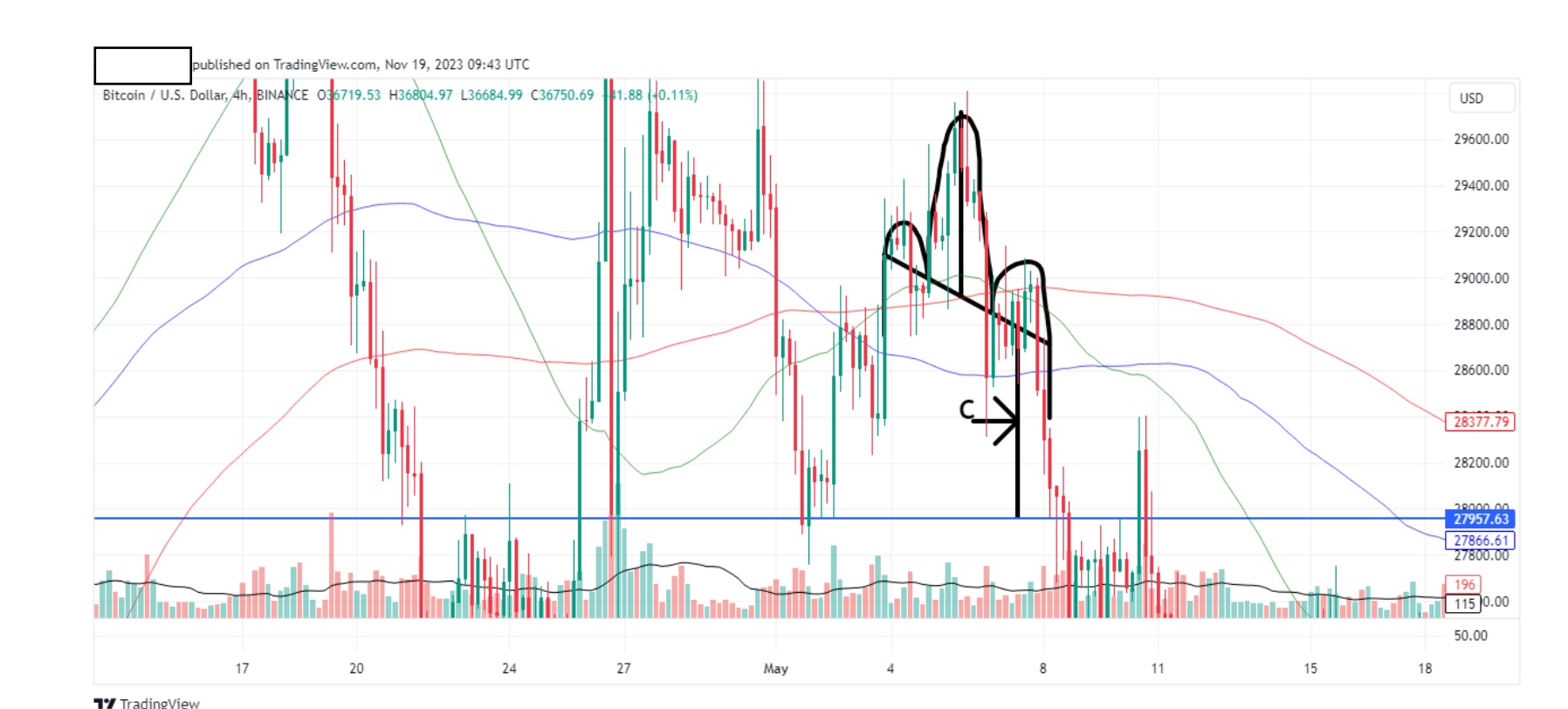
From line C you can speculate the length of the dip that usually comes after a H&Spattern, in this case, 27957 for btc. It actually went a little lower, but note howthe candles hit that level exactly. This is the reason why H&S patterns are brilliant.
There’s also a reverse H&S pattern. As the name suggests, this patterns warns ofan upcoming rise in price, and to be honest, they are a bit harder to pick out. Ittook me long time to find one for you but this is the best I could do.
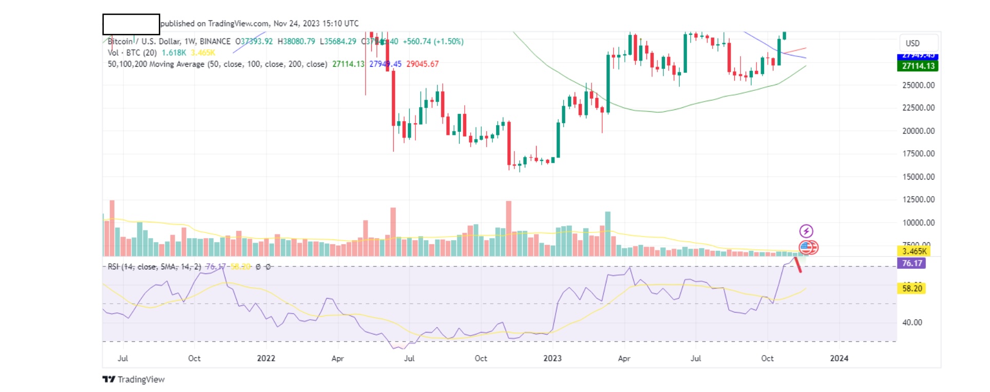
It’s difficult to spot it. Let me highlight this for you.
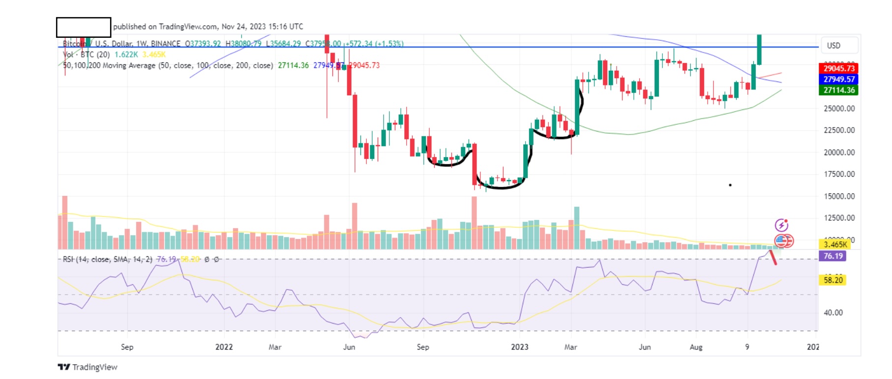
Let’s draw our neckline below.
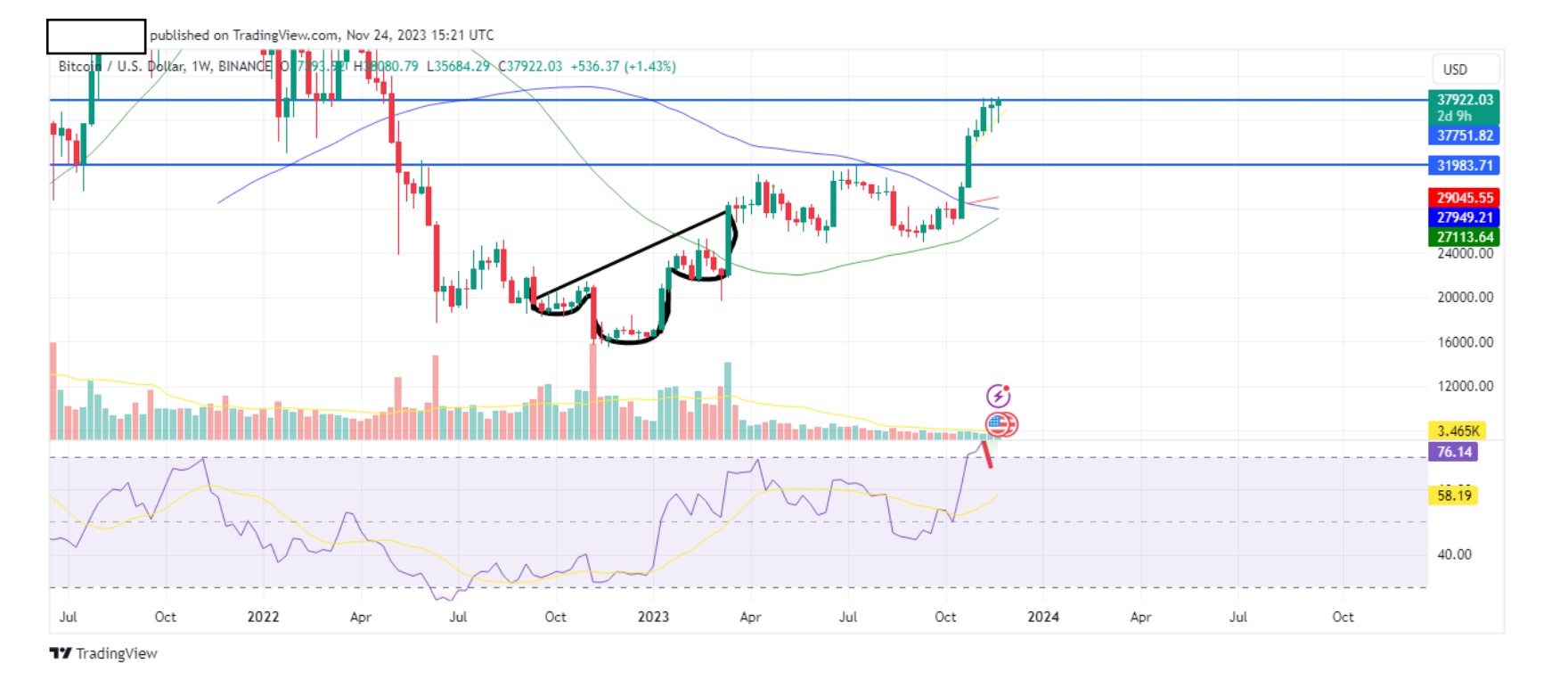
Notice how in this case our neckline doesn’t touch the inner base of the shouldersindicated by the arrows? Let’s magnify it below.
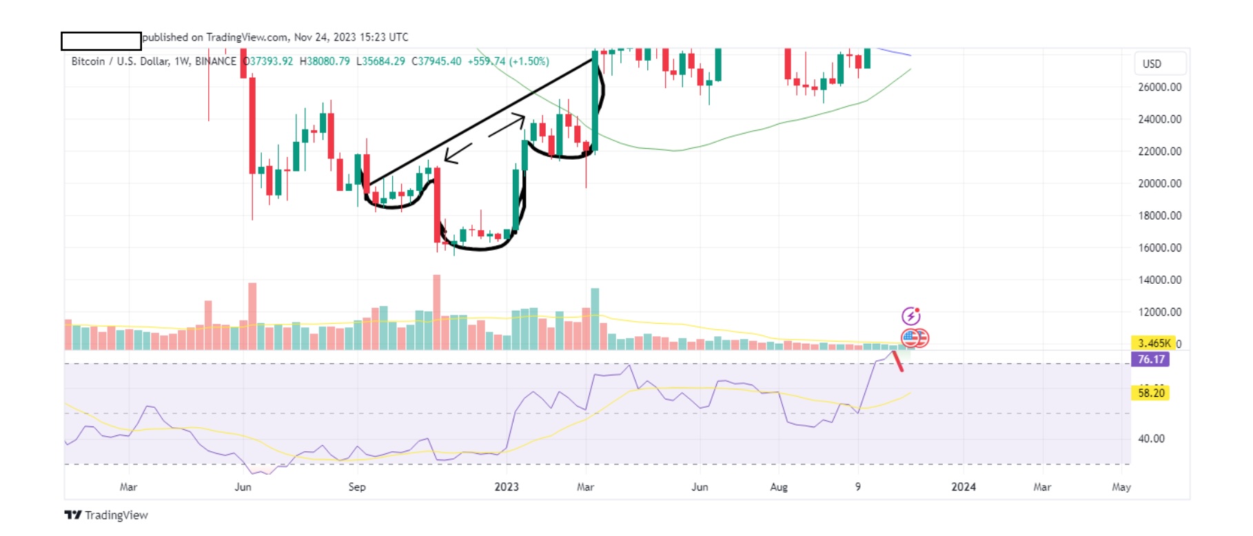
It’s the best we can do in this case but we can still draw our neckline and mostimportant, our tie.
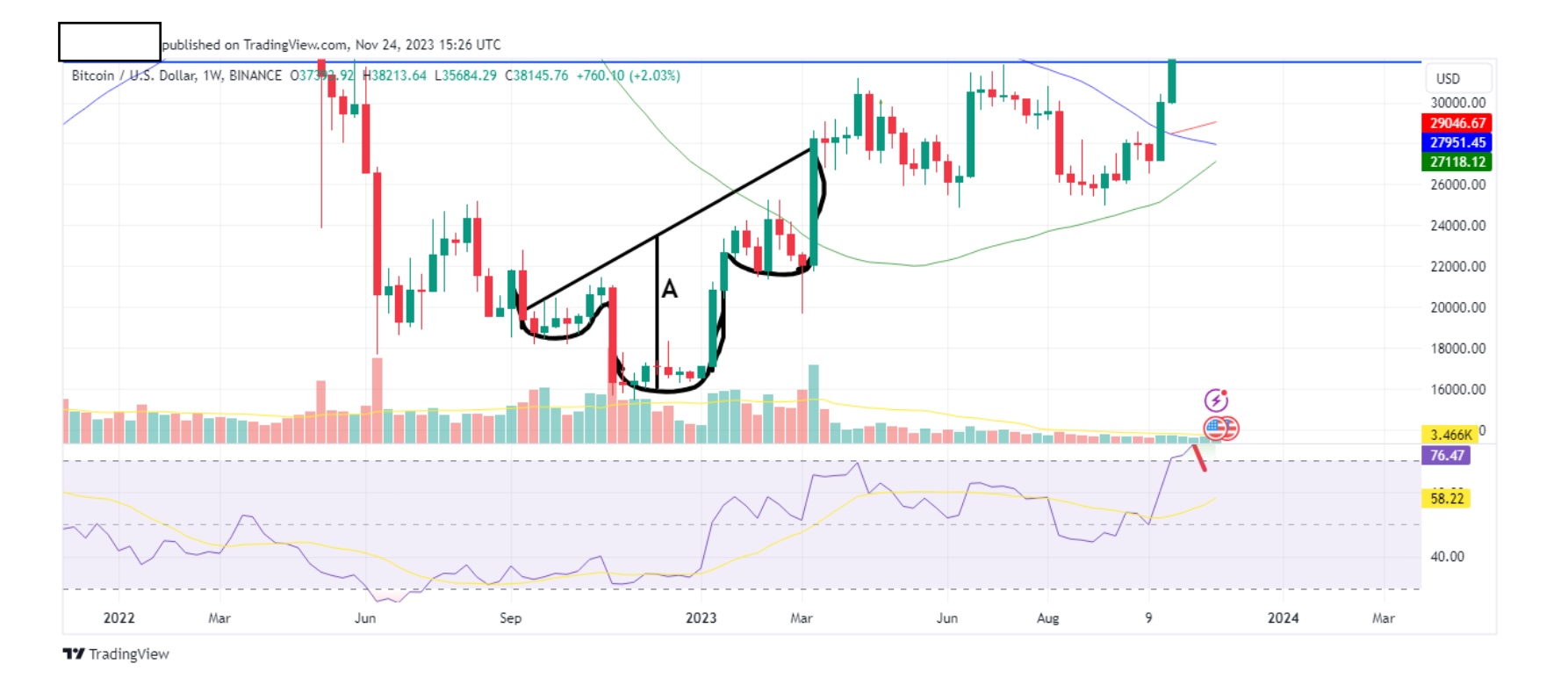
There’s our tie indicated by the letter A.
Now let’s take the same tie and place on the neckline of the right shoulder andgive it the letter B.
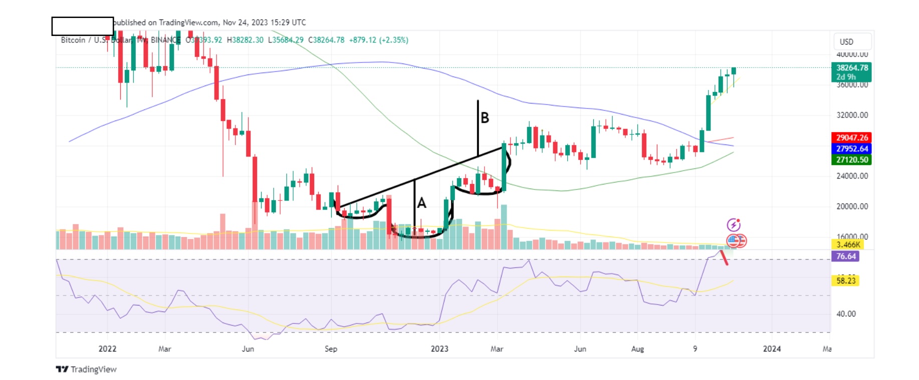
As we mentioned above, this method can help you calculate the degree of the reversal trend. In our case it’s as follows:
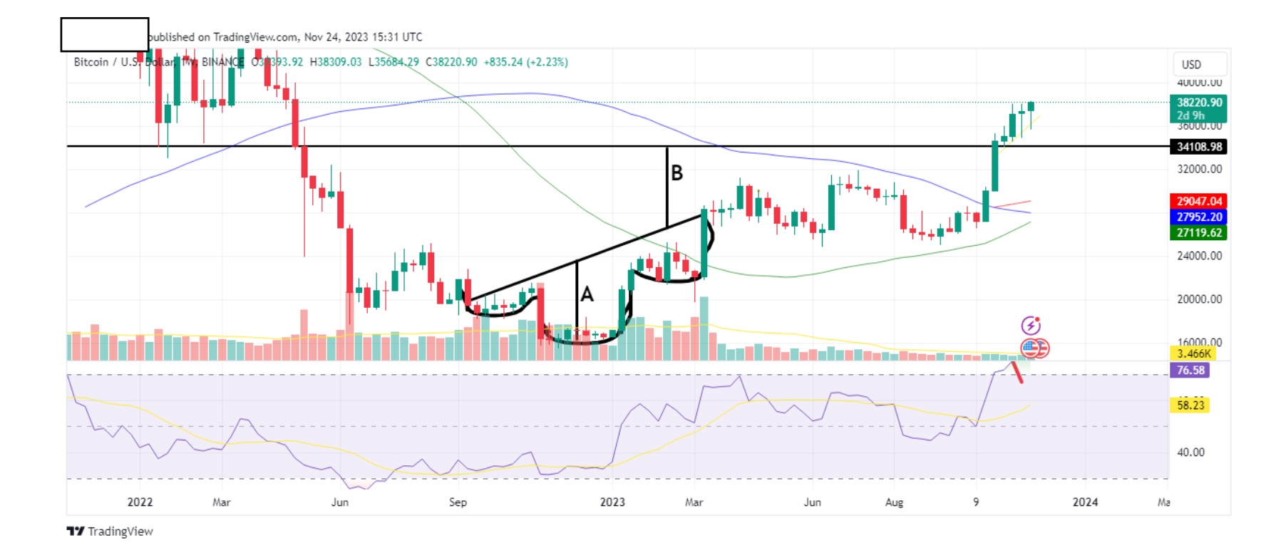
Remember, the tie of a H&S pattern gives you an approximate level of what toexpect. We got close before the market continued to pump.
Another pattern that is useful to know is the double top. A double top usuallywarns of a fall in price.
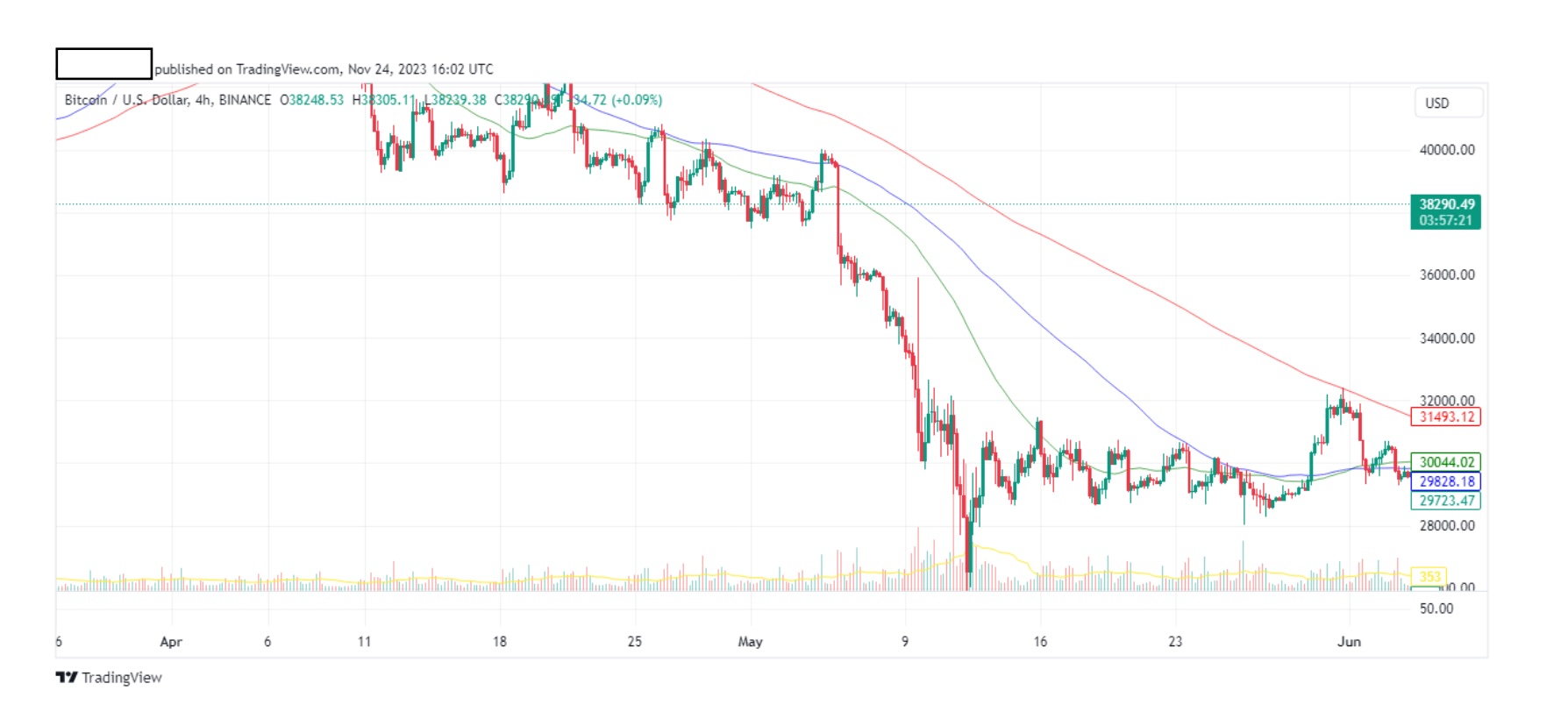
Above is a btc 4hr chart.
Can you see it? Let’s highlight it.
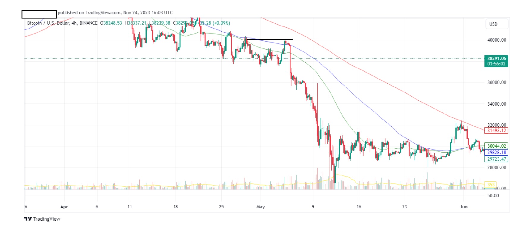
Let’s zoom in a bit.
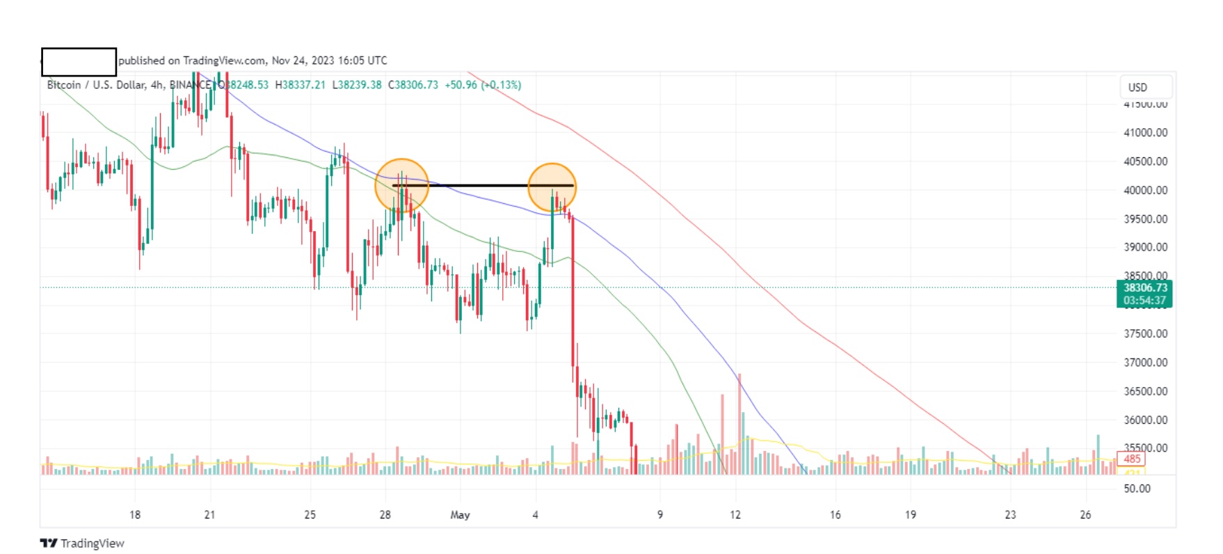
Check out the fall in price after the double top. Let’s zoom out to see maximum impact.
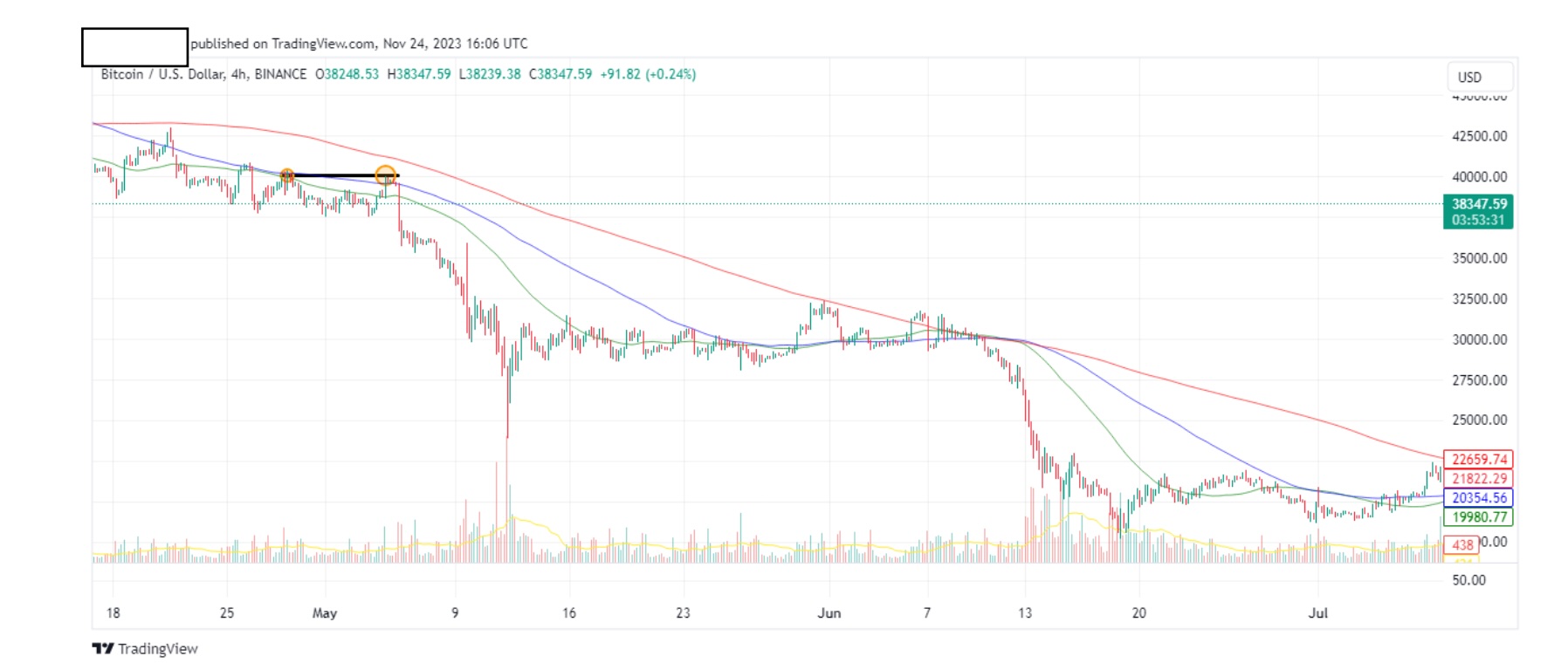
At this double top, I should have sold. I didn’t. I wasn’t paying attention. YouMUST pay attention at charts on a daily basis. Always assume the worst. See theformation of a pattern and keep eyes on it. If it’s invalidated, so be it, life andcharts go on. However, when your patterns are validated, you cannot onlyconserve your wealth, but increase it as well.
We had a look at a double top, now let’s look at the opposite, a double bottom. Adouble bottom usually indicates an upcoming rise in price. Let’s have a look atthe chart below.
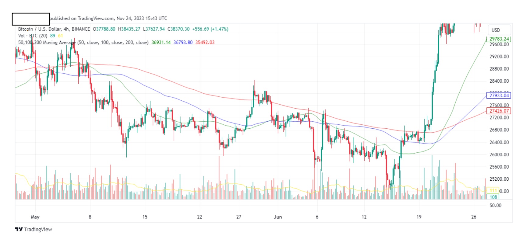
Notice it? Let me give you a hint.
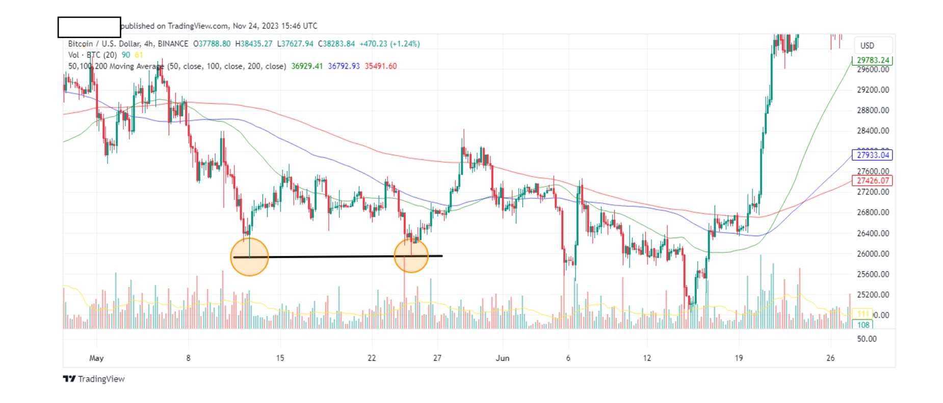
See it now? This is the actual double bottom that convinced me to change frombeing bearish to being bullish in 2023. Evolution. I was bearish for the past yearand a half, and this pattern changed everything for me. At this point, I startedbuying btc spot. Notice the pump later on. Let’s zoom out and see where we are now.
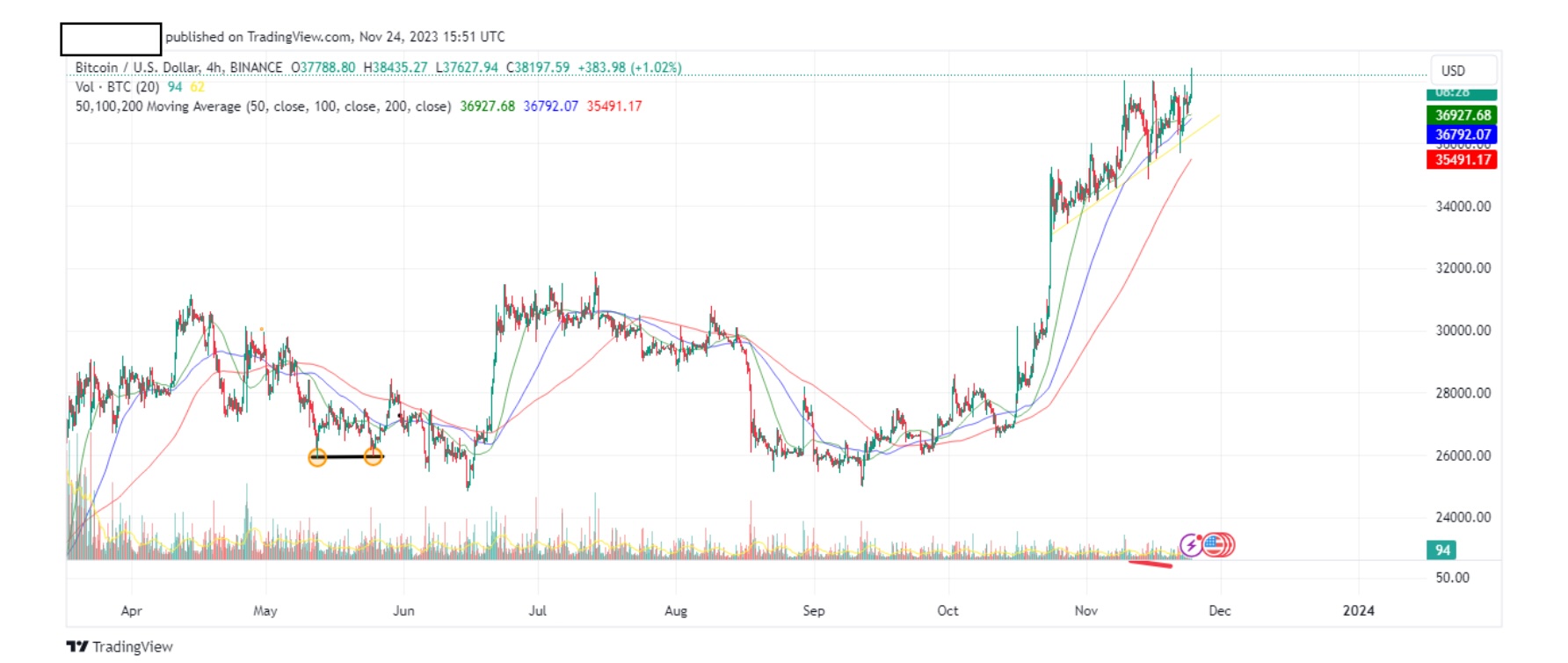
You can still see our double bottom. That’s how I want you to think. Read thecharts and invest in macro. In 5 months btc rose from 27k to 37k. I love macro. It beats futures any time of the year.
That’s it for patterns from me. There are many other patterns but H&S’s anddouble tops/bottoms are the most important for me and are relatively easier tospot. You will get better at noticing them, the more you read charts. How long?
Six months makes a huge difference. Nine months even more. After that, yourmind draws automatic conclusions as soon as you see a chart. Everything youlearned will form a solid conclusion as soon as you see a chart. You don’t have tohave an economics background to do this and once you manage it, it puts youahead of the rest in the trading world. You are in the top 5% of traders.
As a final lesson, let’s look at candles. We briefly glanced at them in previouspages, so let’s expand on them a bit more.
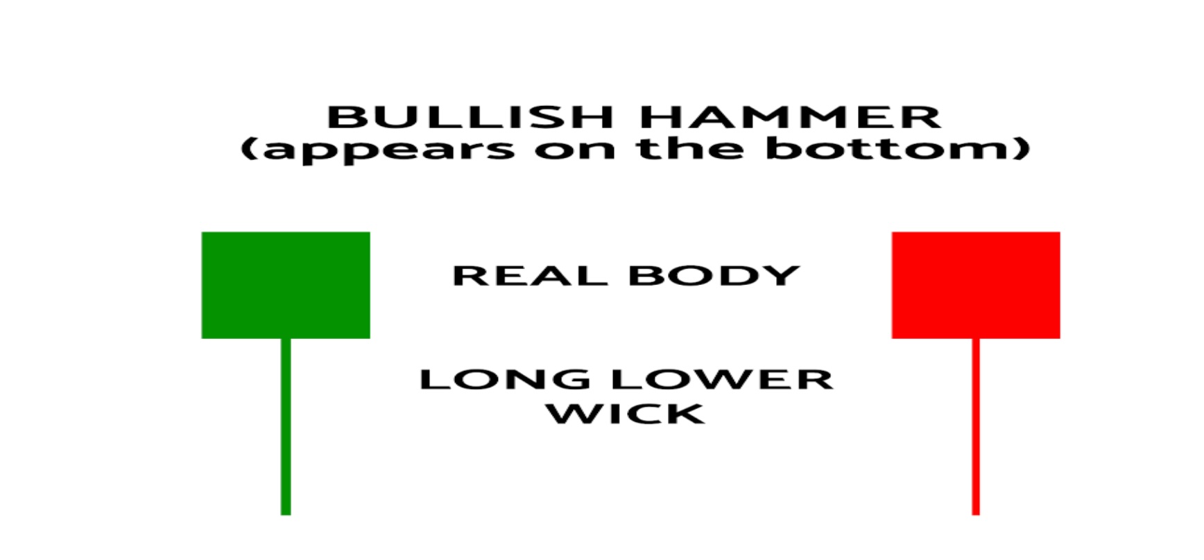
The hammer candlestick is a bullish trading pattern that may indicate that a stockhas reached its bottom and is positioned for trend reversal. Note that the candlemay be either red or green but in general terms, a green candle is a more robustbullish sign.
Let’s throw in a chart and see if we can spot it (this should be easy).
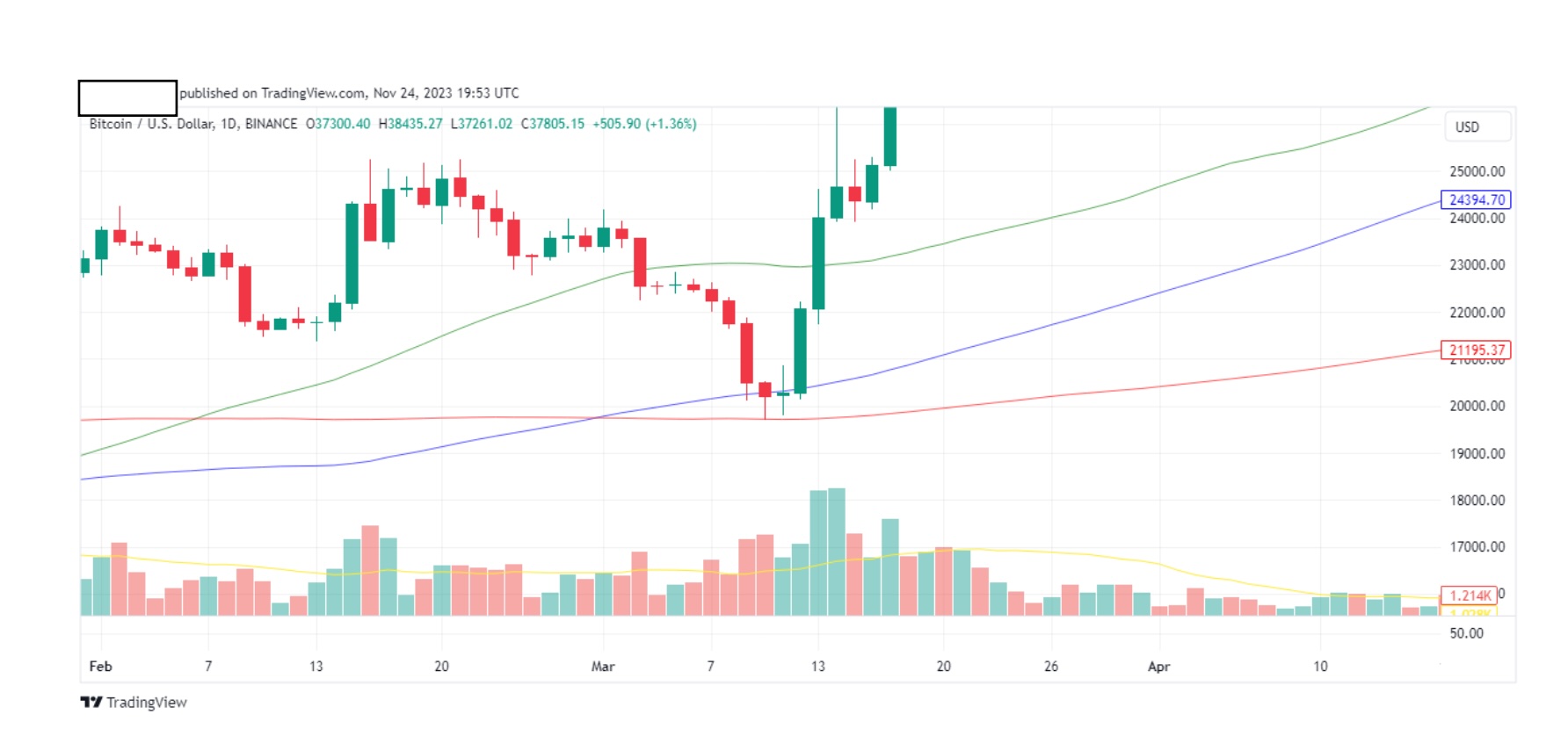
Notice it? Easy.
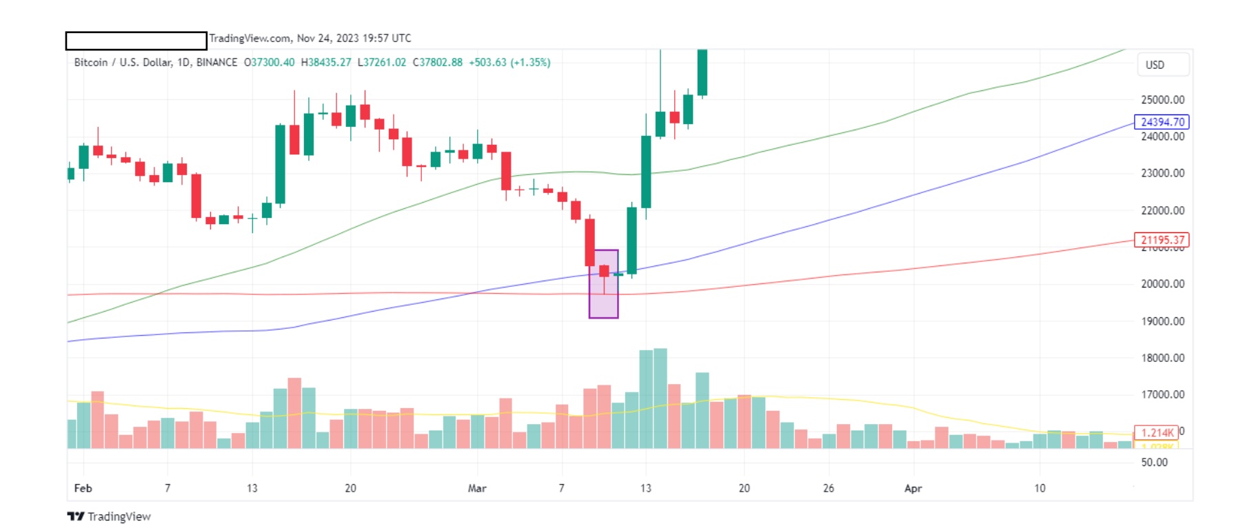
Now look at the other 2 green candles next to it.
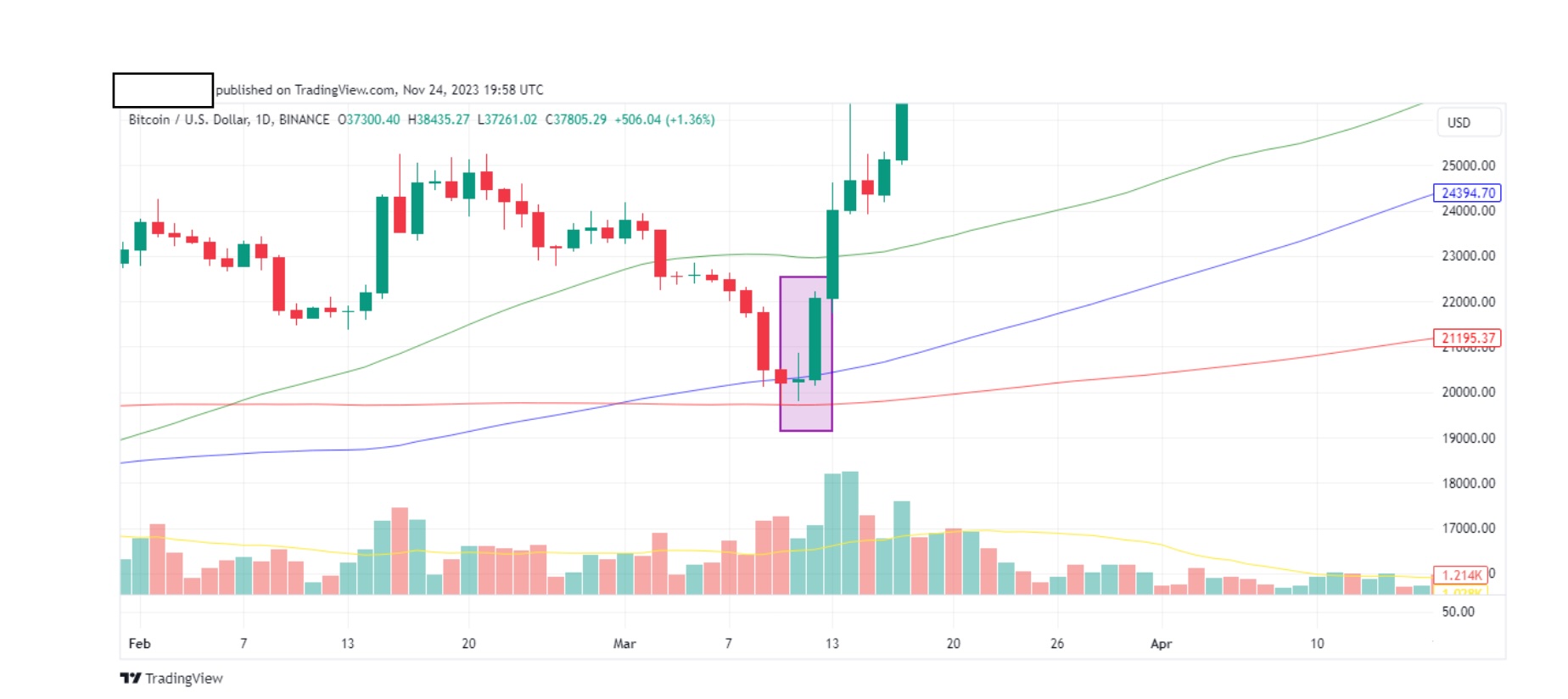
These 2 green candles serve as a confirmation of an uptrend. Only if you see thisconfirmation, would you enter a long trade. Remember, this is a daily timeframe,so I would be happy with one green candle. For a 4hr timeframe, I would want atleast 2 green candles. Always get confirmations. If not, then consider the trade asinvalidated. Never enter a trade if it’s invalidated. Wishful thinking has no placein trading. You must question everything.
For example, let’s look at the chart below:
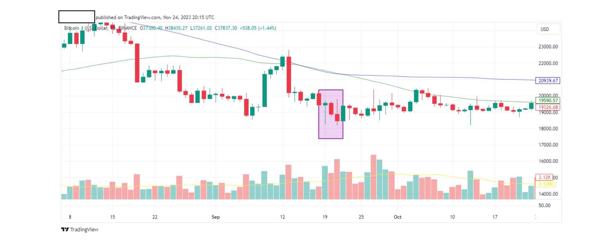
The green hammer candle stick is followed by a red candle stick. As this is a dailytime frame, we abort any plans to go long. Again, always take your time to confirm.
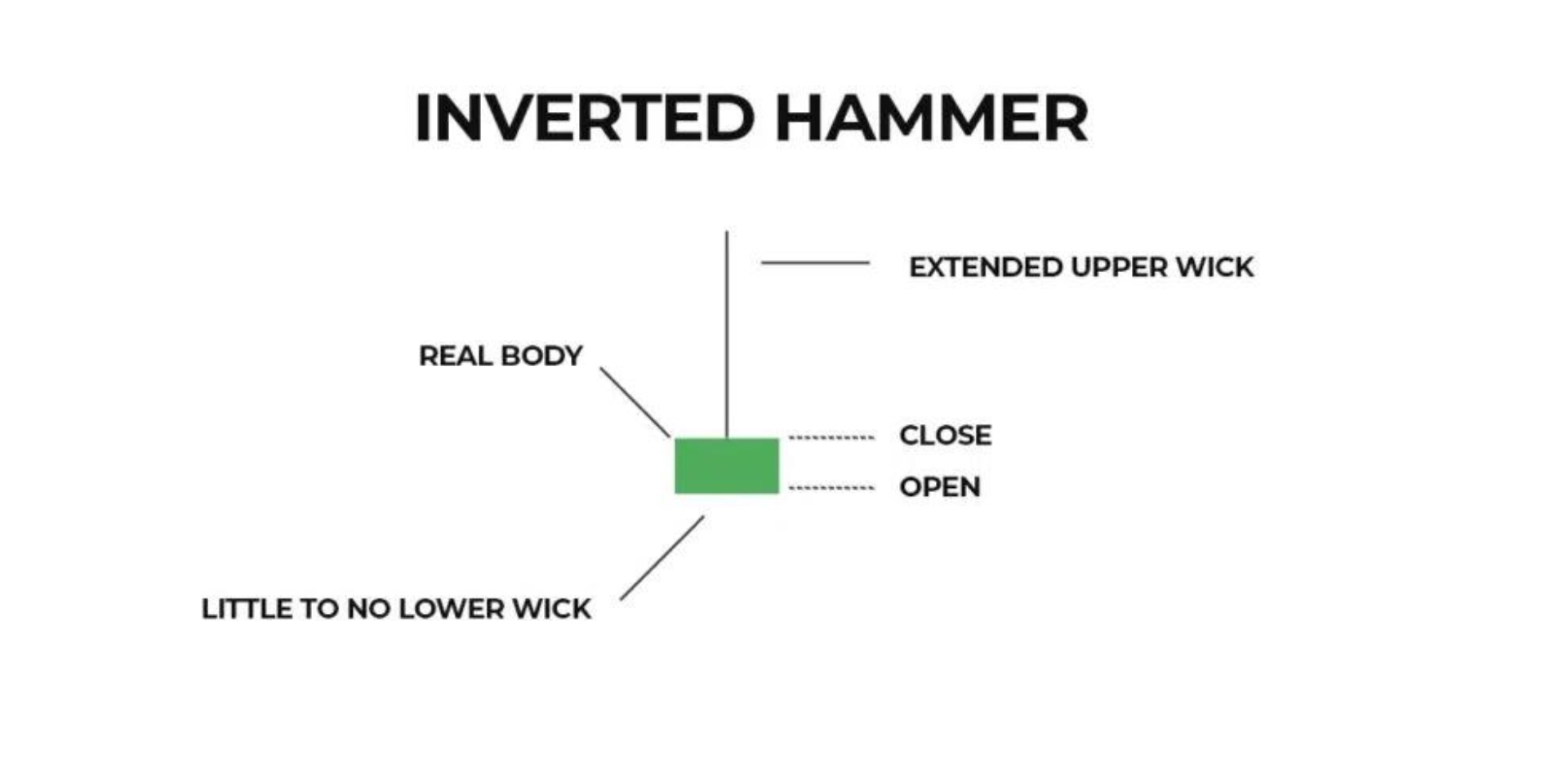
The inverted hammer is seen as a bullish signal. Note that the inverted hammercan be both green and red although green is considered more bullish.
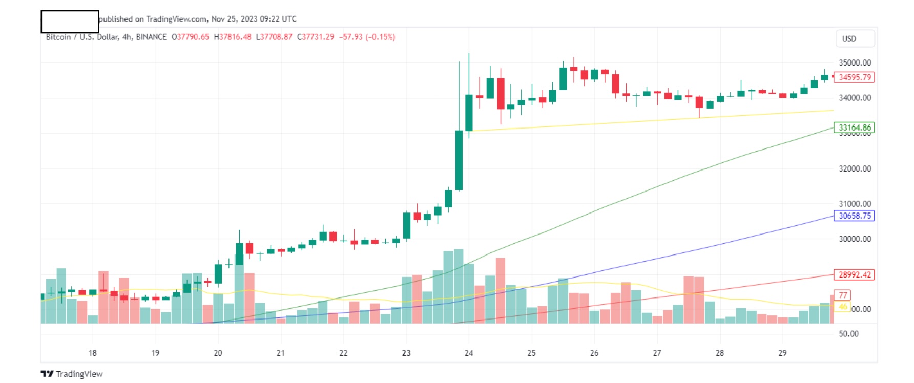
I’m sure you spotted our inverted hammer as shown below.
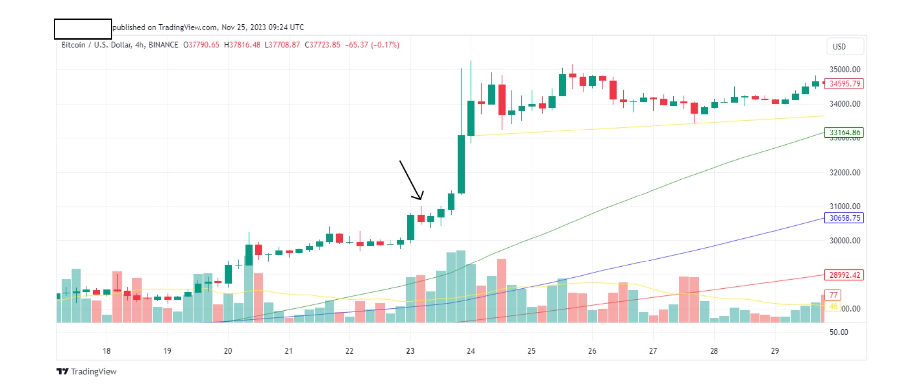
Now remember, this is a 4hr timeframe. Look at the five green candles after ourinverted hammer.
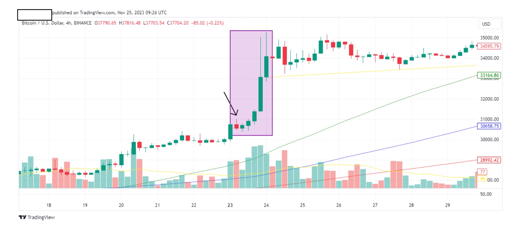
Your train of thought should be similar to the following: This looks like an invertedhammer. That’s bullish so it’s likely that the price will go up. I’m on a 4 hrtimeframe so each candle represents 4 hours. I need at least 2 green candles as confirmation. After the first 4hr, I see a green candle. Good, we are on the righttrack but in order for me to feel safe, I need a second green candle. After another 4 hrs, I see another green candle. That’s all the confirmation I need. I will now gospot or if in futures I will go long. Rinse and repeat, rinse and repeat. If at anystage one of our above steps does not play out, then the whole trade isinvalidated and we cancel everything. We go back to the hunting grounds foranother hunt.
There will always be another hunt. There are many other types of candles that you will come across, and with timeyou may invest more time to learn them. I don’t. I only put in the effort on thecandles that I mentioned above, choosing to spend more time on trend lines andtriangles. Like I said in the beginning, this tutorial is based on my trading style andhabits. Pick it up from here. Evolve your style and surpass mine, perhaps this isyour destiny. One thing is for sure. If you are reading these final words, then youhave more weapons in your salvo to beat most traders out there.
Before I say goodbye, allow me to point out the importance of fundamentals. For every 1 minute I spend looking at charts, I spend 2 hours looking at information. What type of information? News headlines on anything crypto related. Collaborations between companies, court rulings, SEC troubles (they like taking crypto to court), basically anything I can get my hands on. A useful source for meis “Full Feed” channel on telegram. Keep tabs on wall street and its performance.
On a daily basis I look at S&P500, QQQ, VIX and DXY levels. All the things yous tudied above can be applied to them. They are just charts made from candles and you know how to interpret them.
Lastly, keep tabs on what the FED is doing. Read their minute meetings (they usually meet once a month). Follow them on Xand as I mentioned at the start, follow their chairman as well. Listen to hisspeeches. You can determine if his hawkish (tough = market usually responds bygoing down) or dovish (soft = market usually responds by sideways or up).
They determine the path of the market and don’t ever go against them. If the chairmanis hawkish don’t go long.Good luck on this magnificent journey you are about to make. Stay safe.


