Work with the terminal of the Binance exchange
Here we will analyze work with Spot/Futures terminal by the example of Binance stock exchange.
Trading on Spot. To enter the spot trading section, click on (Deals/Trade):

After that you will open the interface of the trading section
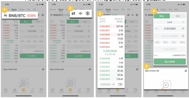
1. The market and trading pairs.
2. Candlestick market chart in real time, supported cryptocurrency trading pairs, “Buy Cryptocurrency” section.
3. Buy/sell order book.
4. Buy/sell cryptocurrency.
5. Open orders.
The default order type is Limit-Order, but if you want to place an order instantly or with restrictions you can change it to the desired type in advance (we will cover all order types later).
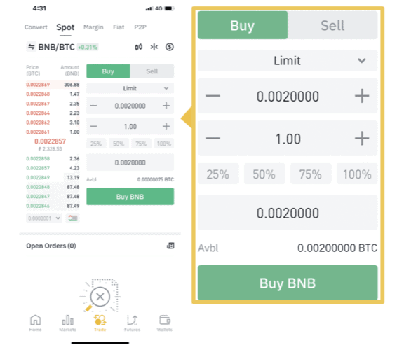
Selling takes place in the same way.
Trading Futures
To begin with, you will need to choose the type of margin and leverage. There are 2 types of margin Cross and Isolated.
With Isolated, the margin is independent of all open pairs.
Each open trade has its own independent account accordingly liquidation does not affect other accounts.
With Cross-Margin, margin is distributed throughout the trader’s account.
Cross-margin assets are distributed among all positions. The liquidation of one position eliminates all others.
Next to the choice of margin, there is the choice of leverage, keep in mind that the higher the leverage, the greater the chance that your position will be liquidated on price fluctuations.
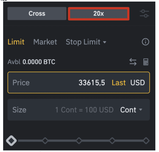
To open a position, select the amount and type of order, then click Buy/Long or Sell/Short.
Just below you can also pre-set your SL and TP (stop loss and take profit):

Basic concepts in trading
Who is your trading? The difference between a trader and an investor?
– Trading is the trading of currency, securities or commodities for profit.
– A trader is someone who buys and sells assets, places orders, closes positions, and thinks through short-term trading strategies. He may do this for himself or a client. In addition, traders trade frequently and the essence of their work is speculation.
– Investor is a person who can buy and sell assets on his own or ask a trader to do it. The important difference is in the purpose and terms of financial investments. An investor is focused on profits in the long term.
Animals in the market
– Bulls: In the stock and cryptocurrency market, this is what buyers are called. They believe in the good prospects of the market and actively buy various assets, expecting to earn a further increase in their value.
– Bears: Traders who sell assets hoping for a further drop in the price of a commodity. Bears at any time can be former bulls, who believe that an asset has reached its optimal price or the overall market has changed and it is time to lock in profits.
– Chickens: Cowardly traders. These investors are overly cautious and very timid. They ponder for a long time before they enter the market. They wait for their “stars to align”, but more often than not, they panic for fear of suffering losses, close their positions early and make other mistakes, which naturally affects their financial results.
– Wild Boars: Fearless or perhaps reckless traders. In contrast to chickens, they have no fear at all.
– Hares: These are scalpers. That is, traders who make a large number of deals in one session, trying to make money on small fluctuations in the price of an asset.
– Wolves: These are experienced traders. These are “mature” investors, true market gurus. A cold head, a strict calculation and a perfect understanding of the market let them close the most of their deals with profit, while possible losses are limited in advance.
– Giraffes: Extraordinary Optimists. These investors, in the pursuit of super profits, set pending buy/sell orders too far away from the actual market opportunities. However, this strategy can be justified – sometimes the deal is still realized.
– Hamsters: These players are constantly making the same mistakes over and over again and are unwilling to learn and draw conclusions.
– Whales: Large investors. These, most often, are hedge funds or national investment funds, the real whales of the financial world, which can significantly move the value of an asset and generally change the balance of power in the whole market. They go their own earlier planned course and do not pay attention to the vanity of the market plankton.
– Sharks: Super-successful investors. These traders are not concerned with financial philosophy, their goal is profit, and if there is an opportunity to get it here and now, they will not theorize long, but prefer to grab the loot. These are experienced investors who, in addition to fundamental and technical knowledge, have a keen sense that allows them to see a profitable deal where others fail to notice it.
Types of Orders
– Market order: An order to buy or sell immediately at the best price available.
– Limit order: An order with a specified Buy or Sell price.
– Stop Loss: a request placed in the trading terminal by a trader or investor to limit their losses when the price reaches a predetermined level.
– Take Profit: A closing order to close a position when the price reaches a certain level (if the price moves in a favorable direction for you).
Key terms
– Bid: the asking price or the maximum price at which a buyer agrees to buy an item.
– Ask: The price at which the seller agrees to sell.
– Target price: the average amount you are willing to pay for each conversion.
– Volatility: intense price fluctuations.
– Bull market: rising.
– Bear market: falling.
– Currency pair: value of one currency expressed in another currency.
– Leverage: Borrowed funds provided by the broker to the trader.
– Margin: The personal funds of a market participant used for financial security of a deal.
– Trend: A direction of price movement during a certain time interval (stable trend).
– Correction: A short-term price movement against a trend.
– Flat (sideways): A fluctuation in price within certain limits without a clear trend.
– Timeframe: the time frame in which a single bar (one candle) can be formed.
– Volatility: A fluctuation in price. High volatility means fast price movements in a wide range. Low volatility: A situation where prices are stagnant and there are no sudden price movements.
– Support: A level from which price “springs” and is repeatedly pushed back and moves upward.
– Resistance: a “glass ceiling” into which the upwardly moving price stumbles, unable to break through that level. Once the price reaches this level of support, it rushes down again.
– Long: A position held for the purpose of taking advantage of price movements upwards. It opens to buy.
– Short: A position held for the purpose of taking profits on the downward price movement. It opens for selling.
– Market Makers: major market players (national banks, financial-investment companies), which have a significant and, in some cases, determining influence on prices.
– Technical analysis: a method of forecasting price fluctuations based on the idea of recurrent market cycles.
– Fundamental analysis: a method of forecasting price fluctuations based on the analysis of current political and economic events.
– Divergence: a signal in technical analysis that indicates the weakening of an uptrend. On a chart, it represents a divergence between the upward price movement and the downward oscillator.
– Convergence: a signal in technical analysis showing that a downtrend is weakening. On a chart, it represents a divergence between an upward price movement and an upward oscillator.
– Diversification: Allocation of funds among various assets (financial instruments) in order to reduce risks.
– Consolidation: a stabilization of the market expressed as a sideways movement of price within a certain range. It occurs either after a pronounced trend or in the absence of serious players on the market, or after the accumulation of their positions before a new impulse.
– Market liquidity: a market is liquid if investors are always present and ready to trade.
Abbreviations
– SL: Stop Loss
– TP : Take Profit
– B/E : Breakeven
– COVER : Closing a portion of the profit to cover expenses
– IMB : Imbalance
– LQ : Liquidity
– EQL : Equal Lows
– EQH : Equal Highs
– PA : Price Action
– RR : Risk – Reward
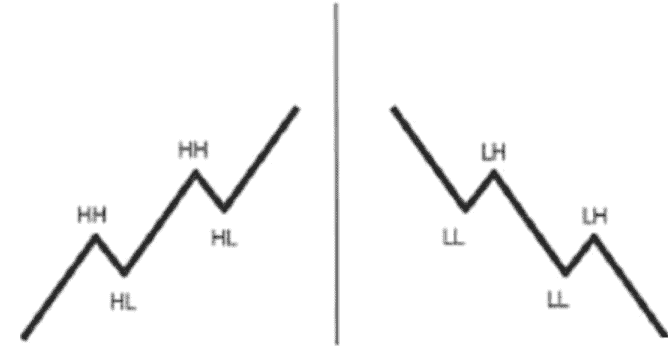
– LL : Lower low
– LH : Lower High
– HH : Higher high
– HL : Higher Low
– AOI : Area of Interest
– POI : Point of Interest
– SMC (Smart Money Concept) Brain
– BOS : Gap in structure
– dBOS : Double structure break
– mBOS : Slight break in structure
– SB : Structural sub-break
– OB : Order Block
– Choch : Change of character
Trading styles
At the very beginning of your journey, you will have to choose a certain style of trading based on your abilities, experience, free time, etc.
There is no easier or harder style, each one is unique and requires a lot of knowledge, experience and practice.
You should get into the essence of each and determine for yourself the path from which your strategies and deals will be built in the future. There are many types, we will break down the most basic and popular ones.
The first type of trading “Scalping
Scalpers are the fastest traders who react to price changes at lightning speed. Scalpers work on short timeframes from 10 seconds to 2 minutes. This is approximately the duration of their deals. The idea of scalping is to gain small or even scanty profit little by little and often, without counting on big profit.
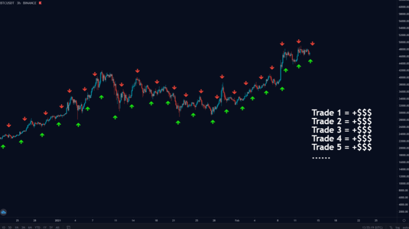
+ and – of such trading
+ Quick experience through frequent trades.
+ High profit potential due to trading, both during the ups and downs.
+ No risk of losing money while you sleep.
+ Huge selection of tools allowing you to more accurately determine the best positions.
+ Due to small stops, you can start with a small bank.
– Fast market movements, the trader needs to be constantly attentive and focused, which is quite difficult for a long time.
– Constant observation of the market, it becomes the main job, which takes many hours a day.
– High emotional and psychological burden.
If you are able to make decisions in seconds under heavy pressure and can devote most of your time to crypto-trading, scalping is for you.
The second type of trading “Daily (medium term)
Unlike traditional stock markets, the cryptocurrency market has no opening or closing time. Cryptocurrency markets are active 24 hours a day.
Day trading in cryptocurrency takes place during the most active hours. It is a short-term trading strategy in which the trader opens and closes trading positions in intervals from 30 minutes to several hours (no overnight positions, that is, only in the period in which you are able to monitor the market). Unlike scalping, day trading allows you to have more time to close a position.
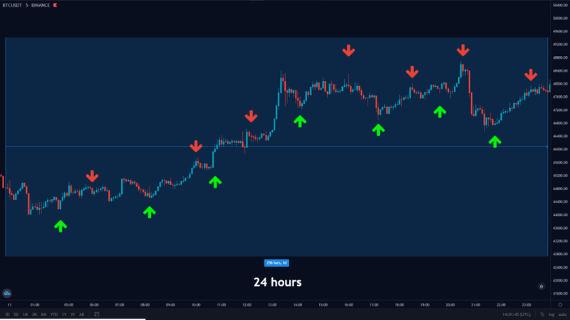
+ and – this kind of trading
+ It takes very little time per day, it’s enough to find good entry points.
+ This kind of trading can be combined with work.
+ Low psychological stress.
+ Strong movements.
– It is necessary to have a sufficiently large bank, due to wide stops.
– Due to more quiet trading, the profit can be less than when scalping.
– Due to a smaller number of trades, the experience will take longer to gain.
– The drawdown on the purse will be longer.
– The risk of holding a position while you sleep.
The third type of trading “Swing Trading”
Many traders start from the premise that cryptocurrency prices go up and down on a certain curve.
Swing trading is identifying such a pattern and using it to make a profit, that is, trading on fluctuations. With this type of trading, a position can be open for days to weeks.
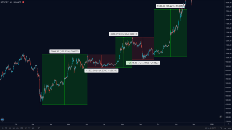
For those who are new to cryptocurrency trading, it is recommended to start with swing trading because it gives much more time to determine trading positions, unlike day trading or, even more so, scalping, when you need to make decisions instantly.
The + and – of this kind of trading.
+ You’ll start to identify clearer boundaries and areas
+ Less time for market analysis
+ It’s easy to combine with work.
– You can get caught in two market trends at the same time
– You must analyze the market very well
– Success rate is lower than in medium and long term trading
– You will need patience
The fourth type of trade “Long term”
Long-term trading is the longest trading cycle, which can last from a year to several years.
Long-term trading is investing. By choosing this type of trading, the trader prioritizes not the profit from speculations but rather investment for the expected growth. As a rule, this type of trading is carried out on the spot market.
+ The advantages and disadvantages of this type of trading
+ After a clear analysis and opening a position, you will only need a couple of minutes a week or a month to check the chart.
+ You get the opportunity to diversify your portfolio (choose several assets that in your opinion will be potentially successful).
– You need a big bank for such trading, because trading is mostly done without any leverage.
– You need a good patience.
– This is not about flipping.
Approach the choice of trading wisely.
Types of Market Analysis
Any successful transaction at the exchange begins with studying a huge amount of various information. In order to take action: to enter or exit the market, or to make adjustments to your portfolio, it is necessary to understand the current market situation and predict future changes in the price of selected assets.
It does not matter whether trading is short-term or long-term, opening a position should be based on a deliberate decision. It can only be made as a result of serious analytical work. The difficulty is that determining the big picture requires a comprehensive approach – observe the dynamics of trading, study supply and demand, pay attention to consumer behavior, assess news from trusted sources, and much more.
There are several types of market analysis.
Technical Analysis
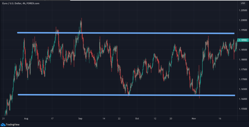
Technical analysis is based solely on data derived from charts, and fundamental factors affecting prices are not considered. Traders analyze past price behavior, which allows them to predict future movements.
Candlesticks Analysis
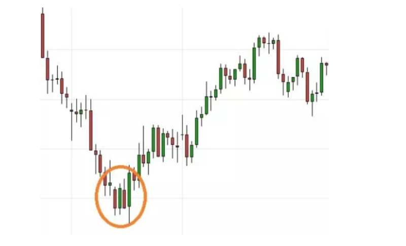
Candlestick analysis is one of the methods of predicting the price of a currency using its display in the form of Japanese candlesticks.
Wave Analysis
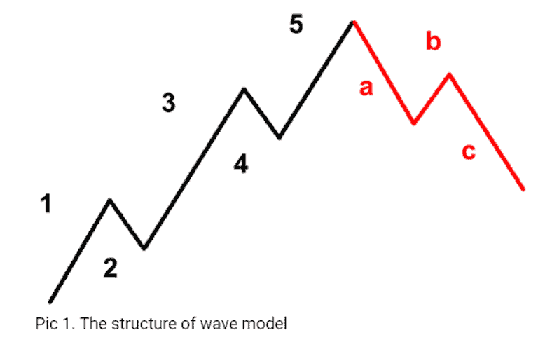
Wave analysis is based on the notion that markets follow certain patterns, called waves, which are the result of the natural rhythm of mass psychology that exists in all markets. There are several wave theories which we will come to a little later.
Fundamental Analysis

Crypto fundamental analysis involves taking a deep dive into the available information about a financial asset. For instance, you might look at its use cases, the number of people using it, or the team behind the project.
Your goal is to reach a conclusion on whether the asset is overvalued or undervalued. At that stage, you can use your insights to inform your trading positions.
Fractal analysis

A fractal is a set which has the property of self-similarity (an object which exactly or approximately coincides with a part of itself, i.e. the whole has the same shape as one or more parts).
In the market, you can observe the fractals in different timeframes, repeating or similar to the price movement that is on a larger / smaller TF
Applying fractals will allow you to memorize almost the entire history of pair quotations in a moment.
You will be able to analyze dozens of pairs, because now it will not be a problem. The theory of fractals is self-sufficient and does not require tools. By applying the properties of fractals, you can create your own trading system.
The more analysis methods you have and how to combine them, the better results you will get.
Trading Algorithm
An important part of trading is to prepare for it. Seasoned traders know, point by point, their trading day.
The algorithm gives you a clear understanding from opening a trade to closing, including your risks that are expected during the day.
You must realize that building your own algorithm will save you from unnecessary emotions and wrong trades during the day and make your trading more qualitative and productive. Each person’s algorithm is different depending on trading style, time, etc.
The main points that traders use to build an algorithm.
News studies
– As described above.
The stock and cryptocurrency market is directly dependent on certain news. This can be a change of the Fed rate, statements of large companies, updating of the blockchain protection system, etc.
Definition of Technical Analysis
– The technical analysis itself is very global and everyone is comfortable to trade based on their own proven tools. If the market at the moment is not clear to you and does not agree with your analysis, it is worth to think it over a few times before you make a decision to open a trade
Conditions for opening a deal
– This is your risk management and money management. Depending on your decision to open a trade in the near future you need to give yourself an account of the risks. What part of the loss you are prepared and what kind of profit you expect to achieve. Accordingly, you will know your SL and TP. You also determine for yourself the size of the opening transaction. What % of your funds you are ready to give to the risk.
An important part of your constructed strategy, is discipline.
– You must strictly follow your plan and not to give in to unnecessary emotions, which will confuse you.
Accounting for your trades
– At the end of the day, you need to keep an account of your finances, your victories and defeats, to do this, traders use the “traders’ diary”, in which they record their transactions throughout the day. Later, we’ll analyze this diary separately and each of you can save it for yourselves.
Types of price charts
Price charts are plotted on the coordinate plane. The horizontal axis shows the date and time, the vertical axis shows the price of the asset corresponding to the given time period.
The time axis can have a different scale depending on the trader’s preferences. This scale is called the time period or time interval, as well as the timeframe.
Let’s consider the most common types of price chart displays.
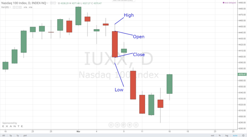
Japanese candlesticks
The Japanese candlestick chart is the most common due to its more convenient reading and visual perception. Each candlestick in the chart is equal to the time period chosen by the trader.
When constructing a candlestick, four basic price values are used: period open price (open), period close price (close), maximum period price (high), minimum period price (low).
Linear Chart
Represents a broken curve, which is plotted using one of the price values discussed above (opening, closing, maximum price, or minimum price) and the estimated price values for the period.
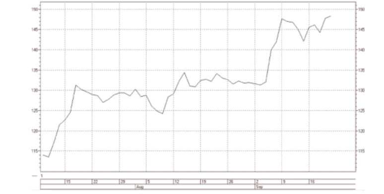
A linear chart has a number of advantages and disadvantages.
– Advantages
– convenience when searching for patterns of technical analysis
– Absence of redundant information
– Disadvantages
– impossibility to estimate the price change within the trade period
– impossibility to see gaps (price gaps between the previous period closure and the next one opening)
BARS
The price chart shown in the form of a bar reflects, just as in the Japanese candlestick, all the main price values: the opening price, the maximum price, the minimum price and the closing price (open, high, low, close).
The bar represents a vertical line with two risks. The upper border of the line indicates the maximum price value in the given time period. The lower border indicates the minimum price of the period. The left risk – the opening price of the period, the right one – the closing price.
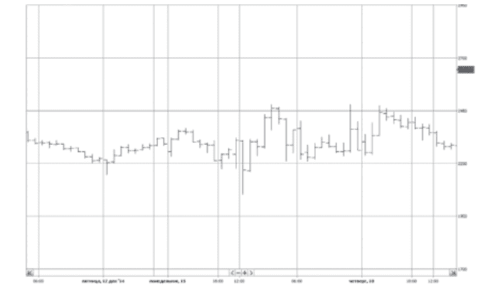
If the left risk is higher than the right risk, the market in this period showed a decline. If the left risk is lower than the right one, then in this period the market was growing.
There are disadvantages and advantages when using this type of price chart.
– Advantages
– A visual identification of gaps and market trends for a period.
– Disadvantages.
– There is no clarity and it is difficult to determine the market trend for large time periods.
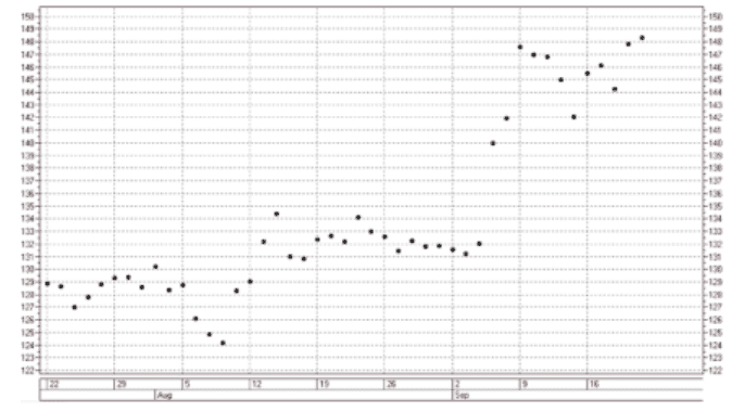
Price histogram
It is usually built on the closing price of the period, which is shown by the upper edge of the vertical lines. This type of chart is usually applied to various indicators or oscillators of technical analysis.
Trend types, trend lines
Trend – price movements in one direction; it may be upward or downward and flat (sideways, sideways, consolidation).
Uptrend – a sequence of higher maximums and higher minimums; it lasts as long as each new minimum and maximum of price is higher than the previous values.
Downward trend is a sequence of lower highs and lower lows.
Flat – a single-level sequence of highs and lows.
As you understand, for a trader understanding where the price will go and where it is better to enter/exit a position is the most important moments. Note that in an uptrend both minimums and maximums move up.
It is common, but not necessary, for the support line to be drawn through the rising lows. Likewise, in a downtrend, both lows and highs move downward. This is a common, but not required, rule for a resistance line, which will be drawn through the descending highs.
Highs and Lows
HH (higher high) – highs (up trend)
HL (higher low) – upper minimums (upward trend)
LH (lower high) – lower maximums (falling trend)
LL (lower low) – lower minimums (falling trend)
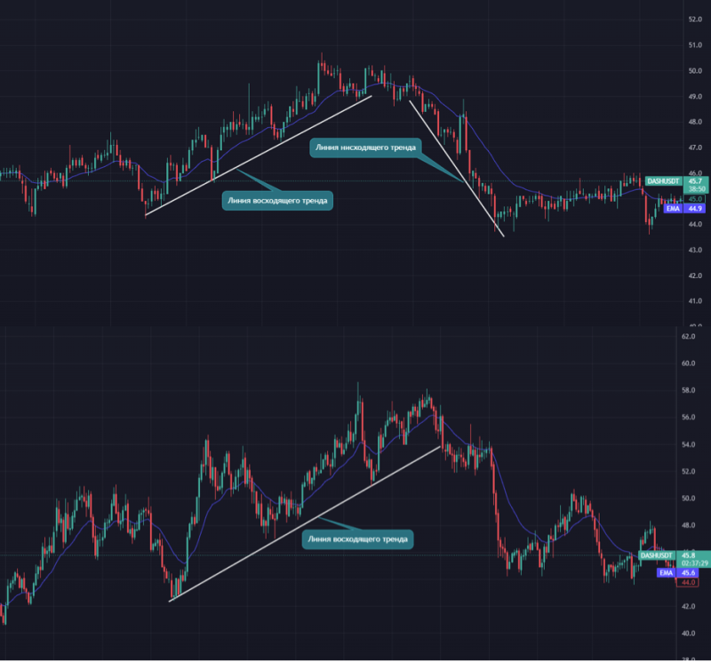
A trend line is a straight line that connects two important minimum or maximum price points on a chart. Any number of secondary and minor trends can occur within the main trend. A trend line is a support or resistance level where price fluctuates within a corridor.
For an uptrend within the period in question, draw a line from the lowest low to the highest secondary low preceding the highest high so that the line does not cross prices between the two points of lows.
Extend the line upward beyond the point of the highest high. It is possible that the line will pass through prices past the point of the highest high. In fact, this is one indication of a possible trend change.
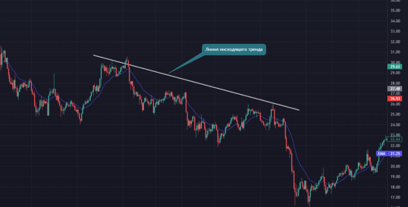
For a downtrend within the period in question, draw a line from the highest high to the lowest secondary high preceding the lowest low so that the line does not cross prices between those two highs. Extend the line down past the lowest high.
Flat in trading
Flat is a price movement in a horizontal price corridor (no trend)
The main reasons for the price to enter the flat:
– The period preceding the release of important economic news. At this time, the whole market is in anticipation. Players are getting ready to stand on one of the bulls or bears sides, depending on what the expected news will be.
– Time of day and day of the week. For example, on weekends and holidays the trade is quite sluggish and many financial instruments are in flat condition.
– Insufficient liquidity level. If there is no supply and demand for the traded financial instrument, there is nothing to change its price for. Such instruments are of little interest for traders.
The price corridor formed by the price movement in the flat may be wide or narrow. A wide price corridor is formed when the price is between two strong resistance and support levels. The entry of the price into a narrow flat tells traders that at this time there is no clearly defined prevailing force in the form of bulls or bears. In this case, in contrast to the trend movement, all extremums are approximately at the same level (local resistance or support). Each following maximum and minimum of the price approximately corresponds to their previous values.
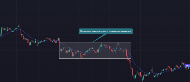
Flat may represent itself:
– An intermediate in the process of changing the direction of an existing trend
– Correction of an existing trend movement
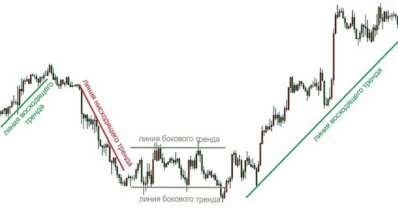
Trends by time
A short-term trend
This trend can fit into a single trading session and can be found on the charts with timeframes M5 – H1. Intraday (short-term) traders and scalpers work within this trend.
The medium-term trend
Its duration is measured in the interval from one week to several months. It can be found on the H1 to H4 charts. This trend is the main domain of medium-term traders.
Long-term trend
It may last from several months to several years. Long-term traders and investors work with this trend on timeframes from D1 and above. Any long-term trend consists of a set of medium-term trends, which, in turn, is the result of a set of short-term trends.
Trend phases
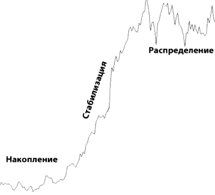
Accumulation – first phase
What is meant here is position accumulation when traders place orders, including pending ones, and decide whether they are going to buy or sell. That is, everyone sort of chooses a side in the confrontation between buyers and sellers. It causes the temporary parity of forces and the market is in the flat position; the main trend is not present yet. When, eventually, the forces of one of the parties are outweighed, the trend begins. Thus, the second phase begins.
Stabilization is the second phase.
Means that the market has decided on the direction and the trend has stabilized. The forces of one of the parties have won and all traders are actively following the formed trend. The best and safest way to trade is to enter the market at the beginning of the stabilization phase so you can move with the trend and not risk trying to guess the direction during the accumulation phase. At the same time, a late entry into stabilization is a bad idea, because at any time the market can move into the third phase, which is called distribution.
Allocation – the third phase
The time of fixation or distribution of profits and the end of the current trend. Competent traders have received their profit and decide to fix it – to close positions. It causes the transition of the trend into a flat, or serves as the beginning of an opposite trend. That’s why it’s a bad idea to enter the market at the end of the stabilization phase, let alone the distribution phase. So the distribution phase – a time to get out of the market for those who have worked well in a trend, whether upward or downward, but not the time to open new positions.
Conclusion:
1. The safest time to open a position is the beginning of the stabilization phase.
2. Unlucky – the distribution phase.
3. Risky, but potentially the most profitable time – early entrance on accumulation phase.
Trend channel
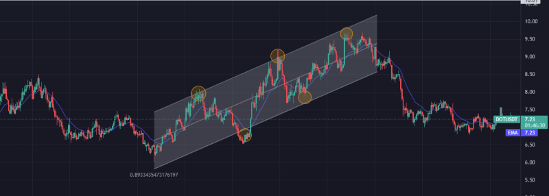
A trend channel is two lines uniting significant extrema in the trend direction (highs and lows). Important note: The main trend line is only a part of the channel. Some sources mistakenly call it a channel. In reality, a channel always includes two lines.
Types:
– Upward – pointing upward.
– Downward – directed downward.
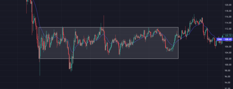
– Horizontal – does not have a pronounced direction.
Rising trend in the market
Horizontal trend in the market
The downtrend in the market

How to build a channel correctly?
It is customary to build trend channels manually using lines. Special technical tools for this are available in every popular platform. It is worth highlighting a few key rules of construction:
1. The line (channel boundary) is drawn only along the extremes, i.e. tops or bottoms of the movement, as shown in the examples.
2. The price should not excessively go beyond the line, while a slight slippage of the quotations is acceptable (ideally, it should not exist).
It is necessary at least two extrema for drawing the channel, as well as for drawing any line, the third one is confirmatory.
4. The channel borders serve as support and resistance zones for the price.
5. A secondary indicator of support and resistance is a line that can be drawn in the middle of the channel between the borders (dashed line in the examples).
By following the above rules, a proper trend channel can be constructed.
However, each trader-analyst draws the lines differently, so channels are essentially a subjective method. It is performed visually and does not lend itself to strict formalization.
Support and resistance levels
When observing the chart, you can see certain patterns – for example, when the price reaches an invisible level, it bounces off of it. A level is a horizontal line of a specific price value, but more often it is an area. When the price reaches this price (area), the chart can change direction.
A support level is a price level from which the price reverses when approaching from above downward. This level can be called a floor for the price, i.e. does not allow it to go lower. Next, let’s look at support levels on a real chart.
A resistance level is a price level from which price reverses on the way up. This level can be called a ceiling for the price, not allowing it to go higher.
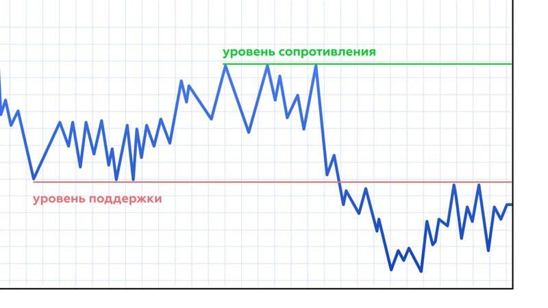
Before we go any further, let’s get a general understanding of why these levels work?
Why do support and resistance levels work?
As you may have guessed, there are buyers and sellers in the market. Buyers in turn buy an asset and sellers respectively sell it. But there are two ways to buy and sell an asset:
1. On the market.
This means that you buy assets from takers (who are they, below), in turn performing their orders. The more market-takers, the more profitable your purchase price will be (as close to the market price as possible).
2. Through a limit order
This is exactly the takers who put their limit orders to buy or sell, thereby forming an exchange glass of orders. These orders, in turn, are executed by market players.
Let me give you an example of the stock market glass and show who is who:
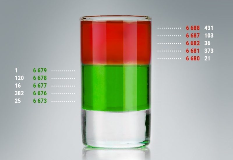
P.s – This is not a stock market glass, but a clear sketch of it.
As we see, at the top there are limit sell orders, and at the bottom there are limit buy orders. And who do you think executes them? – That’s right, the broker executes these orders. If he buys on the market, he executes limit sell orders, thereby pushing the price up.
If someone is selling at the market, he executes limit buy orders, thereby pushing the price down.
So, the levels are in fact a cluster of limit orders, whether to buy or to sell.
That is, the level of support on the stock looks like just a large number of limit buy orders. Usually, this level is a major player, which is not profitable to buy on the market.
And the support levels are just an accumulation of limit orders to sell. This level is usually a major player, who is not profitable to sell on the market. I hope I explained it clearly, let’s move on:
Mirror level
Mirror level is a support or resistance level (depending on the current price on the chart), confirmed by testing from below as well as from above, which increases the significance of the level.

This is also called a level retest. Let’s understand why a retest to a level occurs:
As you know, those who go long place their Stop Losses to sell. If they go long from the level, they place their limit sell orders behind the level. When the level is broken through downwards or upwards (depends on context), those who are entering long positions are in the red. That’s why they wait for the price to go back to the level of position opening, in this case, the support level:
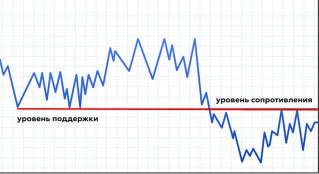
When the price reaches a level (the opening price of a position), traders begin to close at breakeven, thereby selling the asset and pushing the price down.
It is important that you understand what is behind the levels, and not just trade on some figures or lines.
What is Dow’s theory?
Dow Theory is the basis for technical analysis based on the writings of Charles Dow regarding his theory of market behavior. Dow was the founder and editor of the Wall Street Journal and co-founder of Dow Jones & Company. As part of the company, he helped create the first stock index known as the Dow Jones Transport Index (DJT), followed by the Dow Jones Industrial Average (DJIA).
Dow never described his ideas as a specific theory, nor did he call them one. Nevertheless, many learned about it through his editorial in the Wall Street Journal. After Dow’s death, other editors such as William Hamilton refined these ideas and used his articles to piece together what is now known as Dow’s theory.
The following principles are not infallible and are open to different interpretations.
Basic principles of Dow theory
The market takes into account all events
This principle is closely connected with the so-called efficient market hypothesis (EMH). Dow thought that if there is a discount in the market, it means that all the available information is already reflected in the prices.
For example, in the expectation that a company will report a positive yield increase, the market will reflect the news before it happens. Demand for their stock will increase before the report is published, and then the price may not change much after the expected report is released.
Also, Dow was able to notice that in some cases, a company may even see their stock price decrease after the good news is published because the news was not as good as the community expected it to be.
This principle is still considered true for many traders and investors, and especially for those who regularly use technical analysis. However, those who prefer fundamental analysis disagree with this statement and believe that market values do not reflect the real, intrinsic value of stocks.
Market Trends
Some people say that Dow’s work gave rise to the concept of the market trend, which is now considered the most important element of the financial world. Dow’s theory states that there are three basic types of trends:
Primary or Primary Trend – Duration of action, ranging from a few months to decades, also this trend is the main movement of the market.
Secondary trend – Duration of action from a few weeks to a few months.
Minor or minor trend – The action of this trend may be limited to less than one week or ten days. In some cases, the duration reaches a few hours or one day.
By studying different trends, investors have the opportunity to find the most appropriate moment to enter. While the primary trend is key when considering an entry, secondary and minor trends contradict the primary trend.
For example, if you believe that an asset has a positive primary trend, but it periodically experiences a negative secondary trend, you are given the opportunity to buy it cheaper, and try to sell it as soon as the value increases.
In such a case, the only problem is to correctly identify the type of trend, and that is the essence of in-depth technical analysis. Today, investors and traders use a wide range of tools to identify and understand the current trend.
The three basic phases of each trend
Dow established that long-term primary trends include three phases. For example, in a bull market, the phases would be as follows:
Accumulation (accumulation) – After the preceding bearish trend, asset values are still low as the sentiment of the masses is predominantly negative. Experienced traders and market makers begin to accumulate assets during this period before a significant price increase occurs.
Public Involvement – The market, at this point in time, realizes the opportunity that experienced traders have already seen, and the community becomes more and more active buyers. At this point, prices are skyrocketing upward.
Distribution – While the bulk of the participants continue to speculate, the trend is coming to an end. Market makers are beginning to allocate their assets, i.e., sell to those who do not yet realize that the trend is about to reverse.
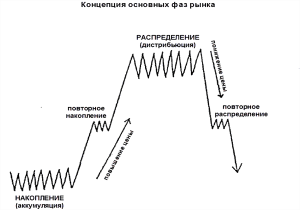
In a bear market, the phases will be arranged in reverse order. The trend will begin with the allocation of its assets from those participants who have recognized the signs of a downtrend, and will be followed by community participation thereafter. In the third phase, the community will continue to speculate desperately that the market will continue its decline, but investors who notice the coming shift will begin to accumulate assets again.
There is no guarantee that this principle works perfectly, but thousands of traders and investors consider these phases before making appropriate financial decisions. It should be noted that Wyckoff’s method also relies on the idea of accumulation and distribution, which can also be seen in the somewhat similar concept of market cycles (transition from one phase to another).
Cross-index correlation
According to Dow, the underlying trend seen on the chart of one of the indices should corroborate the trend of the other market index. At the time, this was mostly true of the Dow Jones Transportation and Industrial index.
The transportation market at the time (mostly railroads) was closely tied to industry. This implied itself: in order to produce more goods, it was first necessary to increase railroad activity in order to supply the necessary raw materials.
Thus there was a clear relationship between the manufacturing industry and the transport market. If one market was in a normal, healthy state, so was likely the other. However, the principle of cross-index correlation is not as good today because many commodities are digitized and do not need physical delivery.
The value of volumes
Like many other investors, Dow believed that trading volume was the most important secondary indicator because a strong trend should always be accompanied by high trading volume. The higher the volume, the more likely it is that the price movement reflects the true market trend. Otherwise, on small volumes, the trend is poorly manifested, as well as the growth in the price of the asset, which in turn does not reflect the real, healthy action of the trend.
Trend action before confirming a reversal
From Dow’s perspective, if the market is in a trend, it will continue to move. For example, if a company’s stock price starts reacting positively after good news is released, they will continue to rise until a trend reversal is properly evidenced.
For this reason, Dow recommended treating all such changes with caution until a new primary trend is confirmed. Naturally, distinguishing a secondary trend from the beginning of a new primary trend is quite difficult, and traders often encounter misleading reversals that end up being a secondary trend.
Conclusion
Some critics argue that Dow theory is outdated, especially with respect to the principle of cross-index correlation (which states that an index or its average must support or relatively match another index). Nevertheless, most investors believe that Dow theory is still relevant, not only for determining the phases of the most favorable financial opportunities, but also because the concept of market trends is a product of his work.
Martingale Strategy
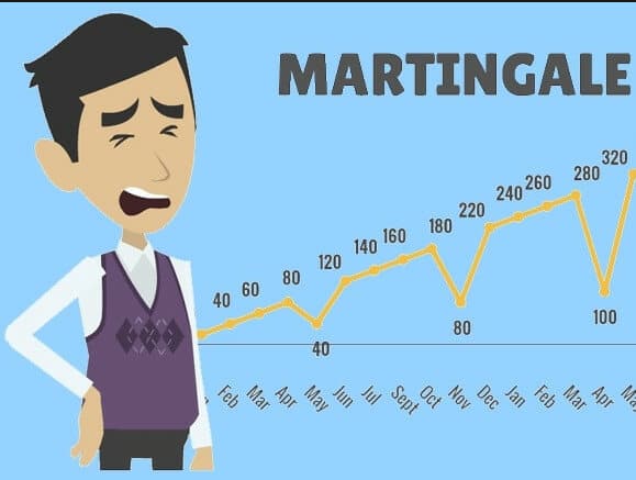
One of the strategies in the world of trading is the Martingale method, the essence of which boils down to a series of deals calculated in accordance with the mathematical theory of probability. A little history This phenomenon came from gambling. It was first mentioned in the mid-18th century.
At that time the Martingale method was successfully applied during the roulette game. It forced the casino owners to change the rules and limit the maximum bet. According to some historical information Martingale was called a clamp, which specifically put on the horse, so that it is not too much tilted head, as a restriction, you catch the analogy?
The word is also found in the terminology of sailors, where it means one of the reinforcing pieces of rigging of a ship. What is Martingale in trading? The parallels with the market are obvious – at the heart of the phenomenon lies the principle of limiting and applying the increasing force after each negative result. Literally, the term means “playing absurdly.
Judging by the meaning, it is clear that this method belongs to high-risk and high-return trading strategies. That is why it is most loved by beginners who come to the exchange market with small deposits. Naturally, their first goal is to make the deposit faster. Experienced traders are wary of this method, resorting to it seldom, because the risk of a deep drawdown or complete loss of the deposit is too high. Nevertheless, there are reasons for using the Martingale method in trading. When the market turns against Bac, all you have to do is just wait.
Sooner or later it should go in your direction, because nobody cancelled the theory of probability based on mathematical analysis. But in order to wait for a favorable trend, you must have not only patience, but also a sufficient amount of money. The deeper the drawdown becomes, the more trades must be opened in the direction of the open position. Yes, exactly the open position – the position that is in a decent loss.
It seems to Co that the trader is trying to reverse the price movement, spends a lot of effort and money, which are almost used up. Then, when the market finally turns in its direction, the trader has a decent amount of open positions allowing him to compensate all of the losses in one go and gain a substantial profit. This is the Martingale method.
What is the Wyckoff Method?
Wyckoff’s method is designed to analyze the market based on supply and demand. The creator of the theory distinguished the stages preceding significant price changes: accumulation (after which there is a sharp rise in price) and distribution (after which there is a sharp decline).
According to Wyckoff’s model of market behavior includes four cycles:
1. Accumulation or accumulation.
2. momentum – upward trend movement. 3.
3. Distribution.
4. Appreciation – downward movement.
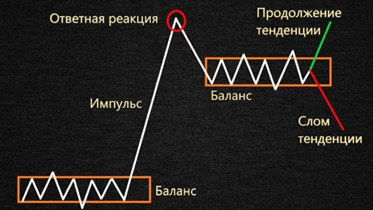
Wyckoff’s method has a direct impact on modern technical analysis and is applicable to stock and cryptocurrency exchanges to analyze stocks, cryptocurrencies, futures, and other instruments.
The Three Weikoff Laws
The Wyckoff method of trading involves three rules: the law of supply and demand, the law of cause and effect, and the law of effort and outcome. Let’s take a closer look at each rule.
The law of supply and demand. An increase in the value of assets is observed when demand exceeds supply. A shortage of assets causes prices to rise – buyers are willing to pay more. The value of assets decreases when demand decreases relative to supply. The market must raise funds to buy back the resulting surplus. When the demand equals the supply, the price is almost unchanged. Volatility in the market is reduced to a minimum. Comparing price movement to volume helps you understand the market better.
Causality. The differences between supply and demand are legitimate. The author of the theory defined a period of accumulation (cause), to which corresponds an upward trend (consequence). Conversely, distribution (cause) leads to a downward trend (consequence). On the basis of accumulation and distribution Wyckoff suggested a technique for determining trading targets. It has been observed that powerful impulse movements are characteristic when an asset has spent a lot of time in the accumulation or distribution zone.
The relationship of effort and results. Results will occur when effort is applied to achieve a goal. If the increased price corresponds to high volume, the trend will continue upward. But, if the increased price corresponds to low volume, the trend will change direction downward.
The “composite person” heuristic
According to Wyckoff’s method, the market should be analyzed from the point of view of large players: market makers, institutional investors, etc. The author suggested to combine such participants into a heuristic device “composite man”. All price fluctuations are considered as a result of actions of one person. The market behavior of the “composite person” is opposite to the actions of most retail investors or traders. However, this behavior is predictable and can be used in trading by retail market participants. Let’s discuss the four cycles of the Wyckoff market model in detail.
Accumulation
“The composite person accumulates assets. A trading range is established. Price moves sideways. The hunt for stop-losses of retail traders is traced: on low volumes support is broken, stops are triggered and small players leave the market. The accumulation occurs gradually until the moment of an impulse.
Impulse .
Over time, the “compounder” increases the number of assets and begins to move the price up out of the trading range. The number of investors increases. Demand increases. Volumes increase. The trend rises sharply to new highs and moves into the next cycle.
Distribution
“The Composite Man” allocates acquired assets by selling profitable positions to participants who entered the market in the last stage. The cycle is characterized by a sideways price movement with increasing volumes. There is an absorption of demand until it is completely exhausted. Then the “composite person” passes to sales. The price breaks through the distribution zone and goes down. Retail traders and investors close positions on stops, accelerating the downward trend.
Markdown
Supply exceeds demand. “Compound Man” pushes the price down until a certain point (distribution), of which there may be several. Once the downtrend is complete, the market moves back into an accumulation cycle. On the BTCUSDT crypto-asset chart, we see all of Wyckoff’s cycles: accumulation, momentum, distribution and markdown. There can be several accumulation and distribution phases.
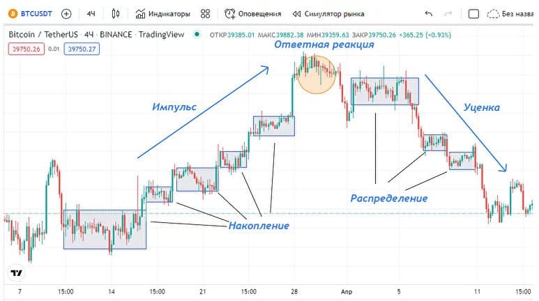
The Wyckoff method helps traders make logical and informed decisions because it presents specific rules and strategies. The author describes the logic and psychology of the market by which purchases and sales occur. The method is combined with cluster analysis and many other types of analysis.
Japanese candles
Japanese candlesticks are the most informative part of the market chart, they show the price maximums and minimums within the selected timeframe, and also show the market mood
Each candlestick consists of a Body and a Shadow.
The body is the distance between the open and close prices. If the close price is higher than the open price at a certain time interval, the body is green, and if it is the opposite, it is red. There are also candlesticks of uncertainty (doji), about them we’ll see later.
The shadows are the highs and lows (lows and highs) of the prices for the corresponding period.

Candlestick analysis
Candlestick analysis is a basic method of technical analysis; studying this method is important because it allows us to evaluate the market’s emotional state and price movements on the chart.
Candlesticks allow traders to understand who currently rules the market bears or bulls.
Based on combinations of candlesticks, it is possible to determine whether the current trend will continue or reverse.
Based on the candlesticks, it is possible to accurately predict the direction of the price, to determine the SL and TP.
Candlesticks clearly show at what moment it is better to close the current position, leaving the market.
Candlestick patterns (Patterns)
Candlestick models are not necessary to memorize, they are quite simple to understand, the main thing is to understand their principles and analysis
There are three indicators
1. Length and position of the body
2. Shadow length
3. Ratio of body to shadow
The length of the body determines the difference between the opening and closing of a candlestick and shows who is stronger at that moment, the buyers or the sellers.
An extended body, resulting in a surge in the value of the asset, indicates a rapid increase in interest from buyers, and also indicates that the price will change. A further lengthening of the candle indicates an acceleration in the value of the asset by the trend. When the number of buyers and sellers is more or less equal, the candle will naturally shorten.
If you see a series of candles with approximately equal bodies, then the dominant trend is stable. Long bearish candles can quickly change to long bullish candles, and vice versa. This is called a trend reversal and the emergence of an opposite trend.
The shadows show the interval of price and its changes. A long shadow almost always indicates uncertainty in an asset’s value because it appears at a time of strong competition between buyers and sellers. A short shadow, on the contrary, indicates a stable situation. If the trend is stable, the candlestick body usually has a longer shadow.
Simple candlestick patterns
Doji
A doji is a candlestick with no body; i.e., the opening price is equal to the closing price. The longer the shadow, the stronger the pattern is considered. During a sideways trend, doji’s show neutrality in the market. But during an uptrend, doji can mean a market reversal.
Doji themselves carry little information, so it is worth taking into account the previous candlesticks in your analysis
Several complete bullish candlesticks with long bodies near the doji points out that the buyers are getting weaker and it is unlikely that further growth will continue. Exactly the same works in the opposite case.
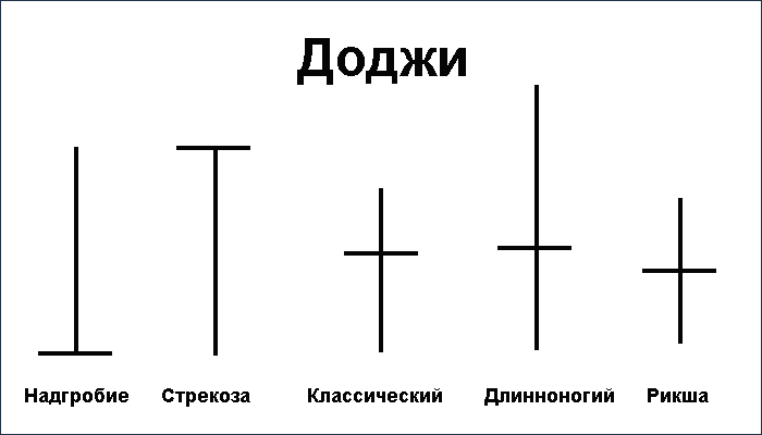
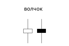
Wolf
The wolf is characterized by a small body and long shadows on both sides, whereby the color of the body does not matter. The small body of the candlestick indicates that the price did not change much from the opening or closing, but it was strongly “walking” up and down.
This pattern indicates a halt in the movement and indicates indecisiveness on the part of buyers and sellers. But it has significance when there are two or more volleys on the chart. Then it is a strong signal to the end of the trend and its reversal
Tombstone
A tombstone is a candlestick that has no shadow (see picture above), that is, the minimum price for the period is equal to the opening and closing price.
This pattern “buries” the current trend – hence its name. The appearance of a tombstone at the top of an uptrend is a signal to sell (if confirmed by a bearish candle).
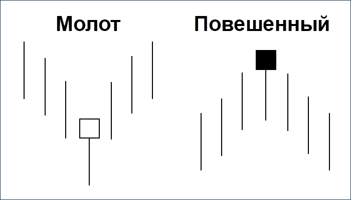
The Hanged Man and the Tombstone
These candlestick patterns represent a candlestick without an upper shadow, with a small body and a lower shadow twice as big as the body. The color of the candlestick body does not matter.
The difference between the hammer and the hanged is that the hammer appears after prices fall and the hanged appears after prices rise. Both figures warn about the exhaustion of the current trend and its soon change.
When after the uptrend the “hung” pattern appears on the chart, it is a signal that the growth of the market may be close to its end. And this signal is the stronger, the shorter the upper shadow and the smaller the candlestick body. In addition, the signal for fall is stronger if after the “hanging” pattern appears tombstone.
Shooting star and inverted hammer
Shooting star and inverted hammer represent a candle without a lower shadow, with a small body and an upper shadow twice as big as the body. The color of the candlestick can be any color. Both models warn of a possible trend reversal.
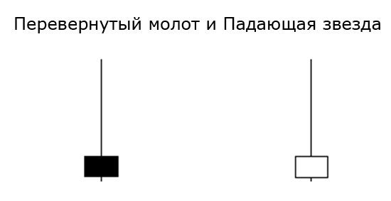
The difference between a shooting star and an inverted hammer is that the shooting star appears in an uptrend and the inverted hammer in a downtrend. As you can see, the shooting star represents an unsuccessful attempt of the bulls to accelerate the price after the opening and gives a bearish signal. An inverted hammer, on the other hand, reflects bearish weakness and sends a bullish signal.
Complex candlestick patterns
Absorption pattern
Signals a strong reversal and is formed with two candles. The second bullish candle completely engulfs the first bearish candle. It means that the sellers lost their initiative after the recent downtrend and the bulls are now in full control.
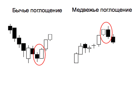
The inside bar
is the opposite of the absorption pattern and represents a small candle that is completely in the range of the previous one.
Tweezers
The pincer pattern usually occurs after a prolonged uptrend or downtrend and indicates an imminent reversal.
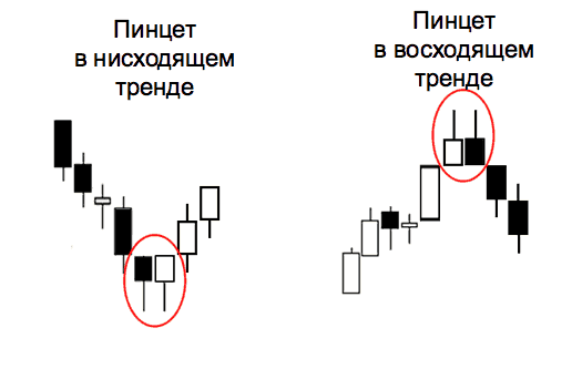
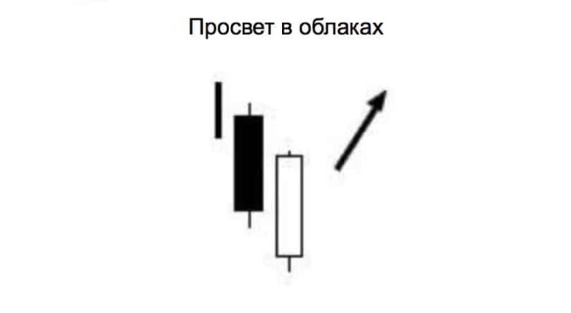
A veil of dark clouds and a gap in the clouds
A veil of dark clouds is a reversal pattern that occurs after an uptrend when the opening price of a bearish candle is higher than the maximum of the previous bullish candle.

The cloud gap pattern occurs at the end of a downtrend.
Three Soldiers and Three Crows
The three soldier pattern occurs when three bullish candles follow a downtrend, signaling a reversal. The three crows pattern is the opposite of the three soldiers. It is formed when three bearish candles follow an uptrend, indicating that the trend is likely to reverse.

Three inside up and three inside down
Three inside up is a trend reversal candlestick pattern that shows that the downtrend may have ended and a new uptrend is beginning. Opposite for three inside down.
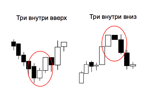
There are many other different candlestick patterns, but you should not memorize them all, they should just be understood.
Patterns of trend continuation
If one of the trend continuation figures appears on the chart in front of us, it means that there is a normal correction (pullback). After its completion there is an opportunity to profitably enter the market at the existing rate.
The complexities of simple analysis
At first glance, everything seems very simple. It seems to be enough for a trader to memorize what the patterns look like, then carefully follow the charts to buy or sell as soon as these patterns (also called technical analysis patterns) appear, and to steadily increase his capital.
Isn’t that too easy? If the analysis were limited to just knowing what a chart looks like, it is unlikely that 19 out of 20 traders would lose their deposits.
The question is: what position should a trader open, short or long if he sees the reversal pattern on M15, the continuation of the trend on H1 and the triangle on D1? And how long will it take the trader to find the right answer, then – the confirmation points, the points of opening and closing deals, setting a stop? The usual trader has to deal with such situations all the time.
It is necessary to synthesize figures of continuation and trend reversal with other instruments of technical analysis:
– Elliott waves (a trend reversal figure is the end of 5th wave, a trend continuation figure is one of correction waves, etc.).
– inclined channels
– resistance and support levels
– currency pairs movement
– Fibonacci levels etc.
Triangles: 3 Triangular Patterns
Among triangle patterns, there are three main types that often show up in the market. It is important to clearly recognize each type of pattern:
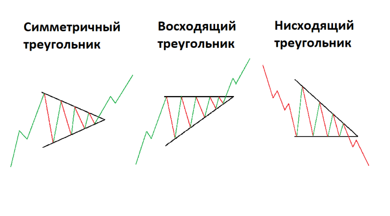
A triangle in trading is characterized by two converging trend lines, within which price fluctuates from one to the other. The minimum requirement for each triangle is the presence of four anchor points. To draw a trend line, as we remember, two points are always needed. Thus, to draw two converging trend lines, each must pass through at least two points.
Also, by definition, a triangle is a trend continuation pattern, i.e. if the triangle is formed on an uptrend, after it is worked out, the uptrend should usually continue, on a downtrend, after the triangle is broken down, the price continues to fall. In simple words, if the price was rising and a triangle is formed, it will shoot upward, and vice versa, if the price was falling and after we see the triangle, it shoots downward.
The triangle itself can be upward, downward or symmetrical (each of them will be discussed below). The type of triangle also affects the direction of the breakout.
And if we remember that we trade in the cryptocurrency market, the number of influencing factors increases many times – it is the news, events, whale psychology, all sorts of manipulations (which we have to try to uncover), it is also necessary to understand whether we are in the middle of a bubble, how the volumes behave, whether there are divergences, etc.
Symmetric triangle pattern
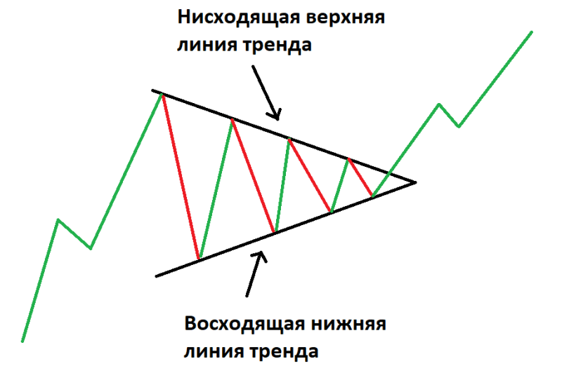
The most common type of triangle is a symmetric triangle (shown in the chart below). In this case, the price fluctuates between two converging trend lines: upward and downward. Such a triangle most often leads to a continuation of the trend.
The pattern can be considered complete after the breakdown of any of the boundaries, the direction of the breakdown indicates the direction of further price movement. At the same time, a symmetrical triangle is the most ambiguous one, as opposed to an ascending or descending one (discussed below), because a symmetrical triangle is the leader in terms of percentage of failed breakouts (about 30% of cases), i.e. when the price, after breaking through a border, does not reach its minimum and continues the trend, it goes back to the triangle body, a so-called false-break or crosses the level broken back.
How to Use a Symmetrical Triangle?
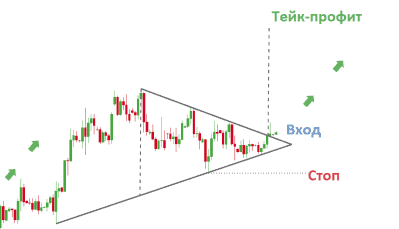
When working with triangles, it is easy to determine and measure entry, stop and take profit levels. In general, the methodology for calculations is not different when working with other types of triangular shapes. A symmetrical triangle is marked on the chart.
The vertical distance between the upper and lower lines should be measured and used to predict the target level when the asset will leave the symmetrical triangle figure. It is important to note that perfect symmetrical triangles are extremely rare, and you should not be in too much of a hurry and reject most triangle formations.
It should be understood that the analysis is not so much about finding an ideal figure as it is about understanding and interpreting the current dynamics due to the triangle.
The ascending triangle pattern
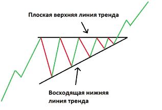
The ascending triangle pattern is a consolidation pattern that forms in the middle of a trend and signals the continuation of a confirmed dominant trend. In contrast to a symmetrical triangle, which is rather neutral and almost always serves to continue a trend, an upward triangle is a bullish pattern and in the vast majority of cases there is an upward breakout. Such a triangle is formed more often in an uptrend and serves as a continuation of the trend.
The pattern finishes with a breakdown of the upper line, and it is necessary to register a significant exit beyond its boundary and a sharp increase in volumes – these points will be a buy signal. Further, the level broken through turns into support and prevents the price from going back inside the triangle.
Less often, but it also happens when this triangle is formed in a downtrend – this is a reason to think about a trend reversal, the first confirmation of which will be a breakdown of the upper (horizontal) line of the pattern.
How to use an ascending triangle
The preceding uptrend is followed by a period of consolidation during which an uptrend triangle pattern is formed. Traders usually measure the vertical distance at the beginning of the triangle formation and use it at the breakout to predict the take profit level.
In this example, you can set a fairly close stop at the level of the minimum of the last price swing to reduce the corresponding risks of a possible price drop.
Downward triangle


A consolidation pattern that forms in the middle of a trend and signals the continuation of a confirmed dominant trend. In contrast to the previous version, it is characterized by a descending upper trend line and a flat lower trend line, which appear during the temporary sideways trading of the asset.
This pattern indicates that sellers are more aggressive than buyers, so the price continues to make lower and lower highs. Traders perceive a breakout in the direction of the previous trend as a signal to enter the market.
How to use the descending triangle?
Gradually, a downtrend line is formed during the consolidation as sellers slowly push the price down. A solid breakout of the lower trend line is a signal to enter. In this example, the asset soon returns to its previous level, which emphasizes the importance of setting an appropriate stop. The take profit level is determined in the already known way – using the vertical distance measured at the beginning of the descending triangle formation.
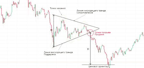
Sell signal here is marked in red, it is better to sell after a significant exit beyond the triangle line with local volume growth, stop loss after opening positions are set on the opposite side of the broken line, which after the crossing becomes in this case a resistance (before the breakdown was support). The level of fixing the profit is at a distance from the breakout point, equal to the height of the triangle (price point). Also, an additional signal is a breakout level, where there was the last touch of the boundary, in which the breakout occurred.
Confirmation of breakout
Sometimes the price breaks through a triangle and sometimes comes right back to its edge, or gets a confirmation. This rebound is also a signal.
Volumes
Volumes in a regular triangle almost always fall in a smooth decline before the breakout (the closer to the convergence of the triangle boundaries the smaller the volumes) and after the breakout there is a sharp growth. If there is a pullback after the breakout, it is also necessary to watch the volumes; higher volumes during a rollback carry the risk of a change in direction; if the volumes during a rollback are low, it is possible to strengthen the position.
False breakout
If the breakout of a triangle border is not followed by the growth of volumes, we may consider it to be a false-break. Sometimes it is rather difficult to distinguish a false breakout, but it can always be prevented from considerable losses by means of a stop loss below the breakout level.
Conclusions:
1. be sure to determine the trend direction preceding the consolidation period.
2. Evaluate the degree of slope of the upper and lower trend lines to determine the type of triangle.
3. Always keep a risk management strategy in mind to reduce the risk of a false breakout and ensure that a positive risk-to-reward ratio is maintained.
Pennant pattern

Pennant figure in the classical theory of technical analysis of the market is classified as a trend continuation model. It appears after an impulse movement of the price. As a rule, it is one or maximum of two candles or bars. After a strong impulse, the market takes a pause and remains in a state of pause for some time, or as traders say pro-trading.
To correctly identify the figure on the chart there should be a sharp impulse in the direction of the dominant trend. The formation of the Pennant pattern should be accompanied by an increase in volumes in both bearish and bullish markets. The pennant price pattern is very similar to the flag in many of its characteristics.
Although graphically it looks more like a small symmetric triangle. One of the main differences from the triangle is that the formation time is very limited. The pattern Pennant appears often after a vigorous movement has taken place.
Features:
Flagpole.
The formation of a pennant always begins with a flagpole, which is what distinguishes this pattern from patterns of a similar type (such as a symmetrical triangle). Flagstaff is an initial strong movement preceding the appearance of a symmetrical triangle on the chart.
Breakout levels.
There are actually two breakout points in the pattern: one at the end of the flagpole, and the other (we might say the main one) at the end of the consolidation period, after which the uptrend or downtrend continues.
The pennant itself.
A triangular pattern formed when the market consolidates between the flagpole and the main breakout. Two converging trend lines form a triangle – a pennant.
Bullish and Bearish pennant
A bullish pennant is a continuation candlestick pattern that appears in strong uptrends. The pennant is formed from an upward flagpole, a period of consolidation, a subsequent breakout and continuation of the uptrend. Traders wait for a bullish breakout above resistance to take advantage of the renewed bullish momentum and open a profitable trade.
A bearish pennant is the opposite of a bullish pennant. A bearish pennant is a continuation candlestick pattern that appears during strong downtrends. Its formation begins with a flagpole – a steep drop in price followed by a pause. During this pause, a pennant-shaped triangle is formed. Then a breakout occurs and the downtrend continues. Traders try to open a short on a break below the support level of the pennant.
The difference between the pennant pattern and the triangle pattern.
– The pennant pattern begins with a strong upward or downward spike that resembles a flagpole. If there is no flagpole, it is a triangle, not a pennant
– A pennant has a shallow correction (usually less than 38% of the flagpole). A deep correction indicates a triangle, not a pennant.
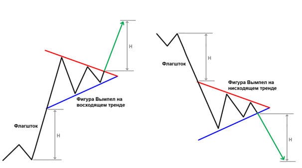
– In a pennant pattern, the upward or downward trend continues
– A pennant is a short-term pattern that usually takes one to three weeks to form. Creating a triangle usually takes much longer
Advantages of a pennant The big advantage is that despite the simplicity of the pattern, you can get a clear signal that allows you to make a quick decision.
It is easy and quick to observe both the fall and the increase in price associated with the further movement. The analysis of the pennant is quite uncomplicated, and the speed allows you to avoid mistakes. Of course, the frequent occurrence of false breakouts is not excluded. Technical analysis indicators will help to identify them.
Trading in bullish and bearish pennant patterns
Algorithm of trading by bullish and bearish pattern is similar, the only difference is the nature of open order – long or short respectively. The chart shows an example of trading in a bullish pattern.
Traders enter the market after confirming a breakout, which looks like a rapid change in price. The formation of the pennant itself after a sharp jump in price indicates the likelihood of a subsequent breakout and continuation of the trend in the direction of the initial movement.
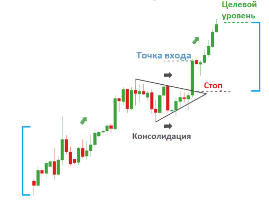
The closing level of the candle above the pennant indicates the entry point. In this example, the breakout was quite significant, which increases the likelihood that the upward movement will continue.
Given that the breakout was very significant, a stop loss can be placed at the low of the breakout candle or at the breakout point. A more conservative option would be to place a stop below the pennant level (below the low of the breakout candle).
Always keep in mind a reasonable risk/reward ratio.The target level can be obtained by projecting the height of the flagpole from the breakout point.
Flag pattern
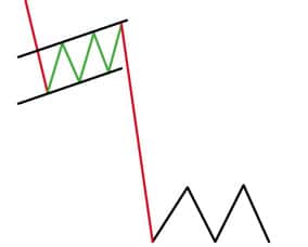
– A technical analysis tool which predicts the continuation of the current market trend. It consists of two parts: the “flagpole” and the flag itself (the channel in which the price moves. If to consider the Flag pattern in terms of waves, the “flagpole” is an impulse, and the flag itself is a correction. And, of course, when correction ends – a new impulse is realized, resuming the previous trend. Types of graphical figure Flag:
– Bullish flag.
– Bearish flag
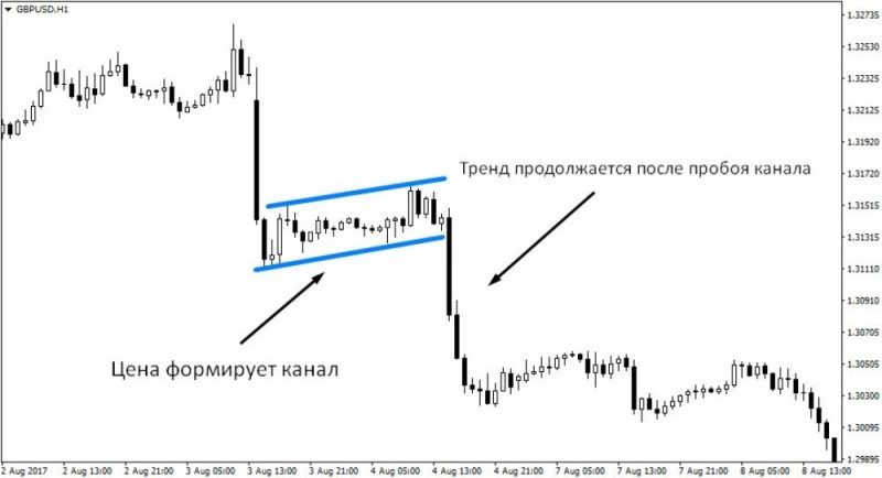
Bullish flag
In essence, a bull flag and a bull pennant appear in the same conditions (sharp and sudden price change), but it is in the conditions of flag formation that more attractive entry levels appear. A characteristic feature of the bull flag model is a downward sloping channel, which appears as two parallel lines against the preceding prevailing trend.
During this period of consolidation, volumes tend to decrease as the flag forms and rapidly increase on an upward breakout. As the name implies, this pattern resembles a flag hanging from a flagpole.

Bear Flag
Similar to the bullish flag pattern, the bearish variant is often associated with explosive price changes before and after the appearance of the pattern. A characteristic feature of the bearish flag pattern is an upward price channel, which appears as two parallel lines against the preceding prevailing trend.
The flag should not be confused with a rectangular pattern: the formation of the flag is completed in a much shorter period of time, and the consolidation has a clear bias.
How to identify the bull flag pattern
It can be quite difficult for beginners to identify a bullish flag pattern on a chart because this pattern includes several important components. Traders need to identify and correctly interpret these components in order to successfully trade on this pattern. Key points to consider when identifying the bull flag pattern:
– A preceding uptrend (flagpole)
– A period of downward consolidation (bull flag)
– If the correction exceeds 50%, the pattern forming may not be a bullish flag. Ideally, the correction should be completed before reaching a 38-percent level relative to the achieved peak of the preceding surge
– Entry into the market should be made upon a break above the high of the upper level of the consolidation channel
– Price could potentially break above the breakout point to the height of the flagpole
How to trade the bull flag pattern
The chart below is a successful example of a bull-flag pattern. The preceding uptrend (flagpole) is marked with a black bar. The price then consolidated in a downtrending price channel (marked in blue).
To use the bull flag pattern effectively, traders enter the market at the bottom of the emerging price channel or, more conservatively, wait for a breakout above the upper level of the price channel (marked with yellow circles). To get the expected target level, it is necessary to project the height of the flagpole preceding the formation of the flag to the breakout point (black dashed line).
The effectiveness of using a bull flag pattern depends on the correct identification of all its components.
Advantages of the pattern:
– The bull flag pattern works in all markets
– Easy to determine entry and exit points from the market
– Excellent risk/reward ratio
Disadvantages of the pattern:
– Identifying the pattern can be difficult for novice traders
Wedge pattern
A wedge is an upward or downward pointing figure with a triangle shape. Unlike the pennant, the wedge lines have one direction – upward or downward. What distinguishes the wedge from the flag is the different slope of these lines.
Like most shapes, it is formed after the trend stops, when the price fluctuations begin to fade.
There are two variations of this pattern:
– rising wedge (bearish) – with growing minimums and maximums.
– downward wedge (bull) – with falling minimums and maximums.
It may represent both a trend continuation pattern and a reversal pattern. One key thing to keep in mind: the successful realization of a wedge is preceded by a price exit in the opposite direction to the wedge. The signal for opening a short position on a “bullish” wedge is a break-down of the support line. A buy position on a “bearish” wedge is made after the resistance line is broken upwards.
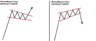
Conditions necessary for the formation of a wedge
– The first and one of the most important conditions is the presence of a trend. A bearish wedge must
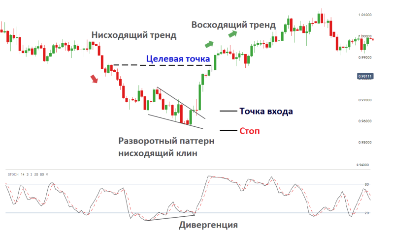
A downtrend will precede a downtrend and an uptrend will precede a bullish trend. This pattern is not absolute, because sometimes you will see an upward wedge when the price is moving up and a downward wedge when it is moving down. However, the trend must be present for sure. It is very hard to make money on a sideways market.
– Price consolidates within two trend lines: upward for a bearish pattern and downward for a bullish pattern. The peculiarity: the lines are not parallel, and one of them (as a rule, through which a breakthrough will be made) has a bigger slope than the other one. Thus, they are directed to the same point, as in the formation of a triangle.
– To build a wedge on a chart, we need at least two peaks and two troughs. As you remember, a trend line can only be drawn through two points.
– The wedge pattern, as opposed to the flag and pennant patterns, is not fleeting. It is formed within a month or even longer. The last, but not the least important condition is the trading volume decreasing. The more the trading range and volatility is narrowed during the wedge development, the less the trading activity becomes.
It means that medium- and long-term traders do not hurry to close their profitable positions and wait for the continuation of the initial trend. At the moment of a breakdown, trading volumes increase significantly and maintain this trend as the trend develops.
How a wedge figure is formed
The standard way to open a position is to enter the market when the price breaks the resistance line towards the continuation of the main trend. As a rule, the resistance is the trend line, which has a greater slope. Stop Loss is placed either under the level, or just below the minimum of the breakdown candle (this is for the descending wedge).
A conservative way to open a position is to wait for the first pullback after the breakdown. This is a less risky option because you already know that the wedge pattern has formed finally and the stock has started trending again. But, sometimes the price moves so strongly that it does not give a pullback. In that case, you may be left out of the market. We place the stop loss either below the level or slightly below the low of the reversal candle (that’s for a downward wedge).

The wedge shape is not as popular as some other trend continuation models. But, it is not inferior to them in its reliability and stability. The more elements of technical analysis you possess, the more trading opportunities will be open to you.
The Three Indians pattern
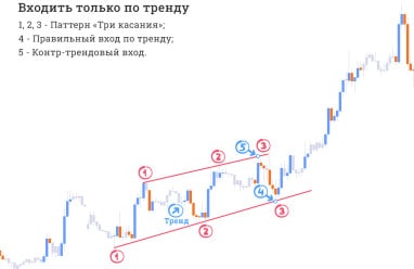
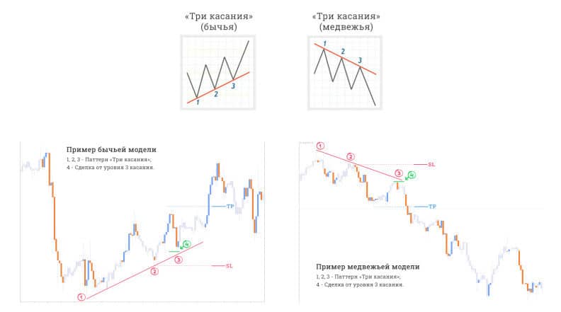
The “Three Indians” pattern is known to many traders as the “third point”. It is also called “pattern 1-2-3”, “three touches”. Its appearance on the chart is a signal of a trend movement, understandable even to beginners. As the name implies, the “Three touches” strategy involves finding three points. These points should be on one straight line, i.e., the trend line.
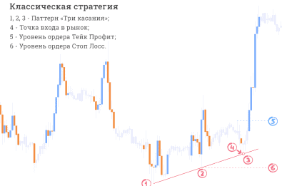
The classic strategy “3 Indians”
The essence of the classic strategy is that if you draw a trend line on two points, then the third touch of the price of this line, you can confidently make a deal on the trend. Please refer to the picture for details:
– Market entry – at the point 3 of price touching the trend line – point 4 on the chart above
– Take profit – when maximum of the figure is updated – level 5
– Stop Loss – is set at 6-th level of the second minimum
The beauty of this strategy is that we open trades only following the trend.
Quality criteria for the “Three touches” pattern
The figure of three touches on the interval M30 and less gives very weak signals. The reason is simple – not all market participants have time to notice it. Hence the conclusion: the longer the timeframe, the better. But even here it is not worth “going too far”. On a weekly interval (W1) they may even forget about the third touch.
2. The pattern of three touches implies entering the market only along the trend, so one should not make a mistake and look for a counter-trend entry.
3 It is best when each of the touches looks like a hairpin, as if the price carefully pierces the trend line and immediately comes back. The pattern itself should resemble a series of arches. This is all to say that the pattern should be as obvious as possible, then the probability of it working out will be higher.
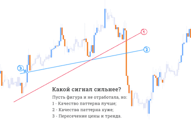
4. One more important nuance: the trend line should be drawn from the outside, so that it would not intersect with the price. That is, if the trend line were an infinite straight line, it should not intersect with the price in the near past.
A few recommendations when trading
1. Don’t immediately recklessly open a trade believing that the price will rebound at the third touch point. This pattern can act as a confirmation signal or a favorable point to enter, but not as a signal to enter. Therefore, to avoid getting in such situations, it is necessary to have the main signal.
2. In contrast to the previous point, very often the price still reacts to the third touch, even if it is not going to work, that is, there is a small rebound. We mean the situation when the price rebounds from the trend line, but does not go far and breaks through it. Perhaps it is a kind of manipulative maneuver. In such cases it is important to correctly assess the situation and, if such a development is assumed, to move the stop loss to the breakeven level.
Be careful when placing a limit order on this strategy. Considering the fact that the trend line is oblique and we cannot know the exact time when the 3rd touch occurs, the limit order in this situation has to be moved constantly. Therefore, it is better to open a trade manually when the price makes the third touch, in order to control what happens.
Trend reversal patterns
Head and shoulders
The most popular and used model for traders is exactly this reversal figure of technical analysis, signaling the imminent change of the current trend. It is quite light and represents 3 peaks, among which one is considered to be the central (head), and the other two are lateral (they also make up the shoulders of this figure).
The specific form-factor has similarities with the human figure, in which the central maximum point resembles the head and the others are the shoulders.
There is also an inverted pattern, when 3 lows are formed consistently, lying on the neck line. This is an inverted “Head and Shoulders” pattern, an undiminished mirror signal.
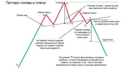
The line from which the value of the selected asset forms the above pattern is commonly referred to as the neck. On this line the pattern comes to its logical conclusion. In addition, its breakthrough is a signal to buy / sell.
The interval between this line and the central point is an indicative way along which the price will go after the neck break. Note, the neck can be not only in a horizontal position, it is not excluded the variant at a slant.
Features:
If an inverted head and shoulders pattern appears on a downtrend and the right shoulder is higher than the left shoulder, this pattern will be more significant. If the “head and shoulders” pattern appears on an uptrend, the right shoulder is lower than the left shoulder, this pattern will also be of greater significance.
Disadvantages:
– the model takes a long period of time to form
– significant price movement is completed after the model is formed
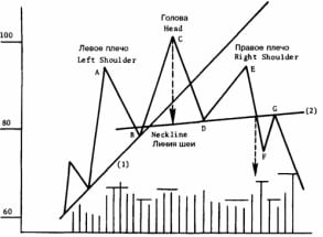
The left and right shoulders (A and E) are about the same height. The head (C) is higher than each of the shoulders. Note that each subsequent peak is accompanied by a decrease in trading volume.
The model is considered complete when the closing price is fixed below the “neck” line (line 2). The minimum price benchmark is equal to the vertical distance from the head to the neck line, postponed downwards from the neck line breakout point. At the subsequent rise it is possible to return to the level of the neckline, but prices do not manage to cross it”.
Inverted head-and-shoulders model
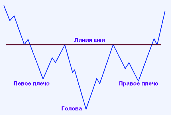
It is a mirror image of the one shown above. It indicates a change from a bearish trend to a bullish trend.
А. Elder in his book “How to Play and Win at the Stock Exchange” defines the following rules for working with this pattern: “Sell when you see the “head” or the right “shoulder” when volume drops, the trend line crosses and divergence between technical indicators and prices. The decline after the “head” forms the “neckline”.
If you are still holding a position, place the precautions below the “neck” line. The rise in the right “shoulder” is usually characterized by low volume and indicators of market weakness on technical indicators. It provides the last real opportunity to exit the uptrend with a profit. In the right “shoulder” the technical indicators often reach higher values than in the “head”, but they never exceed the maximum values reached in the left “shoulder”.
If you are selling on the right shoulder, place a stop at the top of the head. Make this order a Stop-and-Reverse. If the order is executed, the position closes and reopens in the opposite direction (see “Baskerville Dog” signal). After the “neckline” is crossed, a pullback with low volume provides an excellent opportunity to sell with precautions just above the “neckline”.
Double bottom – double top
This figure requires extraordinary attention and accuracy. The essence is that the double bottom may be a fragment of another, very complex pattern. For example, it may be a rectangle as a trend continuation pattern or a triple bottom.
The double top is formed in the period of the bull market, and the bottom – in the bear market. The pattern is formed by means of two pikes that are on the same line. The specific shape somewhat resembles “M” – as if there were two tops, or vice versa “VV” – two bottoms.
The considered figure includes the neck, from which the model begins to form. Its breakthrough means that it is necessary to buy urgently. The target value is the duration of the gap, which is between the neck and the top.

By analogy with a double top we can also make a triple top or a bottom. The only difference will be one more extremum. Such a picture in practice is extremely rare. Both figures are strong reversal patterns.
If you manage to understand and find such figures in time, you will have a chance to enter the market at the best price. The model appears on the top of a protracted upward trend.
The idea is as follows: the market moves up and meets some resistance, the price itself rolls back down. We should mark this peak and draw the level of resistance, if the next approach, the price rebounds from the level of resistance downwards and breaks the neck line, the trader has the right to assume that there is a large player in the market, able to prevent the price higher, and we will see the formation of reversal figure of double top.
Double Bottom is the antipode of Double Top. All the above mentioned can be applied to this model, except that the market should be going downward, and instead of a resistance level, in this case, it will be a support level. In other words, there is a big buyer in the market who has the goal to see the price much higher.
Our task is not to prevent him, but to follow him. So: double top – on the up-trend, double bottom – on the down-trend. To determine the takeprofit level, we need to take the height between the two tops and the low between them, and measure the same distance down from the neckline (as in the figure below).
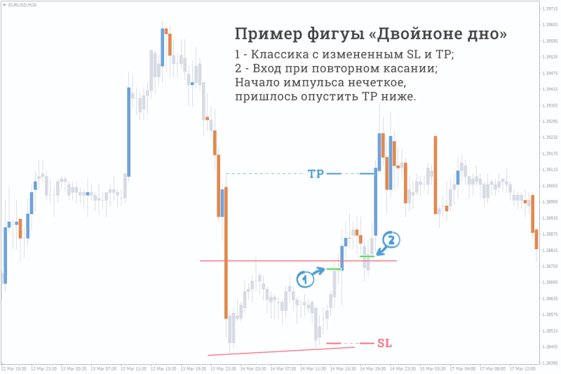
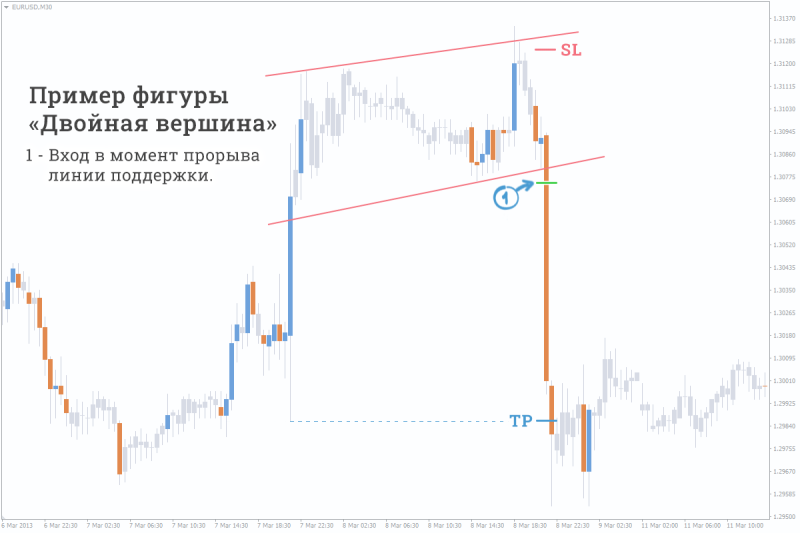
Triple top
It is included in the group of reliable patterns (figures) and signals about the coming reversal of the upward (bullish) trend. Visually it represents three consecutive peaks (tops) of approximately equal height. Formally it may be considered as a special case of the head and shoulders figure, where the height of the head is approximately equal to the shoulders. Moreover the difference between them is purely academic, because from the practical point of view both of them testify of the change from ascending trend to descending one.
Analysts consider the triple top to be a reliable pattern, just like the head and shoulders. In fact, the pattern reflects three consecutive unsuccessful attempts to break a resistance level. Each successive unsuccessful attempt indicates that the bulls are weakening and increases the probability of a future reversal.
In technical analysis the triple top is one of the most difficult to recognize and “tricky” figures for the investor. Until the third top is formed this figure looks like a classical double top. Also three consecutive tops, approximately equal in height, are characteristic of the patterns of the ascending triangle and rectangle, which are trend continuation patterns. Thus, the triple top gets the final confirmation only after the convincing breakthrough of the bottom support level, which should be accompanied by a sharp increase in trading volumes.
For the correct identification of the figure the analyst should pay attention to the following important moments:
– The formation of the triple top must be preceded by a pronounced ascending (bull) trend, which must last not less than a month, and preferably several months.
– Three consecutive tops should be clearly marked and be approximately of the same height. The upper resistance level is built through their maximums (points 1, 2, 3). It is desirable that the maximums differ from each other by no more than 1-2%.
– The lower level of support is built through the minimum of the trough after the first and second tops (points 4 and 5), depending on which of them is lower.
– As the triple top develops, there should be a gradual decrease in the volume of trading. However, local growth of trading volumes in the area of vertex formation is considered to be acceptable. It is a confirmation of gradual weakening of the bulls’ pressure on the market and a sign of an approaching trend reversal.
– The triple top gets its final confirmation only by the fact of penetration of the bottom support level after the third top is formed. The penetration should be accompanied by a significant increase in trading volume, as well as the appearance of price gaps on the chart is desirable. After the breakdown the support level becomes a resistance level, in the area of which further price correction movements are possible.
– To determine the price movement target it is necessary to measure the distance (H) between the lower support level and the maximum point of the triple top. Then this distance should be subtracted from the break-down of the lower support level.
– The reliability of the figure directly depends on the length of time during which it has been formed. It should be not less than some months.

Triple Bottom
Triple Bottom is a bullish pattern, which in technical analysis is an indicator of downtrend reversal. It is the full antipode of the Triple Bottom, and all actions in this pattern are mirror-like.
– The Triple Bottom must be preceded by a clear downtrend (bearish), the period of its formation should be not less than a month, and preferably 2-3 months.
– The support level is formed by three consequent minimums (points 1, 2, 3), which should be nearly of the same height, isolated and distinct.
– As the triple bottom is formed the volumes of trade usually decrease, but in the area of lows there may be a local increase. However, growth after the third minimum should be accompanied by a sharp increase in trading volumes when the resistance line is broken.
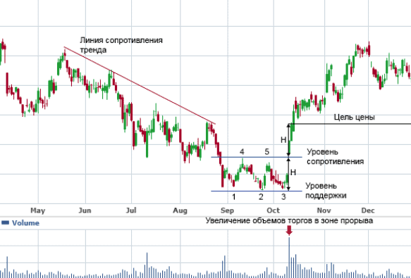
– Since this reversal pattern is neutral, its final confirmation will be obtained only by the fact of breaking the resistance level, which passes through the highest corrective maximum (points 4 and 5) between the minimums. After the breakout, which should be accompanied by an increase in trading volume, the resistance level turns into support, to the area where further corrections are possible
– To determine the price movement target it is necessary to measure the distance (H) between the support and resistance levels and then mark it up from the breakout point. At that the longer the triple bottom has been forming, the bigger the potential for the price movement will be.
The Diamond pattern
The Diamond is a quite rare graphical pattern in the financial markets (sometimes it is also called the “Diamond” or “Rhombus” pattern), but if identified correctly, it allows traders to make quite good money.
The model, in fact, is a pair of triangles smoothly flowing into each other. The first triangle is an expanding one, the second one is symmetric. Their boundaries and form a diamond-shaped pattern. The model can be formed at absolutely any timeframe, even the smallest. The rule is simple: the larger the timeframe, the more reliable the figure is. The optimal period is a daily (D1, Daily) and higher.
The ideal structure of the pattern “Diamond” is a clear symmetric diamond. But let’s be realistic, even among the real diamonds there are stones with defects and clouding. The same is true for a pattern; in real market conditions, its borders can be flattened, stretched or displaced. This is all quite acceptable, as long as the basic principles of pattern formation are followed.
The main rule of “Diamond” trading – do not trade within the pattern! Trading positions should be opened only at the breakdown of a pattern.

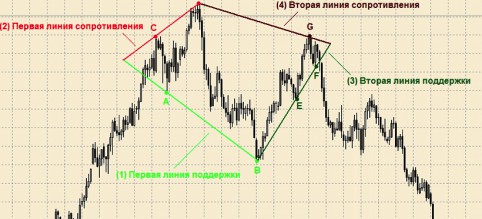
Identification of the diamond pattern
Recall that this pattern is a synthesis of two triangles: an expanding one and a symmetrical one. That’s why first we draw one pair of support and resistance levels (which extend from one point), then we draw the second pair of trendlines (which converge to one point). The more local minimums and maximums we have in order to draw the pattern borders, the better.
Market entry
The diamond is first of all a reversal figure, so we will enter the market in the direction opposite to the direction of the current trend. There are dozens of variants for opening a trading position in case of the Diamond pattern. Different traders practice different ways, but all agree on one thing – never trade within the pattern! Therefore let’s consider the main ways of opening a long position (buy) with a pattern already formed. The opening of short positions (sale) is made according to similar, only the opposite rules.
Options:
(a) On price breakdown of the highest level of the pattern (the upper point of the Diamond)
b) by the close of the candle above the resistance line (upper right border of the “rhombus” outlining the pattern)
c) when the price rebounds from the resistance line, after it has crossed the line in the up direction and returned to test it
d) in case the price exceeds the level of the last important “Diamond” maximum
Stop Loss
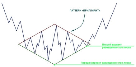
Take Profit
The classic variant of setting the take profit is as follows. First we measure the height of the figure. It will be the distance from the minimum of the “Diamond” to its maximum. Then the resulting distance is subtracted up from the entry point of the market. At this level we place the Take Profit.
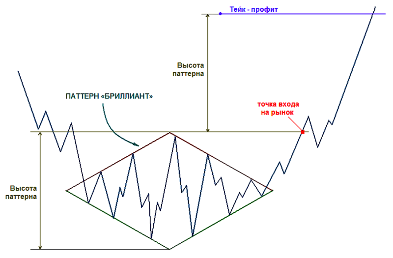
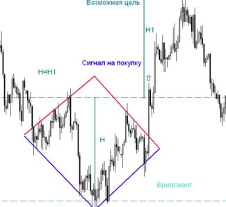
Three peaks and a domed house pattern
As you can see on the picture the pattern is 28 points, which can be highlighted on the chart. It appears quite often and you just have to pay attention to see it. starting from number 1 – growth comes through the point 2 of correction and then makes three peaks 3-5-7 which give the first part of the pattern name. then comes the zigzag down 8-9-10 after which growth starts with crossing the point 7.
Already at this point we can think that we are developing Three Peaks and Domed House Zigzag 7-8-9-10 is very often seen especially clearly.
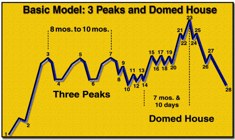

Fibonacci levels
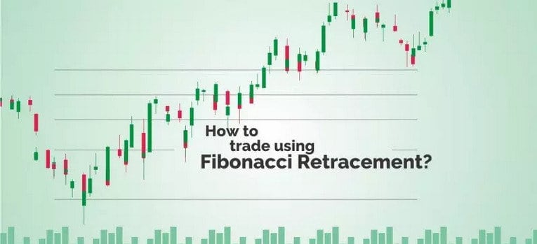
When price moves in the direction of a trend, it is called an impulse, while a move against a trend or against the main trend is called a pullback. Fibonacci retracement levels highlight levels that help us identify a potential reversal area, thereby identifying a potential entry point after a pullback.
A pullback can be applied both after an uptrend and after a downtrend in order to determine likely reversal levels in the direction of the previous trend.
When combined with other technical parameters, price parameters and some important moving averages, the chances of identifying successful trades increase.
The most popular Fibonacci retracement levels are 38.2%, 50% and 61.8%, 78.6%.
Understanding Fibonacci Series
Before we delve into the topic of Fibonacci retracements, it is important to understand the Fibonacci series.
A Fibonacci series is a series of numbers beginning with 0 and arranged in such a way that any particular number in the series is simply the sum of the previous two numbers, as shown below:
0, 1, 1, 1, 2, 3, 5, 8, 13, 21, 34, 55, 89, 144, 233, 377, and so on.
Let’s break down the above logic with an example-
377 = 233 + 144
233 = 144 + 89
144 = 89 + 55
89 = 55 +34
55 = 34 + 21
34 = 21 + 13
And it goes on.
An interesting property of this Fibonacci series is that if you simply divide any number in the series by the previous number, the ratio will always be 1.618; which is considered the golden ratio, also called “Phi”.
Let’s take a closer look at this-
377/233 = 1.618
233/144 = 1.618
144/89 = 1.618
89/55 = 1.618
55/34 = 1.618
34/21 = 1.618
and so on.
Let’s look into some other properties of this relationship, and you’ll find a unique consistency when a number in the Fibonacci series is divided by its nearest next number in the series.
For example:
21/34 = 0.618
34/55 = 0.618
55/89 = 0.618
89/144 = 0.618
144/233 = 0.618
A similar consistency can be seen when any number in theFibonacci series is divided by a number two digits above that number. For example:
13/34 = 0.382
21/55 = 0.382
34/89 = 0.382
55/144 = 0.382
89/233 = 0.382
Similarly, when you divide a number by a 3-digit higher number in the series, the consistency still holds and is displayed below:
13/55 = 0.236
21/89 = 0.236
34/144 = 0.236
55/233 = 0.236
So, if we express all of the above numbers as a percentage, the value comes out as 23.6%, 38.2%, 61.8%, and so on.
How do I use Fibonacci retracement levels?
Whenever there is a sharp move up or down in the stock price, there is usually a high probability of a pullback before continuing in the direction of the main trend.
For example, suppose a stock goes from Rs. 100 to Rs. 200, then there may be some pullback to 170 before going higher to say 250.
Fibonacci analysis has its uses in the stock market and can be applied when you are expecting a correction after a sharp move up or down.
It can help you identify major stops or likely bounce levels after a decline or rise, as the case may be.
These Fibonacci recovery levels give traders a good opportunity to open new positions in the direction of the trend.
Important Fibonacci coefficients are the 23.6%, 38.2%, 50% and 61.8% recovery levels which help traders determine the likely degree of recovery and position themselves for trading accordingly.
Usually a pullback at 23.6% is relatively shallow and suitable for a flag break or short-term pullback.
On the other hand, a 61.8% pullback is relatively deeper, which is considered the golden section and is a very important level.
However, pullbacks in the 38.2%-50% range can be viewed as a moderate correction.
Normally, if a stock bounces back from a 38.2% recovery, the underlying strength of the previous move is considered strong. You can try the Fibonacci retracement calculator to have a good idea of the concept.
An example of a Fibonacci retracement
Let’s take a look at some recent examples to better understand the concept of Fibonacci retracement.
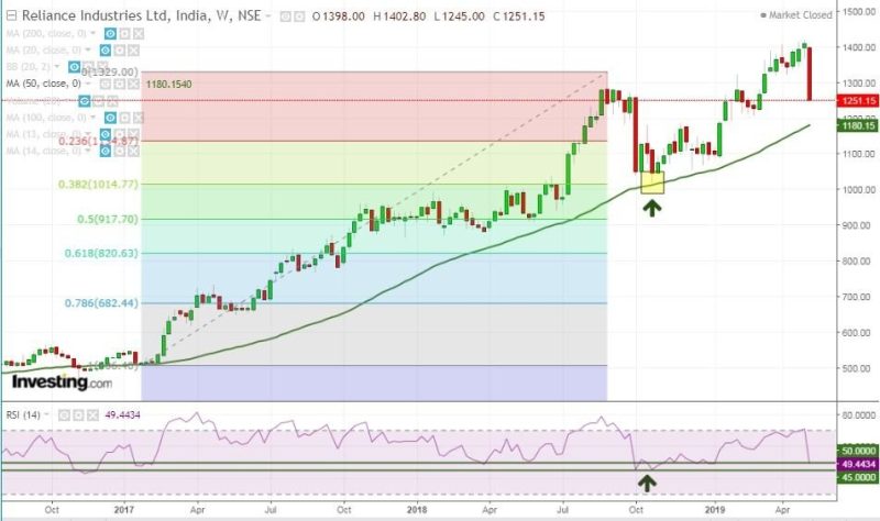
The above example of Reliance Industries, where after a steady movement that began in 2017, there was a correction in August. 2018.
But it received support exactly from the 38.2% recovery and witnessed a sharp rebound in the coming months.
Further technical confirmation from the 50-period MA and the RSI 45-50 zone confirmed the rebound.
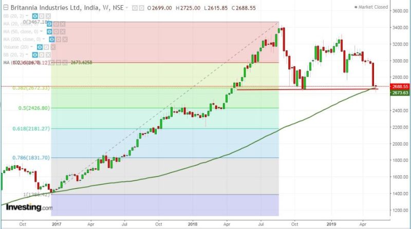
The next example is Britannia ltd, where the stock is currently bouncing off the convergence of the 38.2% retracement and the 100-period MA, and if the stock can trade and maintain above this week’s low, there could be a possibility of some stock pullback.
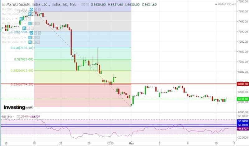
The following is an example where the Fibonacci retracement is used in the case of a downtrend and is drawn by connecting the highest point with the lowest point. As you can see, the stock has continually encountered resistance from the 23.6% retracement, which is further confirmed by the RSI as it cannot break through the 45-50 level.
Watch the video below to learn more about the Fibonacci retracement:
Bottom Line
While Fibonacci is one useful method for analyzing your chart, it does not provide an exact entry point, but rather an estimated entry area.
In addition, there is no guarantee that price will reverse from any specified Fibonacci level and therefore you must combine it with other technical parameters as confirmation.
Fibonacci Arcs
Arcs are the tool that is most effective when prices are flat and are used to catch a correction. Like other Fibonacci indicators, arcs stretch from the start point to the end point of a trend or wave. And it is allowed to build arcs both from the beginning to the end and from the end to the beginning of the trend – it only depends on the direction of the curve.
In the classic version of the tool there are only three arcs located within the range of the initial trend. However, as the price moves away from the key points, the lines diverge, somewhat expanding the target range.
In contrast to previous tools, arcs are notable because they also take into account the time factor. It allows traders not only to estimate how the price will behave, but also at what moment it will happen.
Fibonacci Arcs strongly depend on the chart scale. The most suitable scale can be chosen by analyzing the instrument’s performance on history. As well as the fan, it is recommended to use arcs together with other methods of technical analysis.
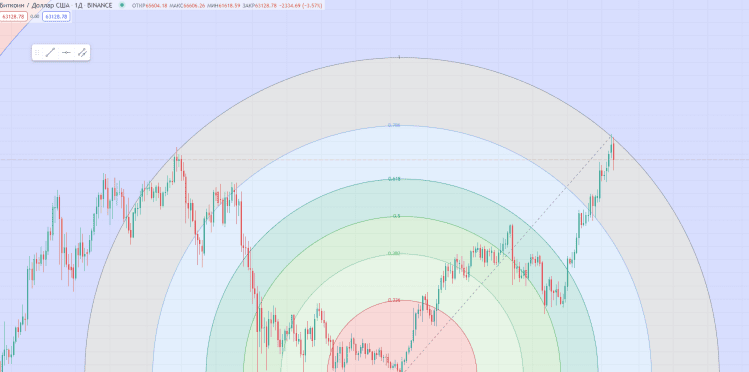
Elliott Waves
Fibonacci levels are often used in conjunction with the Elliott Wave Theory. According to this theory, any trend movement in a financial instrument can be decomposed into five waves:
Three of them (1, 3, 5) cause a directional movement. They are interspersed with two oppositely directed waves (2,4). The first ones are called motive, impulse, the second ones are called corrective, rollback. Motive (motive): 1-3-5-A-Corrective (corrective): 2-4-B
Any corrective motion can also be decomposed, but into three waves. All of the internal waves are also decomposed according to the fractal principle (a fractal is a self-similar structure). This process is illustrated in the figure below.
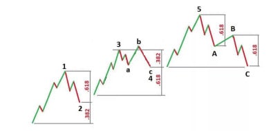
Understanding which wave the price is forming now, makes it possible to assume where it will go next. The third wave is the most interesting for traders. It is considered the longest and fastest wave. The ideal transaction using the Elliott Theory is to enter the transaction at the end of the second wave and exit from it at the end of the third wave.
According to the theory, the height of the 3rd wave refers to the 1st wave as 1.618. So, if we see the 1st and 2nd waves already formed, we can calculate the length of the 3rd wave using the Fibonacci levels. To do this, we need to stretch them so that 0 is at the beginning of the first wave and 100 is at its end. And then just drag the whole construction so that 0 is at the end of the second wave. It is constructed by three points: the beginning of the first wave, the end of the first wave and the end of the second wave.
The main thing is to observe these points on the price scale vertically. Horizontally, the position of the points is not so important. The Fibonacci levels will appear on the screen, and the level marked 1.618 will mark the estimated end of the third wave.
It should be noted that not always the end of the third wave falls on the level of 1.618. Quite often, the price slightly misses or is slightly ahead of this level.
In addition to determining the length of the third wave, a number of specialists suggested ways to determine other waves. The book by B. Williams “Trading Chaos” proposes the following system for determining the length of the waves:
– 1 wave – determined by the fact of formation
– 2. Wave 2 – most often ends at correction levels of 50.0 and 61.8.
– Wave 3 – is from 1 to 1.618 of the first wave length.
– The 4th wave – most often it ends between the correction levels of 38.2 and 50.0, and more often
– most often looks like a sideways movement.
– 5th wave – makes from 61.8% to 100% of the range between the beginning of the first wave
– and the end of the third wave.
According to Elliott, the five-wave model has three constant properties:
– wave 2 never crosses the starting point of wave 1;
– wave 3 is never the shortest of the waves;
– Wave 4 never enters the price territory of wave 1.
Let us look at an example of a chart.
Impulse waves are marked in green, and corrective waves are marked in red. (This is considered a variant in a bear market, we have the opposite picture in a bull market)
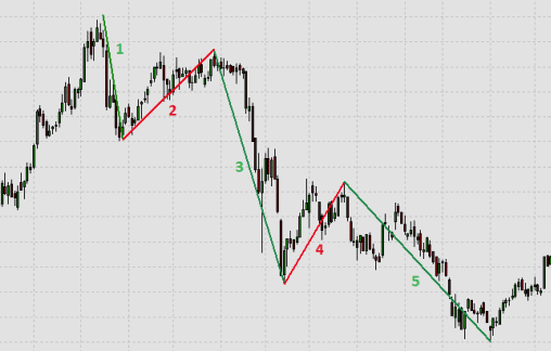
The following types of waves are distinguished by time:
– main cycle (century) – supercycle (40-70 years)
– cycle (several years)
– primary level (a few months to a few years)
– intermediate level (a few weeks to a few months)
– secondary level (weeks)
– minute level (days)
– miniature level (hours)
– super-small level (minutes)
The most difficult question in the application of Elliott Waves is: “What wave is the price in now?” There is no consensus on how to determine the starting point of the first wave among the adherents of the wave theory to this day, and probably never will be. Each existing wave is always in several states: it is part of a larger structure and contains several less significant models.
From a practical point of view, the most effective approach is: “If you are not sure, don’t trade”. In some instruments, waves in a certain phase are drawn very clearly and easily identified. In others, it is almost impossible to identify waves. It is necessary to find, through regular observation, among the entire variety of instruments, those that are clearly visible to you, and trade only them. And as soon as waves start to break, switch to another instrument.
It is important not to get hung up on one instrument trying to find waves where there are none. In addition, the trading system should necessarily include a plan for the case of negative events. Stop-loss should provide a risk/profit ratio of not less than 1/2.
Bollinger Bands
Bollinger Lines (Bollinger Bands, BB) – a widely used technical indicator, reflecting the current price deviations.
The idea of the Bollinger Bands is to combine a trend indicator, a volatility indicator and an oscillator. The bands indicate on a chart the direction and range of price fluctuations, taking into account the trend and volatility characteristic of the current market phase.
Graphically, the indicator consists of three lines: the moving average in the middle, characterizing the main direction of the movement, and two lines, limiting the price chart from both sides and characterizing its volatility.
The upper and lower lines are the same moving average, but shifted by several standard deviations. Because the value of the standard deviation depends on the volatility, the bars regulate their own width: it increases when the market is unstable, for example, during news releases, and it decreases during more stable periods.
Thus, the indicator implements the functions of an oscillator in a more convenient form, when it is possible to immediately assess whether the instrument is overbought or oversold on the chart, taking into account the amplitude of the fluctuations.
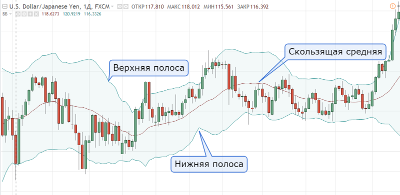
The basic rule for the construction of Bollinger lines is the following statement – about 5% of prices should be outside these lines, and 95% inside. At that price should periodically touch the borders of the channel, and at sharp movements short-term chart exit beyond the borders is acceptable.
Period
For Bollinger Bands it’s recommended to set the period from 13 to 24, the most common – 20, and the deviation from 2 to 5, the recommended value – 2 or 3.
Timeframe
The Bollinger Bands work equally well on any timeframe, but, as a rule, they are used for intraday trading.
The method of constructing the indicator is as follows.
A moving average MA is plotted (usually EMA with a period of 20, but not necessarily). Root-mean-square deviation of closing prices from the moving average on the average period is calculated. A channel is built around the average, the band width of which is proportional to the standard deviation from the moving average for the analyzed time period:
BBTop = EMA + K*SCO
BBBottom = EMA – K*SCO
where BBTop is the upper limit of the channel;
BBBottom – lower limit of the channel;
K – the proportionality coefficient set by a trader;
EMA – root-mean-square deviation of closing prices from the moving average characterizing the market volatility.
Exit of prices beyond the indicator boundaries
As a rule, going over the BB boundary means the beginning or continuation of a trend. Thus we can judge about the market direction – as long as prices touch and break through the upper limit, the trend is upward. While prices break through the lower line – it is a downtrend. Sometimes going over the Bollinger line means a “false-break”, i.e. when prices have just tried a new level and immediately went back.
In this case you also have an opportunity to work against the trend, but carefully assess whether the “breakout” is really a “false” one. Note that such counter-trend opportunities occur infrequently and are characterized, as a rule, by a strong run out beyond the boundaries of the indicator. Such situations are usually very good-looking.

Price rebound from the average BB line and its crossing
Proper selection of the indicator period turns the average BB line into a dynamic support/resistance level, which works perfectly on a confirmed trend. Crossing the average indicator line often means a change in trend.
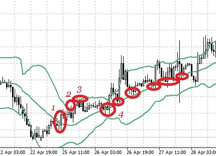
Bollinger slope and price location relative to BB lines
According to the Bollinger slope, as well as according to the price location relative to the middle line, we can judge about the current trend direction – up trend when the BB slope is up, down trend when the BB slope is down. Price under the middle line indicates a downward trend, with prices above the middle line we can talk about an uptrend.

Narrowing and widening of Bollinger lines range
The market tends to move from a trend phase to a stagnant phase. And when we see that the market has been quiet for a long time, we should wait for a storm. The Bollinger range becomes wider when the market instability increases and narrower when it decreases. A narrow Bollinger range indicates a sleepy, calm market.
The strongest market movements usually start from a flat base (the so-called “shelf”). The Bollinger range helps determine the moment of transition from a calm to an active market. When prices rise from a very narrow Bollinger range, it gives a signal to buy. When prices fall out of a very narrow Bollinger Band, it gives a signal to sell. If prices return to the range, we should close the position. BB divergence can be observed when the current trend strengthens or when a new trend starts.
The longer the rate is traded in the narrow limits of the price channel (flat), the stronger and more rapid will be the exit from it. In response to the price awakening the BB bands open. If as the price approaches the BB boundary it starts to grow, most likely the movement will continue.

Trend continuation and reversal
Powerful buying and selling can take the price beyond the Bollinger Bands. Experience shows that in most cases no more than four candles in a row go over the Bollinger line, after which a correction or reversal occurs. But it is very risky to trade against these movements, because the market could go into a short series of very volatile swings before reversing and knocking your stops out.
Using Bollinger Bands with other indicators
As a rule, BB is used in trend systems where an entry is made towards the trend after some pullback. In addition to relying on the BB average line, it is logical to use an oscillator to confirm the end of a pullback. As an example, the Stochastic and RSI would work very well in a pair.
Wolfe Waves
Wolf Waves is a method of thehanalysis, during which the search and study of certain graphical patterns is carried out, and using the tools based on the principles of this theory, the optimal points for entering the market are determined. Woolf wave analysis can be applied to timeframes of any length, starting from five minutes.
Unlike Elliott Wave Theory, there is no need for additional markup on different timeframes when working with Wolf Waves, which greatly simplifies the whole process. In addition, the analysis is carried out during the work, which gives good practical results.
This theory is based on the law of physics that every action has its own counteraction. The Wolf wave can be either “bullish” or “bearish”. The difference is in the direction of the trend, otherwise they are absolutely identical. In the first case we observe the formation of an uptrend, in the second – a downtrend.
Regardless of the type, any Wolf wave consists of a series of segments, which together with the lines drawn through their tops form an “expanding wedge” pattern.
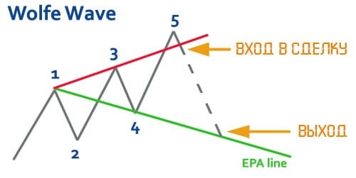
Bullish waves

As the name implies, this wave tells us that the market will soon be able to enter into a long position. This pattern appears on the basis of waves that are directed in different directions (in fact, we can observe an increase in volatility, which leads to the appearance of a divergent triangle).
It is necessary that the graph corresponds to the following conditions:
“1” is marked with the bottom of the wave, which becomes the base for the whole model.
“2” is assigned to the first significant top. It may exceed the previous maximum, but it is not a mandatory condition.
“3” forms the minimum, which must be located below the level of the base.
“4” must rise above “1” but does not reach the top of “2”.
“5” again forms the minimum, which will be under the “three”.
“6” is the most powerful sub-wave in this model.
That the structure has begun to form can only be seriously considered after the first four bars appear on the chart. A straight line is drawn through the bottom of “1” and the maximum of “4”. Its end is supposed to coincide with the top “6” and become the point of fixation of profit. Another line is drawn through the first and third minima.
In the classic version, this segment ends with “5”, from which the movement begins with “6”. This is the entry point into the market. However, in many cases, the “5” does not coincide with the line – it does not reach or crosses it. We will consider this point later.
You should trade exclusively on the sixth wave. To enter the market, it is not necessary to wait for its beginning on the chart.
Bear Waves
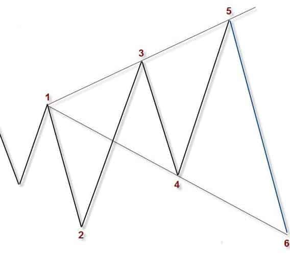
this type of waves is a mirror reflection of the “bear” waves. Accordingly, the conditions for their formation are opposite:
“1” is the top of the model.
“2” represents a significant trough.
“3” is a new maximum, exceeding the initial peak.
“4” drops below “one” but does not reach the level of “two”.
“5” forms another maximum, which will be higher than “three”.
“6” is the powerful finish of this model.
The first wave is formed by points 1 and 2. In the second wave, point 3 should be higher than point 1. As for the third wave, in it, point 4 must be above point 1. Point 5 of the fourth wave must be above points 1 and 3. Finally, the sixth point in the last wave is the result of the model working out.
Conditions for making waves
In order to finally verify the formation of the Wolf wave, it is necessary to subject it to a certain verification. For a “bullish” model, initially a “2” is identified, that is, the first top. Then “3” is identified and only after that “1”, which should be higher. They are followed by “4” and “5”. The last one is ideally located right on the line, built through the minima 1-3.
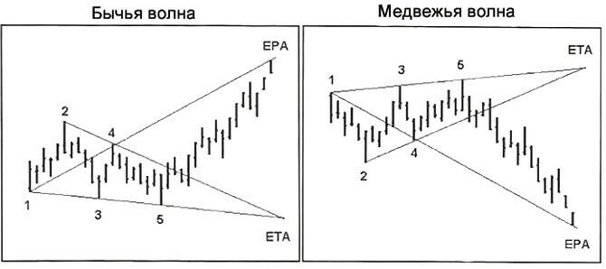
At the next stage through “1” and “4” the EPA is drawn – the tentative price line on arrival. As soon as the price chart reaches it, the moment of fixation of profit comes. We will be able to see the ETA (Estimated Time of Arrival) when the lines passing through “2”-“4” and “1”-“3” connect.
For the “bearish” model, “2” is also defined first, which is the first trough. Then look for “3”, “1”, “4” and “5”. The EPA line is plotted through 1-4, the ETA point is formed from the intersection of 1-3 and 2-4.
The wave at points 3 and 4 and its features
Sometimes the wave that is formed by points 3 and 4 can look like a triangle. This confuses beginning traders. They start to believe that the model does not work out. Nevertheless, if the lines are correctly drawn on the points, the model is clearly visible on the chart.
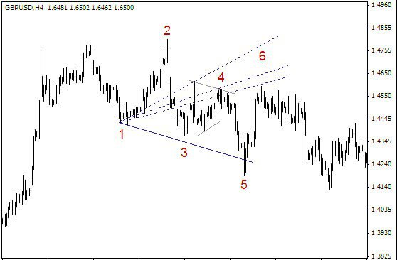
If you draw the top edge of the diverging triangle on top of the small triangle, you get exactly the picture you need to analyze using Wolf waves.
Sweet zone
A “sweet” zone is formed when a price channel is built. One boundary is built through points 2-4, the parallel boundary goes through “3”. The highlighted area in the figure is called the Sweet Zone.
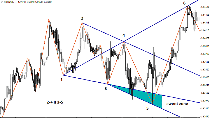
“5” rarely coincides with the line 1-3. Its presence in the boundaries of the zone confirms that the figure in question is a Wolf wave. In some cases, one of the channel lines is built through “1”.
The perfect Wolf strategy
The more perfect the wave, the higher the probability that the price will reach the set take profit. Perfect patterns are rarely formed, it is a serious luck to find them.The requirements put forward for “elite” waves.
1. “2” should be a local peak/trough.
2. The figure formed by lines 1-3 and 1-4 is called “nose”. It is required that they are located symmetrically with respect to the horizontal line drawn through the “unit”. At the same angle should not be obtuse.
3. The distance between “one” and “two” contains more candles than in wave 3-4. In addition, these segments are parallel or close to it.
4. “3” stays within the borders of the channel formed by the lines through 1-2 and through “4”.
5. “5” coincides with the line 1-3. It is formed by not too many candles, i.e., it is not stretched in time. “5” should be shorter than “3”.
6. The group of points 1-2-3 is assembled less compactly than 3-4-5. The distance between “3” and “5” is shorter than the distance of the segment 1-3.
Wolf waves as an example
There are several options for entering the market with the Wolf Waves. Let’s start with the classic strategy – entry from “5” on Take Profit. If the trader believes that the wave is close to the ideal, he can put a minimum stop order. In this case, the profit/loss ratio becomes the most profitable. An additional signal can be the presence of “5” at a significant Fibonacci level, the divergence between 3 and 5 on the MACD, as well as some other messages formed by extraneous indicators.
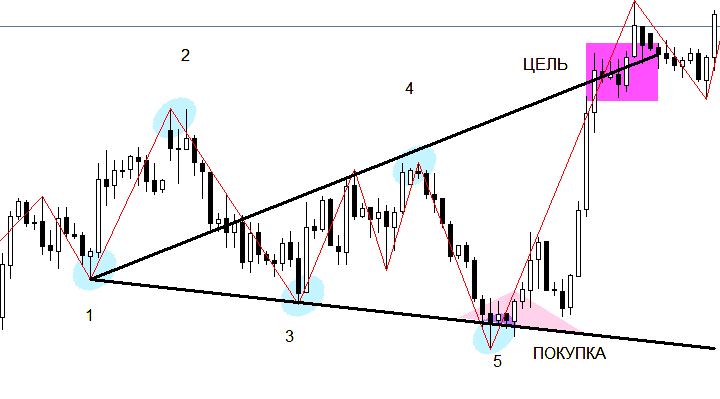
The following strategy involves entering when a pin bar (pattern of three candles) closes on the 1-3-5 line. The stop loss here is small, which is always a plus. In this case, too, it is recommended to use additional signals.
When the price enters the Sweet Zone and returns from there, closing above (the “bullish” pattern) or below the line 1-3-5 (the “bearish” pattern), it is worth to make a buy or sell deal. Use of the pending order is recommended.
The quite widespread trading variant is the entry into the market at the level of point 3. Its disadvantage is a solid stop, which should be placed above the last local extremum. The signal is formed at the moment of price return and formation of a fractal. There are other methods, but for high-grade work it will be enough the above mentioned.
VSA trading
The forecast based on the dynamics of market volume changes is considered one of the most reliable. The methods are applicable to any exchange asset, as they are more related to the psychology of trading participants, rather than mathematical calculations as in technical indicators. One of the most popular strategies of this group is VSA analysis (Volume Spread Analysis).
VSA cannot be considered a trading strategy in the sense that it does not provide clear rules for opening/closing a position as it is common in technical analysis. In this case, the trader gets a general technique of “reading the market” by market volumes, allowing, first, to see the moment when big players (smart money) appear in the market. Secondly, to follow them and not to allow themselves to be squeezed out of the market on a false pullback or correction.
VSA signals consist of the spread (the difference between the High and Low of the price bar), volume (determined by appropriate indicators) and the background (the dynamics of spread/volume readings). The authors of the methodology do not give clear recommendations on what historical period would best determine the background, but usually it is not less than 15-20 previous bars on any timeframe.
Spread is the height of the candlestick body and its shadow; it can be narrow, medium or wide (by eye).
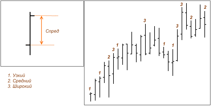
Bars, except for the rising/descending variants, are additionally classified by the ratio of the closing price to the total spread value.
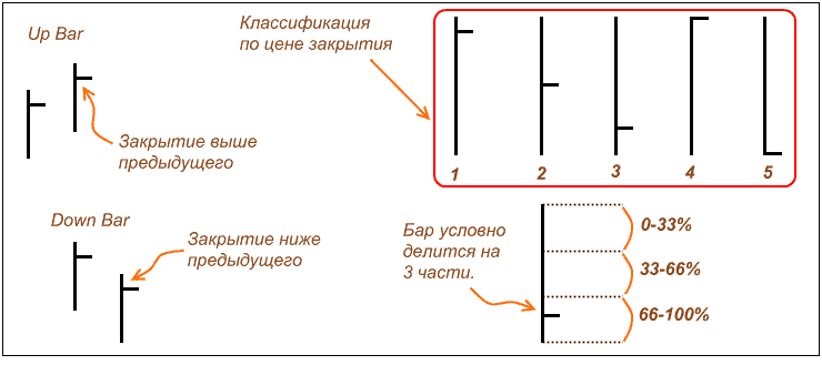
There are four types of volumes
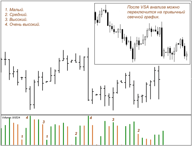
There are four types of volumes
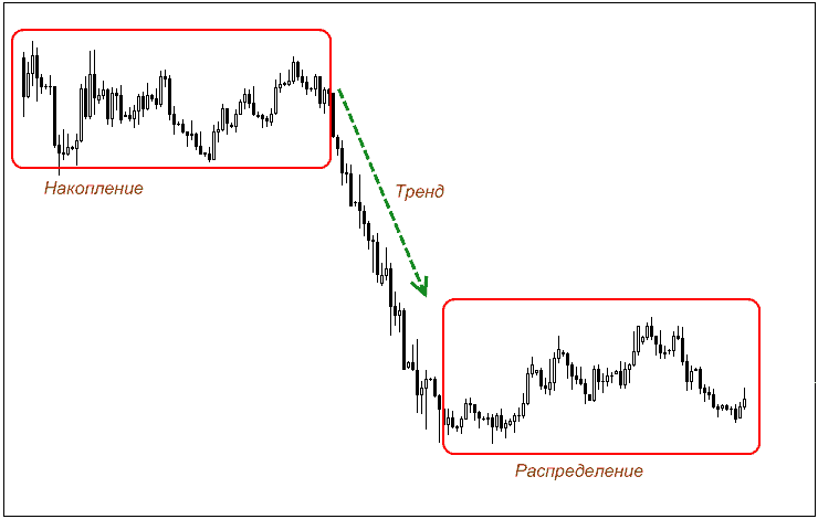
The method of volume analysis assumes that the accumulation occurs at the end of the trend, when the “crowd” panically sells out positions at minimum/maximum prices. In this case, the big players buying them up are not able to quickly increase liquidity. The accumulation is stretched in time, which is reflected in the consolidation in a fairly narrow corridor.
False breakdowns occur inside this corridor with the appearance of unstable VSA signals. It is important to distinguish between the accumulation and distribution stages where sideways movement is also observed. When there is an accumulation, there are bars with smaller volume near the lower border of the corridor.
For the VSA distribution, the analysis gives the opposite situation with signals of weakness at the bottom of the range. When the accumulation reaches a critical mass, the market moves into a trend state accompanied by the periods of adding positions (re-accumulation) as it strengthens. Those who are new to the method of volume analysis often have difficulty knowing what to consider a short-term pullback and what to consider a reversal.
To do this, look at the signs of the beginning of the distribution and other technical analysis tools, despite the fact that the theory of VSA does not welcome them. It is also recommended to partially fix profits and use a trailing stop.
The distribution will be the end of the next market cycle, when VSA signals indicate a decrease in the open interest of large players – small players sold out or squeezed out of the market. On the chart, this is expressed in frequent pin bars, reduced volumes, or volumes with no result at all. These are clear signs of closing and lack of demand.
Basic VSA signals
Upset reversal pattern
Traders also know this method of determining the reversal as a pin bar, similar combinations of bars, indicating the imminent reversal of the trend, are also available in chart analysis. The practice of renaming the known figures is typical for various “extended techniques” and in the case of VSA the Volumes indicator is added as a confirming factor.
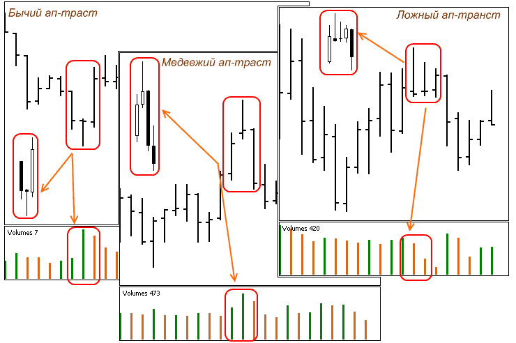
If the appearance of an up-trust is not accompanied by an increase in volumes, VSA analysis considers such situations to be false, and they should be skipped. Moreover, they appear quite often even on higher timeframes.
Stopping volume (Absorbing volume)
Indicates the end or the probability of a sharp trend change. The rapid growth of the open interest causes a sharp increase in liquidity, which “stops” the market and puts it in a state of uncertainty. At this moment the main mass of players is in the market and the distribution phase may begin.
However, this can be a simple stop, as shown in the figure, and newcomers can easily fall into the trap of believing that the move will continue. This is a classic method of hitting stops, so be careful!
Example of a false stop volume.
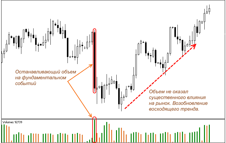
Attacking the level
On the chart the pattern looks like a volatile bar with high volume, which “breaks” a strong price cluster. If it is a sideways market, we can talk about the end of the accumulation and consolidation period.
It is important here not to confuse it with a buy/sell test, when the corresponding volumes are small – this is not a new phase of the market, but simply a test of the buyers/sellers reaction.
An attack on a strong level followed by a downtrend.
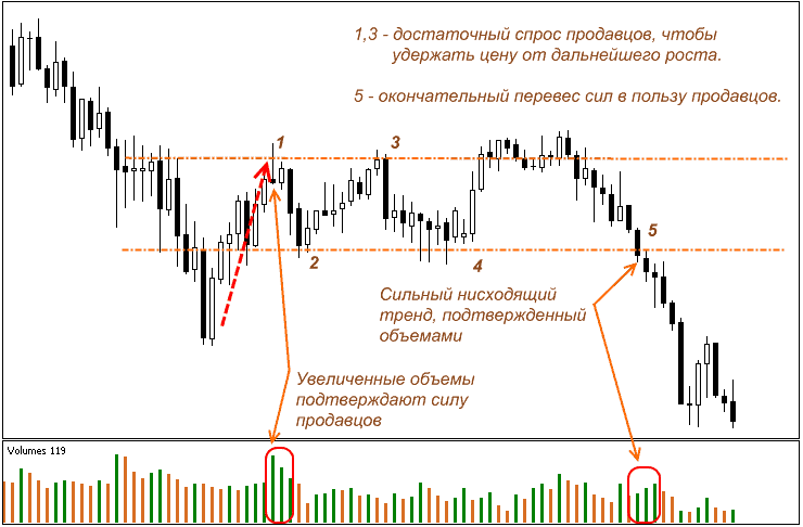
The basic rule: the attack must be on a really strong level (daily and weekly highs/minimums, Fibonacci).
Let the levels form, it is not necessary to visually look for them where they do not exist in reality. The older is the timeframe and the longer is the sideways market, the more reliable signals VSA analysis gives.
Demand/Supply testing
It can be found on any asset, timeframe and volatility. Such testing is a reliable indicator of the current balance of forces in the medium term.
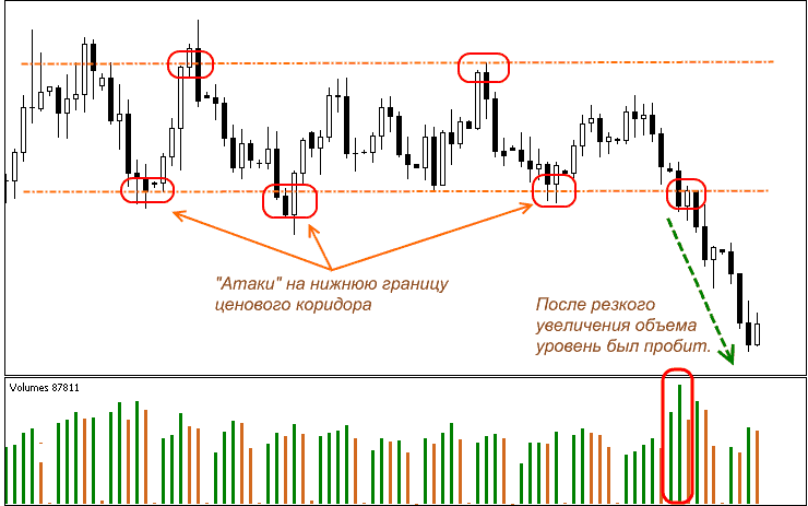
At point 1 the uptrend has run into a hidden resistance level, where there was probably a cluster of pending sell orders. The method of simple “squeezing” did not work, the market moved into the phase of accumulation. Point 2 has finally formed a corridor, in which the price moved until the moment, when another test of the bears with high volumes broke through the lower boundary of the range and the downtrend began.
Such VSA signals may appear not only near strong levels, sometimes such maneuvers are encountered in corrections, the main thing here is that the previous dynamics of volumes was increasing/decreasing at least 3-4 previous bars.
Trend indicators
Moving averages: SMA, EMA, WMA
This is a simple and clear way to see the middle. Namely the average price movement over a certain period of time. You should not forget, that moving average is a lagging indicator. It means that it is displayed only after the next price candle is drawn on the chart.
Of course, there are other variations of the moving average, but we will talk about the most popular ones:
SMA (Simple Moving Average) – a simple moving average, aka MA in most trading terminals. It is more suitable for analyzing long-term trends.
EMA (Exponential Moving Average) – exponential moving average; fresher prices are given more weight, so it is more sensitive than SMA. It is more often used for analyzing short-term trends. The exponential moving average (EMA) takes into account its previous value and gives more weight to the latest prices. The fact that last prices have greater weight, and the influence of older prices decreases exponentially, makes smoothing more qualitative. It is considered that exponential moving average predicts trend reversal better and gives less false signals.
WMA (Weighted Moving Average) – weighted moving average; the weight of the price is calculated in such a way, that the closer the price is to its current value, the greater its weight. This means, that the more recent prices have a greater effect on a weighted moving average than previous prices.
How to calculate a moving average, using SMA as an example:
Let’s say we need a 10-day moving average (10 candles for a 1-day chart). So we have to calculate the average value of price for that period of time. How to do it: add all prices of the 10 candlesticks and divide by 10. By the way, have you ever wondered why it is “sliding”, what is “sliding” in it? “Sliding” the numbers. As new prices come in, old ones are discarded. Therefore, the time period “slips” on a numerical scale, and its size depends on the number of candles counted in the slip.
The sliding speed and the timeframe:
When using the MA, you need to strike a balance between the global picture and the speed. Fast (light) moving averages under 20 are very fast reacting to changes of the situation and thus generating a lot of false signals, but they also react earlier than older MAs. Slower (heavy) moving averages, on the contrary, “flatten out” the movement and give less opportunities for entry. Therefore we need to find a balanced approach, adapted to your trading strategy, supplemented by all possible arsenal of technical analysis, from candlesticks and traditional support/resistance levels to a variety of indicators. That is how moving averages are “squeezed” the best efficiency.
Moving averages are also characterized by timeframe
Approximately there is the following gradation:
– to determine the long-term trend, use a period of 80 to 200 candlesticks (the optimal 200)
– medium-term – from 30 to 75 (optimal 50)
– Short term – from 5 to 30 (optimum 20)
It is best to have at least two moving averages, and one is at least twice as big as the other (we mean time frame). When the fast line crosses the slow one from bottom to top, it is a signal to buy. If both lines are directed upwards, it considerably strengthens the signal:
When the fast line crosses the slow one from above, it is a signal for sale. In this case, the mutual direction of the lines downward serves as additional confirmation of its (the signal’s) veracity.
Some traders use more than two moving averages with different periods. And in order to make a decision to buy or sell, they wait until all of these lines are lined up in a certain order (in ascending or descending order of the period, respectively).
Recommendations for use:

– It follows from the algorithm of МА calculation that when the MA is upward sloping, the current trend is upward, and when the MA is downward sloping, the trend is also downward.
– The longer the period, and the time frame, you will use when working with the moving average, the more accurate signals you will receive. But keep in mind that the number of signals will also be less
– It is better to use two moving averages to determine the trend direction and change.
– If in doubt as to the direction of the trend, you should switch to a larger time frame chart to determine the moving average’s general direction.
– When you use two lines, the greater the distance between them, the stronger the trend is and the higher the volatility.
– It is also accepted that MA often works as a support and resistance line. This property is most clearly seen in pronounced trends. If the trend is weak, such effects may not show up
Details about SMAs
Simple SMAs are calculated as the arithmetic average of closing prices for a certain number of periods:
МА(m) = (С(n) + С(n-1) + …+ С(n-m+1))/m where С(n) – the current bar closing price
С(n-m+1) – the farthest from the current moment price used in the calculation
m – number of bars (МА period)
Usually numbers from Fibonacci series are selected as periods. The most popular MA period values are 21, 50, 100 and 200, but you can also find some arbitrary ones. Thus, the MA is a chart of an average price. That is why the graph of MA has a greater inertia than the price graph. When the chart of the analyzed symbol changes the direction of movement, the MA follows it with some delay, the greater is the MA period.
From МА calculation algorithm, it follows that when МА is ascending, the current trend is ascending; when МА are descending, the trend is also descending. It is often assumed that the MA often works as support and resistance lines. This feature is most clearly seen in pronounced trends. If the trend is weak, such effects may not appear. It should be noted that if doubts arise about the trend direction, it is necessary to switch to a larger time scale chart to determine the general direction of the moving average.
More about WMA
Despite the simplicity of calculation and clarity of interpretation of the simple moving average, it has certain disadvantages, the most important of which are the following:
– The simple MA refers to indicators that give two different signals on the same data, the first time when new data is included in the calculation, and the second time when the same data is released from the moving window of data being processed. Obviously, the real market cannot react to the analyst’s attempt to move the sliding window forward. Therefore, any indicator that is highly dependent on past data introduces an element of random error into the research
– A simple MA will suppress the cyclic components of the price chart with the periods equal to the averaging interval and falling within it an integer number of times
Both disadvantages refer to the so-called marginal effects in the processing of time series, when some limited part of a series is used for calculations. In order to exclude marginal effects, weighting time windows are used, which with respect to the calculation of averages is reduced to the following modification of the summation algorithm:
WMA = (Sum of Ci*Wi)/ (Sum of Wi) where Wi are some weight values given to prices in summation
There are different approaches to defining the weights, however the most common method in technical analysis is the one where the later values are given the greatest weight
More info about EMA
EMA(n) = EMA(n – 1) + K x [Price(n) – EMA(n – 1)]
where n is the current time moment
n – 1 – previous moment of time
K = 2 / (m + 1)
m – the number, which is used to denote the time interval of the average price.
The main advantage of the EMA is that it includes all the prices of the previous period, not only the interval specified when setting the period. The later values are given more weight. The figure shows examples of different types of moving averages with the same period, calculated on the basis of the same price values.
Example of different types of moving averages with period 25, plotted on the same price chart: SMA – simple, EMA – exponentially smoothed and WMA – weighted moving average. From the presented data we can see that in spite of some quantitative differences, the qualitative character of all moving averages behavior is almost the same.
In practice, moving averages with exponential smoothing are most often used. The number “e” (Euler number 2.718), as well as Fibonacci number, is one of the fundamental natural constants and exponential averages have a number of properties, which other moving averages do not have.
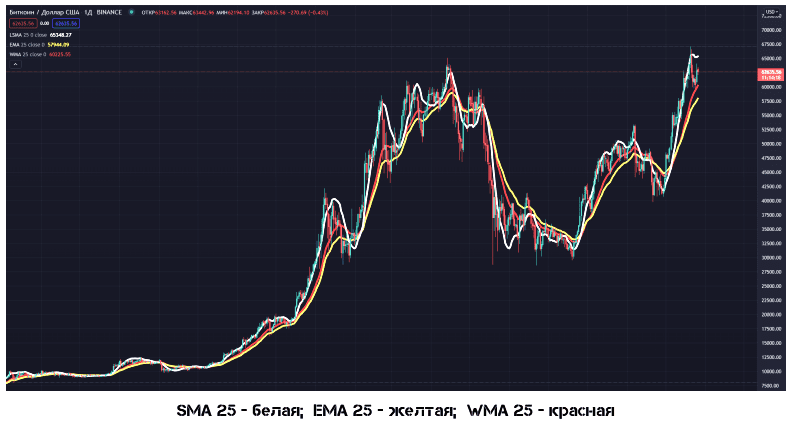
The signals given by all types of MA are quite simple and are interpreted as follows:
– Moving Average, going upwards, indicates a bullish market mood and gives a buy signal
– Moving Average, going downward, indicates a bearish mood and gives a sell signal
– Price crossing its moving average from bottom to top denotes increasing price growth and gives a signal for buy
– Price crossing its moving average from top to bottom shows that price is falling faster and gives a signal to sell.
– On the contrary, reversal of moving average from bottom to top on the ascending price chart is a signal to buy;
– U-turn of the moving average from the top downwards on a falling price chart is a signal to sell.
Moving Average – it is a trend indicator with all its pros and cons, it gives a lot of false signals and requires additional filtering. Nevertheless, a proper choice of MA type and period as applied to concrete market conditions may considerably simplify a trader’s decision-making process. On a sideways trend, MAs are practically useless.
MA advantages:
– volatility filter
– clearly defines a trend
– it acts as a dynamic level
– confirmation of market entry/exit
– maximum automation of building
– (Click the button and everything works)
Disadvantages of MA:
– The signals from the MA lag behind
– A large number of false signals is created
Remember that the smaller is the working timeframe, the more false signals MA gives. The same situation will be in the flat, even on higher timeframes. That is, the task of the moving averages is to “consciously” skip a part of the trend, but join the trend when it has already started.
For an uptrend, the correct order is characteristic (a light muving at the top, then a medium and then a heavy one). In our example: 30 (blue), 60 (red) and 100 (black). As soon as the light price-crosses the medium one, it is a sign of some sort of flat or correction. And as soon as the light and medium mooving crosses the heavy one – we can talk about a trend reversal.
Indicators ADX and LRI
The abbreviation ADX stands for Average Directional Movement Index, which in Russian means Average Directional Movement Index. The author is Wells Wilder.
With the help of indicator ADX can be determined:
– The presence of a price trend.
– Recommended time to open buy orders
– Recommended time to open sell orders
– The moment, when it is necessary to fix a profit
Calculation of the ADX indicator:
ADX = SUM ((+DI – (-DI)) / (+DI + (-DI)), N) / N
Where: N – number of periods used for the calculation;
SUM (…, N) – the sum for N periods
+DI – value of positive directional index
-DI – the value of negative directional index.
If the ADX indicator increases, it means that the market trend exists
LRI indicator
Linear Regression Indicator (LRI), developed by Gilbert Ruff in 1991, is an effective and easy to use tool that helps to predict future prices before they become “overheated”.
The linear regression indicator is displayed on the chart as a channel formed by two parallel lines equidistant from the trend. The width of this corridor depends solely on the selected timeframe.
It may look like this:
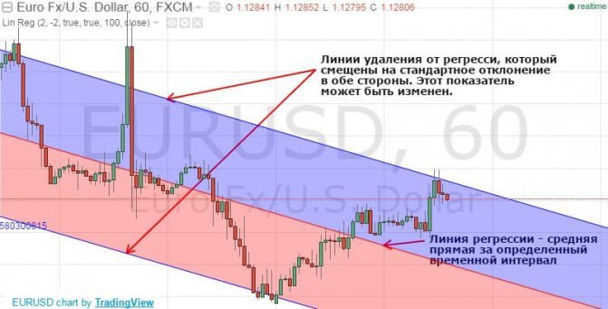
LRI works on any trading pairs and timeframes. The main parameters that need to be set are the channel width and period.
There are two basic strategies for working with a linear regression indicator:
– On a reversal
– On breakout
In this example, the trader is guided by the dynamics of price changes within the channel. When price reaches the resistance or support line, trader stakes on the opposite direction movement. That is, if the price is close to the upper limit, the asset can be got rid of. If it is at the very bottom of the channel, it makes sense to consider buying.
Divergence and convergence
Divergence and convergence in trading on financial markets is a divergence between indicator readings and price on a chart. Such signals are not very common, but they are reliable enough that many traders literally “hunt” for them.
The appearance of any of these signals can indicate the weakening of the current trend or even its soon reversal.
– Divergence (lat. divergere – to detect a divergence). It is a bearish signal, which appears on an uptrend, when the price makes new tops on the chart, but the indicator does not, and warns about its end.
– Convergence (from Latin convergo “bring together”) – the process of convergence, convergence. It is a bullish signal, which appears on a downtrend, when the price on the chart sets new troughs, and the indicator does not, and warns about its completion. The classical interpretation does not describe any convergence. It is not known who invented it, but the concept has taken hold.
If divergence is translated as “divergence”, then it is logical to call by this term only those cases when the price and the histogram diverge from each other. And to call the cases when they converge to each other “convergence”. It would seem to be really logical. In fact it is not. This signal is called divergence not because the trend lines are diverging – but because there is a divergence between the indicator readings and the price. It does not matter in what direction – to each other or from each other.
Some people think that divergence is a signal of a bullish trend reversal (from uptrend to downtrend), and convergence is a signal of a bearish trend reversal (from downtrend to uptrend). But according to the classics, both of these signals are called a divergence. You can often find the description of divergence and bearish divergence, which has the same essence as the convergence. Everyone can call the divergence differently – the essence will not change from this. Further on we will consider only the notion of divergence.
Divergence
One of the strongest signals of oscillators is divergence in the dynamics of price and indicator chart extremums (you can look for such divergences at almost any oscillator). Such signals include a bullish divergence (divergence) on a rising market and a bearish divergence on a falling market.
The divergence itself means that the demand for the asset is falling down/rising but the price is still rising/falling by inertia.
Clear Divergence
The simplest and clearest signal, which hints at a future trend reversal. If price is making a lower low and the oscillator is making an upper low, we have a traditional bullish divergence. In other words, if the oscillator is up and the price is down, that’s a hint of a reversal in the direction of the oscillator.
Schematically it can be depicted like this:
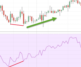
The reverse is also true. The trend is going up, the price updates the upper highs. And the oscillator – just look at it – is not happy about something.
The optimal use of divergence is
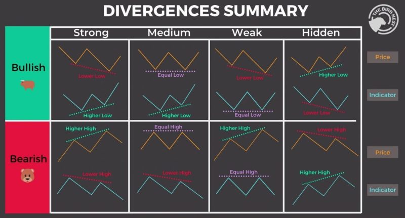
by the maximum and minimum values of the price. This is the easiest way to find the reversal zone. The oscillator directly indicates that momentum is changing and although price keeps updating levels, it won’t last long.

Hidden Divergence
A divergence does not always indicate a trend reversal. Sometimes it is, on the contrary, a clear indication that the trend will continue. Keep in mind that you should be friends with the trend, so any signal that the trend will continue is a good signal.
Hidden Divergence is quite simple. The price updates the upper low and the oscillator updates the lower low. It is easy to see. When the price has updated the maximum, check if the oscillator has done the same. If it has not and is going in the opposite direction, it is a divergence.
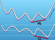
And here is the hidden bearish divergence. The price updates lower highs on a downward move, while the oscillator, on the other hand, tends upwards and updates upper highs. If the general trend is downward, this is an indication that it will continue, quite possibly with twice the effort.
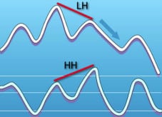
Correct Use of Divergences in Trading
Divergence is a wonderful tool. However, the question often arises as to when exactly to open the trade so that it does not happen that the trade is opened too early or too late. For this purpose, we need a confirmation – some method allowing us to filter the false entries in the divergence. We will consider several such methods. We cannot determine the levels for taking profit by this signal – the divergence shows only where the market is most likely to change.
Oscillator crossing
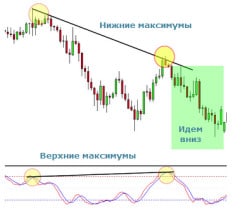
The first thing one usually looks at is a trivial crossing of the oscillator lines, say, stochastics. This is an additional indication that the trend may soon change. Therefore, when the price approaches the upper or lower zone, the crossing can give a good signal.
The screenshot shows price updating lower highs and stochastics updating upper highs. We are looking at a classic bearish divergence, all indications are Put.
Oscillator exits overbought/oversold zone
Another method is to wait until the oscillator lines are not just in the overbought/oversold zones, but also out of them. Let’s see. Stochastic has made a new lower low and the price has made an upper low. Isn’t it time to buy? All the conditions are there: the stochastic is oversold and the price should go up. However, the sellers’ pressure is too high and the price, as we can see, updates the new lower highs, falling further.
Well, we took our time and waited for more confirmations of the divergence. Strong enough to indicate a reversal of this trend. Which ones? Remember the basics of technical analysis. The banal trend line would show that the trend is steadily descending and it is too early to enter the reversal.
Do not forget – first – a general market forecast and only then the search for more specific signals.
The 9 rules of divergence
1. The Highs and the Lows.
When the price updates the maximums and minimums, there is a trend. And if there is no trend and all you see is a consolidation, the divergence cannot be expected.
2. Draw lines between the tops
The price is in only two states – trend or consolidation. Connect its tops with lines in order to figure out what is going on.
If one peak is lower or higher than the other, it is a trend, the market is sweet and available. If there are no clear new highs and lows, it means that there is a consolidation, and divergences do not play a significant role in it.
3. Connecting the tops
The price made new tops? Connect the tops. If the price made lower lows, connect them. It is rather a common mistake – the price makes new highs and the foolish trader connects the previous lows.
4. Watch out for overbought and oversold
We have connected the tops with trend lines. Now we study the readings of the oscillator. Remember – we are only comparing the highs and lows. It doesn’t matter what the MACD or stochastic is showing in the middle of the chart.
5. Connect the highs and lows of both the price and the oscillator
If we have connected the highs/minimums of the price, we should also do the same for the oscillator.
6. Vertical Lines
The maximums and minimums of the price must coincide with those of the oscillator. It’s not difficult to find them, just draw vertical lines for them.
7. Watch the angle of slope of the lines.
Divergence – when the angle of lines for the price and the oscillator is different. The more this difference, the better. The line can be ascending, descending or flat.
8. Don’t miss the moment
If you notice the divergence too late and the price reverses, it means the train has already left. The divergence has worked out, it will not be relevant forever. The one who missed it is too late. Wait for the next price divergence with the oscillator and a new divergence will not keep you waiting.
9. Longer timeframes
Divergence works better on higher timeframes. Simply because there are fewer false signals. That’s why it’s recommended to use them on 1-hour charts or more. Yes, some people like 5 and 15 minute charts, but on these TFs the divergence often likes to lead traders astray.
Conclusions:
– divergence is a way to identify possible changes in the market direction in advance;
– it may be a powerful tool to start trading against the trend;
– there are two types of divergence: bearish, which is defined as highs on the price chart and lower highs on the indicator; and bullish – lower lows on the price chart and higher lows on the indicator;
– at a higher timeframe the reversal may take longer;
– the higher the timeframe, the more reliable the signal;
– To find the entry points, the divergence may be combined with the analysis of several timeframes or the breakdown of the trend line.
– And remember, if you are not sure – do not do anything. You don’t have to guess and guess on your fingers whether it is a divergence or not. A true divergence signal must be clear, crisp, and understandable to you. It must be consistent with your trading plan.
Multiframe Analysis
Multiframe analysis is when we analyze the same currency pair (or other asset) on several timeframes at once.
Before looking for entries on the “small” charts, it is advisable to analyze the larger TF (1D, 4H, 1H). And for each you need to draw support/resistance lines, channels, etc.. That is how you can identify reversals on, say, a 15-minute chart. Because on higher timeframes the price encounters strong support or resistance. And the bigger is the timeframe, the stronger is the resistance and support.
When you see the whole picture – the chances for successful trading decisions increase significantly. On the contrary, it’s the opposite for beginners. They set 1 or 5-minute charts and sit on them only, they are not interested in other TFs. As a result, the poor guys are constantly missing the global trends that occur in older timeframes, and then they do not understand why their forecast on the 1-minute chart “suddenly did not work”.
It is important to determine which TF is more convenient and comfortable for you to work with.The trading period is the basic parameter when choosing a strategy.The size of the base timeframe affects the duration of the open trade. Other time periods are used for clarification in the general estimation of the market situation when forecasting. Attempts to use several timeframes as a base parameter will end in losses and disappointment in trading.
When choosing a TF it is necessary to:
– Determine the trading style according to the desired trade holding time;
– determine an acceptable range of working timeframes;
– open several charts with the price;
– Observe the price dynamics at the level of feelings to understand on what timeframe it is more convenient to predict the market mood;
– to test the work on the selected timeframe.
Oscillators
Oscillators are leading indicators that track the so-called “overheating” of a trend. This condition means that the trend has not reversed for too long or has accelerated excessively recently. In the case of an uptrend, overheating means that the asset is overbought, and in the case of a downtrend – oversold.
Almost every oscillator has the boundaries of overbought and oversold. If the oscillator line crosses the oversold line from top to bottom, it indicates that the downtrend is overheating. The signal to buy occurs when the boundary line is crossed once again. The oscillators work similarly when they cross the overbought boundary, i.e. when the uptrend overheats.
The most common oscillators are:
Stochastic
Stochastic expresses the relation between the closing price and the range “maximum – minimum” for a certain period as a percentage value from 0 to 100.
A Stochastic Oscillator value of 80 and above indicates that the closing price is near the upper limit of the range, in the overbought zone. Stochastic oscillator value of 20 and below indicates that the closing price is near the lower limit of the range, i.e. in the oversold area.
The author of the indicator recommends using daily and weekly charts because stochastic generates the most reliable signals on them.
On the charts in the terminals oscillator is usually presented in the form of two lines:
%K – fast or main stochastic line
%D – slow and signal line. It is worth mentioning, that %D is a moving average.
The signals for action appear when %K crosses %D: from below upwards – to buy, from above downwards – to sell.
The zones of the oscillator above 80% and below 20% are called overbought and oversold zones, respectively. When the paper crosses these boundaries, we must wait for the trend to reverse before the oscillator returns to between 20% and 80%. The signal for selling is when the 80% level is crossed by the %K line from the top downward. Similarly, a signal to buy is when the 20% level is crossed by the K% line downwards.
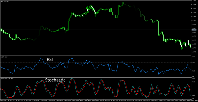
RSI
allows us to estimate who influenced the price more: buyers or sellers. RSI also helps to guess how events will develop further.
The indicator does not require complicated settings. The only parameter is the number of periods, which is set to 14 by default, because in most cases this value is effective.
By analogy with other oscillators, RSI can track overbought and oversold zones, in which reversals of the indicator and its exit from the zone can be used as signals. By default, the zones here are marked at levels 30 and 70, which are quite effective on a daily chart.
Traders often use divergence – a signal whose effectiveness is confirmed in practice. The essence is in the divergence between price movement and oscillator readings.
If, for example, the price makes two consecutive increasing leaps at the top of the trend, while RSI indicates a decrease, it is a clear sign that the trend is slowing down, and a new maximum is formed due to the absence of sellers, rather than an influx of buyers. In such a situation, it is worth refraining from new buying, looking for optimal prices to close current long positions, and considering playing down the asset.
MACD
The MACD is a so-called trend oscillator, which combines the properties of both a trend indicator and an oscillator. Trend-following indicators show in which direction the trend is moving, oscillators show by how much the price deviates from its average value. The MACD has both.
This indicator is calculated based on moving averages.
The purposes of MACD:
– Simplify the visual perception of signals given by moving averages
– reduce lag
– Eliminate some of the drawbacks of conventional trend indicators.
There are two ways of MACD creation: the linear MACD and the MACD histogram.
Three exponential moving averages with different periods are used for calculation. A slow moving average with a longer period is subtracted from the fast moving average with a smaller period. The MACD line is plotted on the obtained values. Then the obtained line is smoothed by the third exponential moving average, and the so-called MACD (Signal) line is created. The two resulting curves represent a typical linear MACD. Also in the indicator window there is usually marked the zero line, relative to which the curves oscillate.
The main signal produced by the indicator is the crossing of the MACD line and the signal line. When the main MACD line crosses the signal line from bottom to top, this is a buy signal. Intersection from top to bottom is a signal to sell. On the histogram such signal will correspond to crossing of bars of histogram over zero.
As with the RSI, a common MACD signal used today is divergence. When the price draws a new extreme and the MACD line shows the opposite dynamics, it indicates that the trend is fading and there is a high probability of a move in the opposite direction.
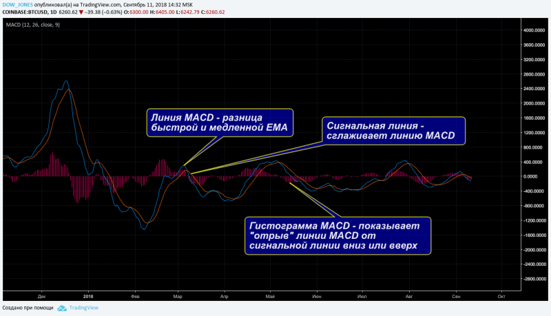
Depth of market
The Depth of market (DOM) is a list of limit orders registered at the exchange, presented in the form of the table. The top part of the table contains sell orders, as a rule they are colored red, they are called “Ask”, and in the lower part the buy orders are sorted out in green, they are called “Bids”.
Reading the Depth of Market
The stock market glass can be considered a reflection of the market sentiment in a very short time frame. Carefully observing the activity in the market depth you can sometimes correctly predict how the price will change in the next few minutes or even seconds. Such a method does not suit traders who trade on a medium-term and even more so on a long-term basis.
Neither are investors, of course. However, scalpers who trade within a minute range often pay attention to the signals given by the dynamics of orders in the cup. The main indicator when analyzing the Depth of Market is large bids.
A large bid is a price level at which a significant number of orders is concentrated relative to the average trading volume. The presence of a large order may form a local resistance line. For this reason, scalpers often place stops and take-profits several points in advance of such requests – the price movement to this level is, as a rule, more predictable.
Such orders sometimes form a channel inside which the price cannot overcome resistance. But if the price manages to “break through” the volume of a large one, it often follows its further advance beyond this value.
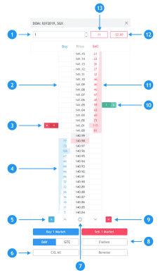
[2] – cells for placement of orders. The limit order is placed in them when you click normally, the stop order is placed when you click with ctrl pressed.
Bids [4] / Asks [11] – volume of orders available in the market.
[3], [10] – an order placed by user.
[5], [9] – buttons to cancel all limit or stop orders placed by the user on the current instrument.
[6] – a button to cancel all orders placed by the user on the current instrument.
[12] – open position profit/loss. You can change the display setting to money, pips or percent by clicking on this item.
[13] – size of position
Trading Psychology
– Optimism
It all starts with a positive view of the market situation, which leads the trader to open a trade.
– Excitement
The trader anticipates events and hopes that success is assured.
– Euphoria
The point of maximum financial risk. Investments turn into quick and easy profits. The trader completely ignores the risk.
– Anxiety.
The first signs of movement not in the trader’s favor appear. But he does not notice it and believes that the market will recover and the trend will continue.
– Panic
The most emotional period. At this stage, the trader feels his ignorance and helplessness and is completely at the mercy of the market.
– Depression
The trader starts to blame himself for being silly and why he did not close the deal in time. Some choose the right way and start to analyze what went wrong. Real traders are born at this very stage, learning from past mistakes and drawing conclusions.
– Belief.
At this stage the trader regains faith in his future in the market and starts trading again.
80% of success on the market directly depends on the correct psychological state of the trader
Three vices of the trader
1. Perfectionism
Perfectionists are forced to work harder and harder because they never feel competent, worthy, or liked enough. Thus, even when a perfectionist makes a profit on a trade, they will always focus on the part of the market movement that they missed. When a trade doesn’t go well, however, he looks for various reasons to reproach himself for some mistakes.
Talk to yourself mentally, as if you were a close friend. Most people treat others with respect and love, but have not learned to treat themselves the same way. If you treat your friends with more understanding than you treat yourself in the same situation, then you are not a friend to yourself. If something goes wrong in trading, a constructive trader will ask himself “What lesson can I learn from this situation?” rather than “What happened to me?” The best antidote to perfectionism is the ability to reassure yourself: “There will be better deals in the future.” It’s important not to miss out on those better deals while you’re doing self-criticism!
2. THE EGO.
By investing your emotions in the trade, you are operating at maximum psychological leverage. In the currency of self-esteem, you are trading 100 lots. Thus, most of your emotional account goes into each trade, which inevitably affects your decisions to cut losses, enter and exit on time. A successful trader focuses on the quality of the trade, while a selfish trader focuses on their profitability. Egoism has a devastating effect on a trader and often causes them to make unreasonable trades just to recoup recent losses.
Direct your self-esteem to other areas of life: recreational interests, non-trading activities, personal relationships and spiritual life. A balanced life promotes balanced trading.
3. Self-confidence
Self-confident traders do not take the market seriously. They think that a couple of setups from the next trading book or buying a modern trading platform will help them to make stable money on the market. Such traders don’t want to gradually move towards success. They resist the idea that screen time is the best teacher. Overconfident traders don’t wait for short-term patterns to align with long-term patterns and take all trades, thereby working to enrich brokers.
The main remedy for overconfidence is to trade based on strict rules, tested on a demo account (or a real account with low volume positions). The strict adherence to the rules will allow the trader to get rid of impulsiveness in making trading decisions. When trading deliberately, a complex conscious process is sandwiched between impulse and action. An action is preceded by awareness of its motives and consideration of the consequences. This approach to trading helps traders make effective trading decisions.
Thoughts:
The greatest vice in trading is the tendency to take everything personally and focus on the outcome of the trade, losing sight of the process itself. If you sufficiently express yourself outside of trading, developing physically, socially, spiritually and professionally, you will find that the market is no longer a place for you to boost your self-esteem. This approach to life will allow you to get rid of the destructive influence of emotions on your trading.
Traders mistakes
– Take your time
Many beginners make the same typical mistakes, afraid that if they do not take a position right now, the market will run away from them, and they won’t get this profitable opportunity again. Don’t do that! The market is not going anywhere. You can make money in this boat 24/7, whether up or down.
– Lack of Experience
It is better to start trading with small amounts. As they say, practice makes perfect.
– Lack of self-control
Trading requires discipline. You will never succeed without it. You wake up, draw up a plan of actions, make a promise to fulfill it, and then you do it no matter what. Trust only statistics and numbers.
– Overconfidence
The market must be treated with respect as a pupil treats his teacher.
– Lack of the right environment
If you communicate in a specialized community, then the chance to grow as a trader, to get on your feet, you will have much more
– The lack of risk management
Allow yourself to gain experience, gain some knowledge, because Moscow was not built in a day.
How to keep a positive attitude?
For intraday traders who open and close trades day after day, trading can become quite boring, if not monotonous, especially if they specialize in only one market. Ironically, the first step to maintaining a positive trading mood is to take a trading break. This means that you shouldn’t look at the charts for a while to get rid of any preconceived notions about the market you’re trading.
A fresh look and periodic breaks can help you not only dispel the monotony of intraday trading, but also find new trading opportunities or even discover risks that you didn’t notice before.
Traders should also take into consideration such aspect as their environment. An unpleasant situation in personal relationships or taking a serious loss in the course of trading, negatively affects their psychological state.
Therefore, it is often said that traders (especially if trading is their only income), need to know either how to deal with their emotions, or how to refrain from trading until the psychological difficulties are overcome. Remember, anyone can become a trader, but only less than 20% of people who make that decision will stay in the business.
Trading may seem like an easy profession, especially when profits flow right into your hands. However, the real test of professional suitability, the trader is exposed at moments when things do not go according to plan or his trading capital is seriously damaged.
Quite often only those who were able to recover psychologically after failures and continue trading, having made conclusions from made mistakes, are able to pass this way to the end and achieve desirable results.
If you have not yet thought about the importance of psychology of trading, take the time and look at the results of your trading!
Why a sudden increase in deposit leads to its loss
- The trap of the sum in the account.
Emotionally you are stable, adequately perceive losses and risks. It seems that here it is – some, but already a stability. However, at some moment a very attractive thought occurs to you, sweet as candy. Namely: if I work steadily in the black, why not do the same thing, but for a larger amount? And indeed.
The trading system is worked out, you’re closing weeks in the black, one after the other. It’s time to feel like a serious trader, isn’t it? How long can you work for a measly few hundred dollars? It’s time to take it to the next level. That’s how the fateful step is taken.
2. Tension in trading is very high.
Nervousness, relationships in the family, children, pets, the environment at home and at work, food, hobbies, opinions of friends and relatives, the mother-in-law in the end – all this affects, often in a negative way. But nothing affects as much as trying to jump in over your head dramatically.
3. Exceeding the deposit
The goal of retail trading, on the other hand, is to get out of either poverty or the middle-class trap. When you have enough for basic needs, but you are up to your ears in kids and credit, and life is more like survival. And you’re constantly spinning like a squirrel in a wheel, desperately trying to get out of vicious moneylessness.
And there is no way out. Trading, it would seem, provides that opportunity. Here it is, the most accessible way in the world in the shortest possible time to make huge amounts of money. What is it – there are examples when traders got from 100 dollars to $ 50,000-100,000 for a few months. And what is this money for?
For nothing. Just for the ability to press the Up/Down button at the right time, in some program or website, that’s all. And so, when the trader, thinking that he has learned the market, dramatically increases the amount of transactions, strange metamorphoses occur. What has been working for months suddenly stops working.
A profitable trading system or trading style suddenly starts to show losses. The reason for the failure is simple – you failed. You went in where you shouldn’t have, and it broke not your trading system at all – but yourself.
4. Psychological limit.
It is built into us since childhood, and is shaped by the environment, family and social status. Therefore it varies from person to person. As you see, exceeding the psychological limit carries a huge subconscious charge, which accumulates in a person throughout his life, there, in the unconscious depths of the psyche. And so this limit is different for everyone.
Someone can break even a thousand dollars, and someone a million. There are well-known cases of professional traders who lost a lot of money and jumped out of windows or shortened their lives in other various ways. Exceeding the limit can be so catastrophic that a person is sometimes unable to cope with himself.
5. Smooth growth of the deposit.
This is the solution to the problem. You have to let your inner breakdown out a little at a time. This is not easy. You have to try hard. But there is no way to solve this problem, except to increase the deposit smoothly and without haste.
So your job is to take small steps, one by one. Increase $100 to $300, for example, then withdraw $200, and continue working with the base amount. It turns out well? Next time take it out so that you are left with 200. Then 300. Increase your limit slowly, there is no need to rush anywhere. The slightest attempt to make a sudden move can end badly.
Risk Management
Risk management is one of the most important components of profitable trading. There are many different articles written about it, of varying degrees of interest and usefulness. You don’t come to the cryptocurrency market just to trade, your main goal is to make a profit. Set a specific goal for yourself.
One of the principles of successful trading is: “Let profits grow”. Of course, it is very satisfying to watch the price go in your direction and the current profit figures on the trade go up. But this principle doesn’t mean that you should push back the take profit level or remove it altogether in order to make even more money.
Greed in the cryptocurrency market always leads to losses. One moment the price is pleasing you, and seconds later it has already turned around and is moving against you.
Take your profits, don’t leave them to the market – reinsure yourself with all available tools. This can be a transfer of the transaction to Breakeven, the use of a trailing stop or partial fixing of profits on the deal.
The figures on your balance will grow and make you happy. Do not leave all the money in your trading account, but withdraw it gradually, in order to “win back” the funds you invested in trading.
Do not gritting your teeth and threatening the market with “get your own money anyway”. Take a break, take a rest – it will be good for you and your deposit.
Basic principles
Risk management when speculating or investing means, first of all, strict control by a trader of his open positions, regardless of his trading style and time horizon of holding these positions. The strict control implies understanding at which predetermined price levels unprofitable positions will be closed and profitable ones will be held.
In real practice, Warren Buffett fund managers are constantly monitoring and reviewing the assets in their portfolio. And if they see a “red flag” on any security, they immediately begin to get rid of it, simultaneously replacing it with a better, in their opinion, exchange-traded asset.
Mid-term and intraday trading do not differ in terms of general principles of risk management. Note that the approaches we consider are one of the many ways to manage your portfolio or a single position open intraday.
Classification of risks
– Market risk
Prices of trading instruments are in constant motion during the trading session. In this case there is a significant probability that the quotes will move in the direction opposite to the open position. The accounting of risks in this case helps to limit the potential size of losses.
– Currency
Changes in currency rates shall affect all quotations. As a result, there may be situations when the price of an asset also changes to the disadvantageous side. Trading gold or shares of foreign companies when the dollar changes against the hryvnia/ruble can serve as an example. The fall of the latter reduces the attractiveness of buying metal and securities for the national currency.
– Risk per trade
The maximum risk per trade (series of trades) allowed in your risk-management system. At the initial stage the trader often trades with the smallest possible standard lot in order to gain statistics for a new strategy. As the positive statistics accumulates, the risk per trade can increase up to 2.5%-5% of the deposit. Such a small risk gives time to the trader to adapt to changing market, as well as does not have a strong psychological pressure and allows to trade calmly.
– Day risk
Maximum risk of loss for one trading day that is allowed by your risk management system. The recommended risk for the day – no more than 3-5% of the deposit. This risk allows the trader to stop if the day is not a good one.
– Risk per week.
The maximum risk of loss for one week that is allowed by the risk management system. The recommended risk for the week is no more than 10% of the deposit. If the market has changed and the system is constantly producing losses, then after the weekly risk is reached, it is important to stop trading for a few days, work on your mistakes and, perhaps, reduce the volume of work.
– One Month Risk
Maximum risk of loss for one month, which is allowed in your risk management system. The recommended risk for a month – no more than 20% of the deposit. This risk can be attained in times of high market volatility, which is often the case at the beginning of a crisis. Then you need to adapt your system to the new volatility and wait for the markets to become calmer.
– Maximum risk
The risk of loss that is allowed in your risk management system. The recommended maximum risk is a maximum drawdown of no more than 30% of the deposit. This drawdown is the most comfortable for a trader and potential investors. When maximum drawdown is reached, you need to stop trading and completely revise your trading system. After that start testing and statistics collecting at minimum lot again.
Example
Your deposit is $20,000. Then your risk management system will have the following parameters:
Risk per trade – 1% = $200
Risk per day – 5% = $1000; if you reach a threshold – stop trading on this day
Risk per week – 10% = $2000; if it is reached – stop trading till the end of the week; make analysis of reasons
Risk for a month – 20% = $4000; if reached – stop trading this month; make analysis of reasons
Maximum risk – 30% = $6000; if reached – stop trading on this trading system
Such a system of risk-management will save 70% of your deposit, allow you to continue to improve yourself in trading, keep your mind from excessive stress and worries.
General recommendations
1. In any project, even a very attractive one, you cannot invest more than half of your total capital. Otherwise, it will be like death. Trade different markets and different instruments – in this way, you will reduce the risks. That is, in order to successfully continue in the financial market, it is best not to invest all of your money in just one undertaking. More than half of the money must be left for other projects and to continue your work.
2. it is necessary to open positions on several instruments, but within the limits of the amount of guarantee, which is often 25% of the deposit. You should not risk your money to open large positions only for one group of instruments. The principle of diversification is to ensure that losses from one group of assets are covered by profits from the others. 3.
3. The risk rate of a trade should not exceed 5% of your total available funds. If you follow this principle, then the loss ratio of any trader will be less than 5% of his total capital. That is equal to, or even less than, inflation. Depending on what area of investing one trades in, the percentage of risk can be reduced to 1.5%. Every trader should strive to decrease risks – the less risk, the more stability.
4. Keep a balance between diversification and concentration. Although diversification is one of the most reliable risk management methods for reducing risks, there must be a measure even in its application. You need to balance diversification and concentration of funds. There is no need to turn your portfolio into a “mincemeat” of investment instruments, you will only need to open positions in 5-7 groups of instruments, otherwise you risk getting confused. It is generally advisable to begin with 2 or 3 types for the same reason.
5. Place stops. It is an elementary thing, and yet it is ignored by many. There is no better protection against losing money. Remember – this is the market with all its intricacies, where the price can easily go in the wrong direction. Choosing between lost profits and the total disappearance of the deposit, use your head. Limit your losses programmatically, so that in case you are suddenly distracted, and a large movement occurs in the market – the excessive losses will not break you.
6. Cut your losses and let your profits grow. Your transactions must have a profit potential several times greater than the potential risk, then you can trade more stable and quickly come out of drawdowns. Adequate norm of profit in trading is 1:Z. If you cannot achieve such ratio due to the calculations, forecasts or other reasons, then you should refuse to make a deal.
7. Competently open positions, especially if there are several of them. Select in advance, where you have trend instruments, and where you have trading instruments. Why? For trading instruments, the stops are located close to each other, while the trend instruments that work for the medium and long term, will have them farther away. With a small spread in prices, your positions will hold and generate substantial profits.
8. Risk management should be flexible. Markets are not some constant monotonous pattern. It’s a living, evolving organism, which you need to constantly learn and adapt your trading to it.
9. Take into account the non-linear reversal of drawdown. Avoid deep drawdowns, as it is extremely difficult to get out of them, because of the non-linear growth of the profit per capital that needs to be earned to get out of a drawdown.
Formulas for Calculating Risk
Risk of a deal
– P=Cp-psc.
– If it is calculated in %, then P=(Cp-price)/Cp*100
– Cp-price of purchase
– Stop-loss price
Absolute risk (Ra) on the whole trading capital (К) in %:
– Ra=P/K*100
Volume of position (О):
– О=Pa/(Цп-Цс)
Trade volume (V)
– V=O*TsCo
How do you manage risk?
– “Iron Ass” – Don’t sit around trading all the time. The more trades you make in a day, the greater the risk of making a mistake. Make it a rule of thumb to make 3 trades a day. If they are negative, you are definitely out – your deposit and your psyche will be safer.
– “Keep a diary” – write down all of your trades in a “trading diary”. Keeping statistics and “deal diary” allows you to see on what instruments you earn and lose more, the dynamics of your trading by days, weeks and months, what instrument you trade best, etc.
– “One stop, two stops” – put stop losses when entering and exiting positions.
– “Better a bird in the hand” – the amount of risk in each position should be a Z:1 ratio. Before entering a trade, calculate the Stop Loss.
– “Don’t put your eggs in one basket” – this is the rule that investors in trading adhere to. They invest from 5% to Z0% of their deposit. If you are planning to become an investor, take this point into account.
Trader’s Diary
A trader’s diary is a history of your trades and actions regarding trading on the crypto market. Trader’s diary is necessary to improve your trading results in the crypto market, to learn to open more profitable trades and less loss-making ones. Constant trade analysis and discipline, will help you reach the next level and become a professional cryptocurrency trader.
Content:
– Time and date of trade opening
– Reason for opening a trade
– Order size
– Reason for closing the trade
– Deal result
– Deal analysis
It is better of course to find an automated diary and enter all data there, but if this is not possible, you can start with an ordinary notepad, Excel spreadsheet, Word, etc.
Money Management
Money Management is the rules of money management. It is understood as a number of principles and a system of allocation of funds intended for investment, which include the use of tools and strategies to preserve and increase assets. The goal is to minimize the risks of losing all of the trader’s monetary capital.
Now let’s imagine that you have $100 and you open $25 trades. It does not take a genius to understand: after 4 unsuccessful trades your deposit = 0. You have lost all your money. The broker, on the other hand, took your $100 and is waiting for you to deposit again. What a great business, what can I say.
The basic rules of money management
– You cannot invest all of your money in one transaction at once. It is better to open several different deals, or save money for averaging your positions. It is psychologically easier to exit a losing trade, if the market will fall. Jesse Livermore himself invested no more than 10% of his capital in a trade.
– To allow the profit to reach its maximum, i.e. to have enough patience, so that open positions could show a significant profit
– To go to cash in time, that is to translate profits into money. The great trader believed that it is necessary to transfer in cash at least 50% of profit from each major transaction, but modern traders believe that everyone must set their own threshold.
All rules and principles can be divided into 3 groups:
– Asset management
– Defining trading volume
– Limitations in trading
Asset management
Asset management rules determine what funds can be withdrawn from your account and how much of the resulting profit should be left for future trading. Management allows you to set specific goals for your available funds.
An example of active money in trading from all capital.
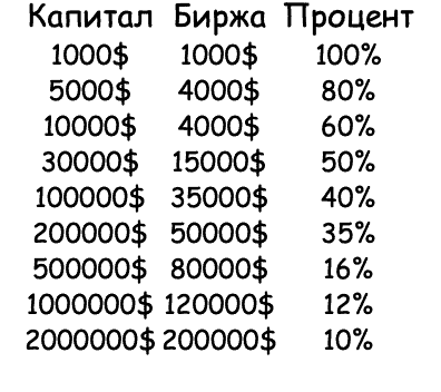
Determining trading volume
This part of money management is combined with risk management. The investor must compare the size of the trade with the size of the deposit in order to maximize profits and avoid serious losses in case of failure. Losing on a trade is a normal process. Even in the moments when a trader uses his strategy most effectively, some deals can cause losses. In order a streak of losing trades does not eat away at your deposit, its size should be enough for 30-40 trades, not 5-6. Then the theory of probability will be on your side.
Limitations in trading
– If there are 3-4 losing trades in a row, then you should not conduct more trades on that day
– Stopping of trading for two-three weeks, if in current month deposit will decrease for more than 15-20%.
– Stop performing deals if daily profit makes up 2-5%.
– Not to open more than 2-5 deals per day
Strategies of money management
1. Averaging
Beginning investors often use an averaging strategy. This strategy consists of increasing the proportion of your assets as the asset price falls. This method lowers the average purchase price. The effectiveness of this method can best be told by those whose money ran out before the downturn. This method of investing is especially popular with investors who use fundamental analysis (although technical analysts don’t shy away from it either).
It comes from a simple assumption: if I have made a valuation of an asset and believe it is undervalued, then each price decline increases the undervaluation and hence the attractiveness of the investment. Of course, this goes against the basic investment principle of “cut your losses quickly.”
Unfortunately, averaging the price because the commodity is unprofitable has many proponents. At a glance, you can see that its main drawback is that at some point we may be out of money and asset prices may continue to fall. In the futures market, this approach is one of the easiest ways to reset your account, if only because of the need to constantly add money to your deposit.
2. Cost-fixing.
It is better to use a fixed cost strategy, which is a management method based on lowering the average price. The fixed cost method involves systematic (e.g., monthly) purchase of assets for a certain amount. Because of this, when asset prices are high, we will buy them relatively little, when they are low, we will also buy them.
Fixed % method. The method is based on determining the size of the position for each transaction separately, as a % of capital. In case of deposit growth – working volume grows (we add money to working volume from profit a little bit). In case of deposit reduction – working volume smoothly decreases, reducing losses.
3. Floating money management
Floating money management. We work within strict limits, up to 5% of the deposit amount. But in this corridor of 0.1 to 5% we select different percentages depending on the market situation. This is a more psychologically adapted approach. Let’s imagine that your confidence in your own prediction is quite low and you have doubts about the result. Not so much that you would miss an entry, but still its effectiveness confuses you. So why use more than 1% of the deposit?
No reason. You can even use less, say, 0.5%, if the deposit allows it. But what if you have on the chart one of those situations that have been giving great results for a long time, say, some familiar pattern from a support or resistance zone? Then you can afford 5% of your deposit. This flexible “floating” system is recommended to traders who have already had their first bumps and are well aware of what they are doing.
Money Management Violation
Only after losing several deposits you will realize that money management is the only way to keep your funds safe. The only way. No strategies and patterns will help you if you violate MM and risk what you should not risk. The professional is different from the beginner in that he strictly adheres to the MM.
A beginner is trivial trying to win back and may easily risk 50-100% of the deposit, at the very first stage. It will end up in the loss of the deposit and loss of confidence in their own abilities. So, the faster you learn to respect the MM, the faster you get to the stage of “non-deposit” after which you can already work on increasing the deposit.
Accelerating the deposit
Is it reasonable to “overclock” the deposit if you have only 10-20 dollars at your disposal and you cannot use the conservative money management a priori? Overclocking implies a regular and systematic violation of MM, when you take big risks in order to get a significant percentage growth in a short period of time.
Sometimes martingale, anti-martingale and other systems with huge risk are used for this purpose. In theory, we should discourage overclocking. However, most of the people ran small deposits anyway, it’s an axiom. Yes, it is extremely risky, but the initial amount that is dispersed is usually quite small and people are willing to lose it. So your task in this scenario is to switch to MM after a successful overclock. The problem is that this usually doesn’t happen.
Having accelerated 10 dollars to 100-200, the person is in an excited emotional state and continues to “churn” larger amounts. And, as a result, he loses everything. The lack of control when overclocking – the main problem, but not the overclocking itself. If you are serious about it, there is no other way than to take care of a sufficient deposit for MM and work the way a professional trader should work. It is cold to assess the risks, know your limits and work on the results.
There is no point in gambling, chasing three kopecks in the hope of a fairy tale. This infantilism will end quickly, and so will your trading.
Trader’s tips
We’d like to make some comments and recommendations.
1. Be aware of your individual differences.
2. 2. Make sure your trading style fits your personality.
3. never use a strategy until you’re sure it’s worked in the past.
4. At the very beginning, the best way is to simply analyze past charts, looking for situations in which your system will work.
5. Forget the numbness.
6. Trading is a game of survival. If you manage to preserve your capital, you can survive to trade the next day.
7. Analyze your performance.
It is best to analyze after every 10 trades. This gives a full understanding of the trade. What worked, what didn’t work, what you need to work on and what deals work best. Whether it’s a long or short. You have to treat this very responsibly, because your future trading will depend on it. It is like learning your soulmate and over time you begin to understand her half-word. Here everything is the same and there is nothing secret here.
8. Fear.
It is necessary to analyze the situation and prepare for work. But it is necessary to be ready to risk, if there is an opportunity. It is better to risk a little than to lose a chance, which may open brilliant prospects.
9. Also, remember that wins and losses are part of the trade. It is important to believe in your system and in yourself. And even if you lose something, faith will help you get it all back. Remember to have faith.
10. Control.
In your trading, you are a creator, who must create and always control the situation. This means that without estimating your profits, without overconfidence you will not succeed, I assure you. Don’t chase fast and high profits. Move slowly but surely and then you will break out of this vicious circle of poverty.
11. Create your book, your book of experience, and reread it constantly. For it is the book that will lead you to success. Make trading your playground and become a professional in this field.
Useful sites
– Coinmarketcap.com – CMC is the most popular and widespread website about cryptocurrency. Here you will find a lot of valuable information about almost any coin.
– tradingview.com – Charts, communication, deals. A platform with charts and a lot of tools to work with them, as well as a social network for traders and investors.
– coinmarketcal.com – An economic calendar for reliable cryptocurrency news with coverage of the mass of events.
– coindar.org – Another cryptocurrency events calendar
– coincheckup.com – An alternative to CMC, but with deeper analysis.
– coinfairvalue.com – Interesting fair value and fair price calculation system worth a look
– cryptocompare.com – Informative site with an extensive database. It has sections for traders, miners, investors and regular users. There are reviews and ratings of crypto exchanges, wallets, asics, video cards and ICO projects
– coin.dance/stats – Detailed data on BTC, BCH, BSV
– cryptoquant.com – Site with information about BTC exchange reserves
– cryptobubbles.net – One of the most useful statistic site
– datamish.com – Excellent indicator of data on longs and shorts
– tokenview.com – Interesting site with a lot of different data
– coin360.com – Another site with a lot of visual information
– scalpexindex.com/app – Great addition to monitoring for scalper
– blockchainwhispers.com – A very extensive database of tools
– cryptowat.ch – Is an aggregator of different cryptocurrency exchanges – it displays information from various exchanges, including futures on some coins. Can be attributed to the category of professional
– lunarcrush.com – Uses artificial intelligence and machine learning to analyze social trends focused on cryptocurrency.
– cryptorank.io/en – CryptoRank provides expert market analytics and collects critical news to help market participants make informed trading decisions.
– bitcointradevolume.com – Real bitcoin trading volume from Bitwise
– studio.glassnode.com – A very comprehensive list of various metrics. A good topic for a full view of what’s going on in the crypto world.
– ru.investing.com – Huge trader’s assistant (for traditional investment trading market, as well as for the crypto market)
– bloomberg.com – The main English-language market news site. Here you will find: The latest news about world markets. A huge number of useful articles on economics, finance, politics, etc. There is Live TV, where global financial and political news are discussed and market forecasts are given. There’s a choice of markets – Europe, Asia, America, the Middle East. You can watch the latest news on futures, currencies, markets, stock reviews of various stock markets.
– finance.yahoo.com – This site offers a wealth of news statistics, profiles, various financial data, analytics, institutional investor data, and many other important indicators. This site would be more applicable to stock market trading.
– google.com/finance – A very popular English-language site. About 90% of traders use it. The latest news of the world markets – in the “Markets” section. You can create and manage your own stock portfolios.
– finviz.com – This is a Klondike for successful trading. Here you can find very detailed information about the companies. There are handy filters on stocks, and you can track changes in sectors. Keep in mind that information about the stock comes with a delay of 15-20 minutes. Fresh information on futures and different trading instruments.
– research.tdameritrade – At this site, a trader can find year-over-year and quarter-over-quarter changes in financial indicators, which makes it easier to search and gives access to several periods at once. The site gives data in the form of columns and cells. The main plus of this resource is the versatility and ease of finding the stock data you need.
– shortsqueeze.com – The site shows the number of shorts. A very useful resource for determining the overabundance of shorts. The data is usually updated once a month, this should be considered. If the Short Percent Float is large, it will give the trader a warning of an imbalance in the stock.
– iposcoop.com – Another must-see site when trading IPOs. On the resource you can find out companies, dates, numbers of shares to be offered, tickers of companies preparing for public offerings.
– streetinsider.com – When trading reports, it is necessary to know in advance when and which companies will release their financial indicators. Many trading websites provide release dates, but the one we find most useful is Street Insider. On the site you can select a day and see which companies report on that day.
– Insider-monitor.com – To track insider transactions, purchases or sales, the insider monitor provides detailed metrics on stocks, news and insider transactions. The site’s convenience is that all data is provided in real time.
Smart Money
Our team has been trading in the market for quite a long time, but it’s no secret that we have been using purely Technical Analysis tools. With our knowledge and experience, we really managed to make money on it. But over time, we began to notice some “patterns” in which our favorite shapes did not work, thereby a lot of questions arose:
– For what reason did the ascending triangle suddenly break out in a completely different direction than the one we see in absolutely every article?
– Why do support and resistance levels not always work out?
– What information does this or that technical analysis tool give us?
– Why does something that 90% of traders use not work?
– What is the connection between “geometrical figures” and the market?
The list of questions can go on and on, but I think you will have asked yourself a couple of these questions. And if you haven’t, try to think about it right now.
Technical analysis is a completely manipulative tool and a profiteering tool for the big players. Later on we will provide you with some illustrative examples in order for you to understand the essence of the Smart Money Concept.
Let’s move closer to the subject:
Smart Money is a kind of capital that refers to the biggest and smartest players in the market. Often these are central banks, market makers, institutional investors, funds and other financial professionals (with large capital)
The Smart Money Concept is a set of tools with which you can track the actions of the major players in the market and act accordingly as they do.
The difference between Technical Analysis and Smart Money
Technical analysis is an invented, by retail traders (hereinafter referred to as retail traders), style of trading that is a profiteering for large market participants. Large market participants (players) have large capital to manipulate the price in the direction that is advantageous to them thus creating the ideal conditions for closing the transaction with the help of retail traders’ tools. That is the difference between two quite different methods of earning money.
Naturally, many of us do not have much capital to manipulate the market, our goal is to track the big players and earn with them on majority instruments and what a typical trader does not see on the market.
Probably many of you have heard that 95% of traders lose their money in the market and this is certainly true, even not all Smart Money traders are able to earn due to lack of understanding of certain instruments, unstable emotionality, inability to manage risks and banal lack of experience.
But together with you we want to improve our understanding and trading in the market as much as possible, so that we do not end up in the “pocket” of the big players. Therefore, in time, I will give you access to our tutorial, in which we will introduce you to this concept a little closer.
And now I will show you examples where Technical Analysis is “profiteering” for the big players:

In this example, we can also see the panic seizure caused by the news of Tesla’s nonacceptance of Bitcoin, here we see the actions of a major player.
A tweet by Elon Musk warning that Tesla would stop selling cars for bitcoin. The news, provoked a sharp reaction to the market, which might not have been as strong if it wasn’t for the big players, who saw this as an opportunity to “throw” a lot of traders out of the market, a lot of competitors.
The traders began to panic, and the whales only benefited from it. A lot of positions were closed, there were a lot of liquidations, stops – isn’t it an ideal time for the whale to gain a position?
Next, we look at the chart:
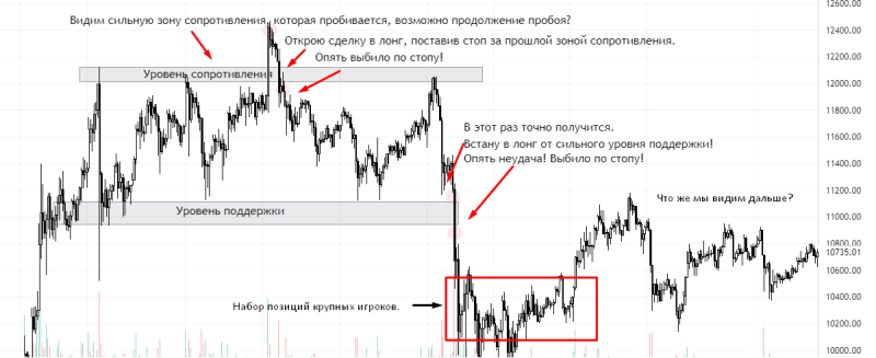
Another example of a major player, also on the chart:
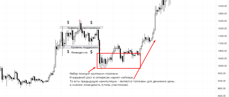
At the end I would like to add that this concept was not invented by us and the discoverer of this trading principle is not in the CIS. This man was an American, the Inner Circle Trader, a concept soon called Smart Money.
And now let’s move on to the concept of SM.
The concept of Smart Money
Market structure
Structure is the basis for understanding and making decisions in the market.
To identify the structure we must correctly find lows and highs on the chart. This will help us correctly identify the direction of the asset and determine this or that trend (upward or downward).
– A bullish structure – a series of higher highs and higher lows.
– Bearish market structure – a series of lower highs and lower lows.
– Consolidation period – no higher highs or lower lows.
There are 3 basic types of structure: upward, downward, and consolidation (sideways, range).
Remember! We trade only on the trend. In an uptrend – we are looking for an entry into a long position. A down trend – entry to the short position. We should trade counter-trends very carefully, by placing stops. How to trade in a consolidation, we will consider later.
The ascending structure (HH+HL) – maximum update, without updating the minimum.
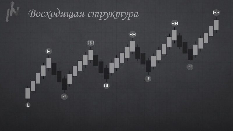
Rising structure
Downward structure (LH+LL) – update minimums without updating maximums
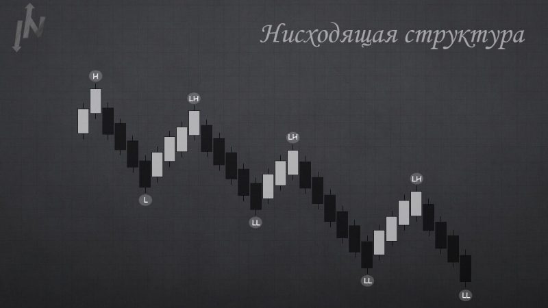
Downward Structure
At Smart Money we use the concept of Range (consolidation, sideways, flat) – a trading range that occurs when an asset trades between constant high and low prices for a certain period of time, a certain balance between buyers and sellers.
The reason for a flat is the loss of interest in the asset or the recruitment/discarding of positions by a major player.
To indicate the range, we use the Fibonacci correction grid (0; 0.5. 1)
1 and 0 – boundaries of the trading range, which we build by the first high and low (maximum and minimum).
0.5 – the middle of the sidewall, the fair price (equilibrium) from which we should receive a reaction to identify our Range.
Deviation – price moving out of the Range.
There is always liquidity beyond the consolidation boundaries, to which the price tends in order to sweep liquidity and gain position by a large player.
There is a property of deviation: the opposite generation of deviation. If there is a deviation from the top, the price is likely to move to the bottom of the sidewall for a deviation from the bottom, and vice versa.
Deviations can be used as an entry into a position:
– Aggressive entry – during the deviation.
– Conservative – after fixing in the trading range.
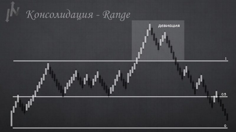
Consolidation – Range.
Break of structure
As we know the market structure may be uptrend (uptrend) – increase of minimums and maximums and downtrend (downtrend) – decrease of minimums and maximums.
The break of this or that structure may be called differently BMS (break market structure) CHoCH (Change of character) BOS (break of market structure). They all have the same meaning. For ease of identification, we use – CHoCH, and the confirmation of the structure – BOS.
To clarify:
ChoCH – change in market character, change in trend direction.
BOS – updating of maximums and minimums in the trend. Uptrand – renewal of maximums, downtrand – renewal of minimums.
It is the turning point on the main trend chart and change of trend direction that is a break in the structure. Breaking is preferable by the body of the candle, the shadow is regarded more as a liquidity withdrawal.
How to trade a structure break?
For this, we need a Fibonacci retracement grid.
1. we look for the break of the structure by identifying the ChoCH.
We pull the Fibonacci from our swing high to the swing low in case of a short position, and from the swing low to the swing high if the position is long. We wait for a correction in the OTE.
3. In the same OTE we look for an additional factor (any Smart Money Concept tool). Always price moves in OTE, ideally look for an instrument around 0.705-0.79 Fibonacci.
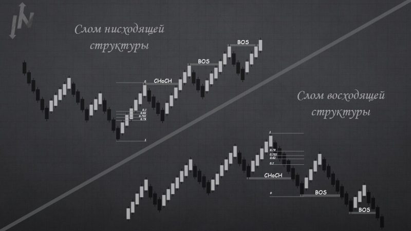
Breakdown of the downward / upward structure.
Orderblock (OB) – a candle, the range of the price in which a large player traded a large volume, thereby further manipulating the price.
OB is often the last red candle before the rapid increase in price, and the last green candle before the fall of the price.
And at the moment when the price reaches this range – we get a reaction and the price turns around.
According to the classics, the entry is made with 0.5 Fibonacci and stop is put behind the OB. But also do not forget that inside the Orderblock on the high timeframe may be present Orderblocks from the lower timeframes, then the entry can be made from the OB, which is formed on the low timeframe, or look for a break structure in the OB of the high timeframe.
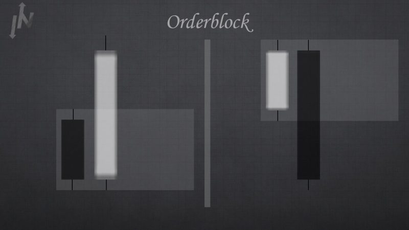
Orderblock.
As a side note.
– If there is liquidity in front of the OV, it increases the payoff, since it will be taken off.
– Orderblock should knock out some kind of low/high or fetish.
– The body of the orderblock is usually big, and the fetils are small.
– If the OB is liquid, we skip the OB, since this area of interest is very risky and we will most likely catch a stop.
– If the OB is without wicks, we take a position from 0.5 Fibonacci.
– If it has large shadows and a small body, we wait for the body to touch.
– When the body and shadow are the same, we wait for the shadow to touch.
Breaker
Breaker (breakerblock) is a reversal instrument the essence of which consists in the impulse order-breaking after the liquidity has been removed from the last HIGH or LOW. After these factors, the price should retest the broken orderblock and change the trend. That is the peculiarity of this reversal model. That is, the necessary conditions for the existence of this instrument are:
– liquidity withdrawal
– impulse break of an order block
– Re-test of a broken order block.

The breaker in its unity cannot be used as a point to open a position. For the most part, it is a price magnet. For a more accurate analysis, it is worth using the tool with others, the totality of factors will give a more accurate performance and a safer position. OTE (optimal trade entry) – for this tool is 0.5 candles (Fibonacci), but in most cases the price already reacts from the beginning of the body or even a wick.
Liqudity
Every Smart Money trader should be familiar with the concept of Liquidity. Liquidity is the fuel for a major player. The main and well-known rule is that the price moves from one pool of liquidity to another. In simple words – a Major Market player has a huge amount of funds and he artificially creates a liquidity pool to gain or to close his position in order to gain profit from it.
For example, to gain a position, he needs to find areas where there will be a lot of selling. In these places there will be liquidity pools, where the large player will fill in the stops of the market participants and thus gain his position. Liquidity is often the shadow of a candle that has not been traded and that is where the technical analysis traders place their stops.
As mentioned earlier, a large player makes his decisions based on stop-losses, so market participants’ stops are our liquidity followed by smart capital. Liquidity zones can very easily be formed on a chart, typical support and resistance levels behind which retail traders hide their stop losses, or any TA pattern beyond which there are also stops.

Liquidity can be observed as an equal high/low as well as a fetal candle. Smart capital knows how retail traders think. When a trader really understands the game he is playing, he can trade more confidently. This is necessary to succeed in the trading game if we really want to beat the big player.
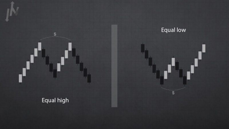
There are many reasons why retail traders are losing in the market:
– The use of large leverage.
– Buying on hawks.
– Sit out losses.
– Ignoring stop losses.
– Averaging in losing trades.
– Greed.
– Hope.
– Fear.
– Using a large number of indicators.
– Trading without knowledge.
– Not following a real trading plan.
– Impatience in deals.
Retail traders often think it’s all about technical analysis, a professional at the same time always understands the big picture and looks for what smart money does. With this in mind, our goal is to find traces of smart money, and an understanding of liquidity and knowledge of market structure will help us work out our setups to the best of our ability.
So before we trade liquidity – we need to stop being liquid!


